Unlock a world of possibilities! Login now and discover the exclusive benefits awaiting you.
- Qlik Community
- :
- All Forums
- :
- QlikView App Dev
- :
- Using aggregated values in calculations
- Subscribe to RSS Feed
- Mark Topic as New
- Mark Topic as Read
- Float this Topic for Current User
- Bookmark
- Subscribe
- Mute
- Printer Friendly Page
- Mark as New
- Bookmark
- Subscribe
- Mute
- Subscribe to RSS Feed
- Permalink
- Report Inappropriate Content
Using aggregated values in calculations
Please help with the problem i have see the qvw attached.
I have to calculate dynamically if a customer is 'Web' or 'Offline' and then use the resulting figures for further calculation.
This is based on the number of Orders they have placed and where within the selected time period - if > 75% of orders are online they are classed as online, <75% = offline
I have used aggregation to show the split and calculate the growth % vs previous year.
What I am stuck on is how to use the results of my aggregation for further calculations
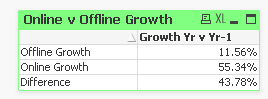
I need to show the difference between the 2 growth figures Online = 11.56% and 55.34 to give me 43.78, but I don't know how to use these values against each other.
Please help.
Thanks
Accepted Solutions
- Mark as New
- Bookmark
- Subscribe
- Mute
- Subscribe to RSS Feed
- Permalink
- Report Inappropriate Content
Maybe like attached?
- Mark as New
- Bookmark
- Subscribe
- Mute
- Subscribe to RSS Feed
- Permalink
- Report Inappropriate Content
Maybe like attached?
- Mark as New
- Bookmark
- Subscribe
- Mute
- Subscribe to RSS Feed
- Permalink
- Report Inappropriate Content
Not sure where you are wanting to do this, You can also try this if you want this as the third row in the chart
Script Changes: Added a new Island table:
Dim:
LOAD * Inline [
Dim
1
2
];
Dimension:
=Pick(Dim, IF(Aggr(SUM({<[Branch] ={"$(='Web')"}>} [CountOrders])
/
SUM([CountOrders]), [Customer]) < 0.75, Dual('Offline Growth', 1), Dual('Online Growth', 2)), Dual('Difference', 3))
Expression:
=Pick(Dim,
(SUM({<[Year] ={$(=MAX(Year))}>} Sales )
- SUM({<[Year] ={$(=MAX(Year)-1)}>} Sales )
)
/
SUM({<[Year] ={$(=MAX(Year)-1)}>} Sales ),
RangeSum(Above([Growth Yr v Yr-1], 1), -Above([Growth Yr v Yr-1], 2)))
- Mark as New
- Bookmark
- Subscribe
- Mute
- Subscribe to RSS Feed
- Permalink
- Report Inappropriate Content
This gives me the figure, as an alternative way to the above solution.
Very useful way to approach to get the answer
Help is much appreciated
- Mark as New
- Bookmark
- Subscribe
- Mute
- Subscribe to RSS Feed
- Permalink
- Report Inappropriate Content
This is exactly what I needed, I was approaching it from the wrong angle, using set analysis works perfectly for what I need.
Thanks, your help is much appreciated
- Mark as New
- Bookmark
- Subscribe
- Mute
- Subscribe to RSS Feed
- Permalink
- Report Inappropriate Content
Thanks for the input and help