Unlock a world of possibilities! Login now and discover the exclusive benefits awaiting you.
- Qlik Community
- :
- All Forums
- :
- QlikView App Dev
- :
- Values on data point through a specfiic range
- Subscribe to RSS Feed
- Mark Topic as New
- Mark Topic as Read
- Float this Topic for Current User
- Bookmark
- Subscribe
- Mute
- Printer Friendly Page
- Mark as New
- Bookmark
- Subscribe
- Mute
- Subscribe to RSS Feed
- Permalink
- Report Inappropriate Content
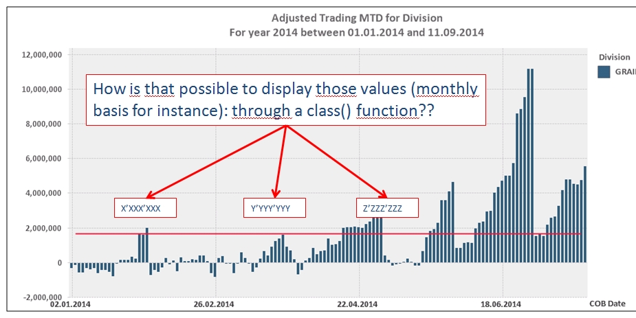
Values on data point through a specfiic range
Good afternoon,
As per below I have a 'classic' chart which display values along the year but given that the huge amount of values, on a daily basis, I'd like to display the VALUES IN CHART but only through a specific period for instance Monthly basis............or weekly basis.........can someone help me please? Also, do you know if it's possible to display the values in chart but with specific border color and fill-in color as per below?
Thanks a lot!
Enjoy your day,
Michaël.
- Mark as New
- Bookmark
- Subscribe
- Mute
- Subscribe to RSS Feed
- Permalink
- Report Inappropriate Content
Hi Michaël,
I think there is a way to do what you need, at least something approximate.
For example, I did the following:
// Table with random data
Random:
LOAD RowNo() as Day,
1000*rand() * RowNo() * rand()*10 as Amount
AutoGenerate 100;
In the bar chart, you need to use Day field as dimension and the expressions in this example are as follows:
Expression 1: sum(Amount)
Expression 2: if(mod(Day,10)=1, sum(Amount),'')
With these expressions, you should uncheck the Bar checkbox for the Expression 2
So as there are 100 days in my table, you will see 10 values.
Hope this helps.
Regards,
Jose