Unlock a world of possibilities! Login now and discover the exclusive benefits awaiting you.
- Qlik Community
- :
- All Forums
- :
- QlikView App Dev
- :
- Which charting component is this?
- Subscribe to RSS Feed
- Mark Topic as New
- Mark Topic as Read
- Float this Topic for Current User
- Bookmark
- Subscribe
- Mute
- Printer Friendly Page
- Mark as New
- Bookmark
- Subscribe
- Mute
- Subscribe to RSS Feed
- Permalink
- Report Inappropriate Content
Which charting component is this?
Hi,
I got the following mockup from client to create in the dashboard. Can anyone please identify which charting component is this?
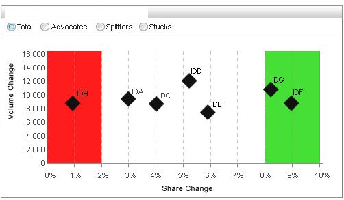
The chart looks like a grid or scatter chart. Have been able to plot it using scatter chart. But the plot area background color comes disabled and greyed out in the colors tab. I really need that Red and Green color to mark outliers and inliers.
Anyhelp would be really appreciated.
- Tags:
- chart
- grid
- grid_chart
- Mark as New
- Bookmark
- Subscribe
- Mute
- Subscribe to RSS Feed
- Permalink
- Report Inappropriate Content
Hi,
I guess this is a line chart and they used symbols in expression tab
For the first 3 and last 3 they used some condition to show background as red and green
Sivaraj S
- Mark as New
- Bookmark
- Subscribe
- Mute
- Subscribe to RSS Feed
- Permalink
- Report Inappropriate Content
Hi,
You can achieve this using Combo chart.
Use symbols to draw your data points and bars to show this red/green background.
I have attached an application, hope you will get an idea from it.
.....
Ashutosh
- Mark as New
- Bookmark
- Subscribe
- Mute
- Subscribe to RSS Feed
- Permalink
- Report Inappropriate Content
The X & Y axis is a continous range and the red and green region shift on the basis of the dimensions ((std dev)).
- Mark as New
- Bookmark
- Subscribe
- Mute
- Subscribe to RSS Feed
- Permalink
- Report Inappropriate Content
Looking a 'How To' for that background itself.