Unlock a world of possibilities! Login now and discover the exclusive benefits awaiting you.
- Qlik Community
- :
- All Forums
- :
- QlikView App Dev
- :
- heatmap with continuous x-axis
- Subscribe to RSS Feed
- Mark Topic as New
- Mark Topic as Read
- Float this Topic for Current User
- Bookmark
- Subscribe
- Mute
- Printer Friendly Page
- Mark as New
- Bookmark
- Subscribe
- Mute
- Subscribe to RSS Feed
- Permalink
- Report Inappropriate Content
heatmap with continuous x-axis
Hi everybody,
I am looking for a heatmap solution that allows me to show the value for about 20 different measurements over time.
In principle, the solution is a pivot table:
The name of the measurement should be displayed vertically and the time horizontally. The data itself then defines the colour of the respective cell using the colormix wizard (for text and background to erase the numbers in the cells)
Easy thing...BUT:
My time dimension has about 1000 or even more variants which ends up in >1000 columns.
Is there a way to make the columns infinitely small? In my QV11.2 it seems there is a minimum column width of about 1 character or so. But I want the whole range of time to be displayed on one screen only.
Any ideas?
All solutions I found online work with just a few columns on the x axis.
Keep Qliking
Michael
- Tags:
- heatmap
Accepted Solutions
- Mark as New
- Bookmark
- Subscribe
- Mute
- Subscribe to RSS Feed
- Permalink
- Report Inappropriate Content
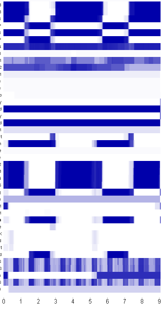
Problem solved, surprisingly easy:
Remember, there is a time series of about 10.000 points in time, each has a value fro a set of measurements.
What I used was a stacked barchart with the expression
=only(Time)-Above(Time)
what it does is simply taking the first timepoint as a baseline and adding the time increment for each point in time. Given that time starts with zero (did I mention?) the stacked bar in the end is exactly the full period of time.
This bar now exists for each measurement and the VALUE of the measurement itself is only reflected in the COLOR of the bar. That's what makes it a heatmap.
That's how it looks:
Thanks for all the ideas however
Keep Qliking
Michael
- Mark as New
- Bookmark
- Subscribe
- Mute
- Subscribe to RSS Feed
- Permalink
- Report Inappropriate Content
Hi Michael,
could it be a solution to cluster the time-values with something like: time(class(YourTime, 1/24/60 * 5), 'mm') ?
- Marcus
- Mark as New
- Bookmark
- Subscribe
- Mute
- Subscribe to RSS Feed
- Permalink
- Report Inappropriate Content
Hi Marcus,
unfortunately not really as we need the individual timestamps to be selectable.
My workaround was a faked chart with continuous time on the x-axis and a stacked bar chart with measurement type as 2nd dimension. To get a unique height for each measurement, the expression is simply “=1” So each stacked bar is 20 units high.
Disadvantage: The y-axis gets the values 1-20 instead of the names of the measurement and the legend does not synchronize with the levels of each measurement in the stacked bars…
Keep qliking
Michael
Von: Marcus Sommer
Gesendet: Montag, 11. Juli 2016 16:28
An: Klix, Michael
Betreff: Re: – heatmap with continuous x-axis
Qlik Community <https://community.qlik.com/?et=watches.email.thread>
heatmap with continuous x-axis
Antwort von Marcus Sommer<https://community.qlik.com/people/marcus_sommer?et=watches.email.thread> in QlikView App Development - Komplette Diskussion anzeigen<https://community.qlik.com/message/1080593?et=watches.email.thread#1080593>
- Mark as New
- Bookmark
- Subscribe
- Mute
- Subscribe to RSS Feed
- Permalink
- Report Inappropriate Content
Hi Michael,
maybe it's better to separate the pivot-heatmap from legend-informations and selectable timestamps. I think I would do some cluster on the time-level and maybe add some informations within the expression, something like:
= 1 & chr(10) & chr(10) & concat(Timestamp, chr(10)) & chr(10) & 'some further details'
and use a listbox or a straight-table beside the pivot with the single timestamps and maybe a count of them and other descriptive informations.
- Marcus
- Mark as New
- Bookmark
- Subscribe
- Mute
- Subscribe to RSS Feed
- Permalink
- Report Inappropriate Content
Problem solved, surprisingly easy:
Remember, there is a time series of about 10.000 points in time, each has a value fro a set of measurements.
What I used was a stacked barchart with the expression
=only(Time)-Above(Time)
what it does is simply taking the first timepoint as a baseline and adding the time increment for each point in time. Given that time starts with zero (did I mention?) the stacked bar in the end is exactly the full period of time.
This bar now exists for each measurement and the VALUE of the measurement itself is only reflected in the COLOR of the bar. That's what makes it a heatmap.
That's how it looks:
Thanks for all the ideas however
Keep Qliking
Michael