Unlock a world of possibilities! Login now and discover the exclusive benefits awaiting you.
- Qlik Community
- :
- All Forums
- :
- QlikView App Dev
- :
- Re: how to create this advance radar chart?
- Subscribe to RSS Feed
- Mark Topic as New
- Mark Topic as Read
- Float this Topic for Current User
- Bookmark
- Subscribe
- Mute
- Printer Friendly Page
- Mark as New
- Bookmark
- Subscribe
- Mute
- Subscribe to RSS Feed
- Permalink
- Report Inappropriate Content
how to create this advance radar chart?
Hi guys,
i am working on risk management dashboard. Client has proposed an advanced radar chart to me, whether i could create it in QlikView or not.
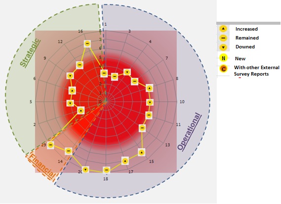
Have a look guys, the image is as below.
1) From what I have can see from this chart. It looks like I can create 1 pie chart - operational, strategic, and financial. Then overlay it on top on the radar chart.
Possible guys?
2) On the radar chart, instead of displaying points/dots , how can i show it with icons(increased, remained,downed. new, with other....)
Guys, i do not have any data or sample qvw that i can post it up now. I hope you guys can give me some suggestions and examples , if you have done similar stuffs before.
Rgds,
Jim
- « Previous Replies
-
- 1
- 2
- Next Replies »
- Mark as New
- Bookmark
- Subscribe
- Mute
- Subscribe to RSS Feed
- Permalink
- Report Inappropriate Content
I don't think that you could get a chart which is exactly the same like your example but with your mentioned method to overlap a pie-chart with the radar which had some picture as background and some free text from tab presentation and/or additionally textboxes which are overlapped, too (everything with some degree of transparency) you might get quite near.
What isn't possible are your small icons for increased, remained ... and so on but you could try to emulate the logic with a color-code within the background-color from the expression. You will need some hours for playing trial and error by an uncertain result ...
- Marcus
- Mark as New
- Bookmark
- Subscribe
- Mute
- Subscribe to RSS Feed
- Permalink
- Report Inappropriate Content
You want to show Web View? Try Line Gadget extension ?
- Mark as New
- Bookmark
- Subscribe
- Mute
- Subscribe to RSS Feed
- Permalink
- Report Inappropriate Content
yeah... the icons part is making me worried... but it should work in the expression, something like if it this amount then this icon, else, this icon, last, icon.
something like that.
- Mark as New
- Bookmark
- Subscribe
- Mute
- Subscribe to RSS Feed
- Permalink
- Report Inappropriate Content
nope
- Mark as New
- Bookmark
- Subscribe
- Mute
- Subscribe to RSS Feed
- Permalink
- Report Inappropriate Content
No, I don't think that this will be possible than there are no customizing-expressions for the symbols. If you could outsource the icons within a parallel table-chart it would be possible to show those icons (maybe you could add some more data to this table-chart to add really more value which might you able to convince your customer ...).
- Marcus
- Mark as New
- Bookmark
- Subscribe
- Mute
- Subscribe to RSS Feed
- Permalink
- Report Inappropriate Content
Hello Marcus,
i have done a testing. i wasn't able to change the "dots" color. instead, i can only changed the background color of the expression.
not close to what I wanted to achieve...
Rgds,
Jim Chan
- Mark as New
- Bookmark
- Subscribe
- Mute
- Subscribe to RSS Feed
- Permalink
- Report Inappropriate Content
Maybe you need to use another chart-types which might be even more suitable than these radar-chart and of course an extension would be thinkable (whereby I don't know one).
- Marcus
- Mark as New
- Bookmark
- Subscribe
- Mute
- Subscribe to RSS Feed
- Permalink
- Report Inappropriate Content
haha. i am still thinking to use radar chart + and a stragiht/pivot table to show the data n indicators.
- Mark as New
- Bookmark
- Subscribe
- Mute
- Subscribe to RSS Feed
- Permalink
- Report Inappropriate Content
What if you wrote a unique expression for each of your custom icons and rendered only the symbol (no lines)? The assumption being only one value/state can exist at any one interval? The final expression could be all the expressions combined, and plotting only the lines (no symbols).
What I don't understand are the values on your Radar chart, are those hours of the day? They are not sequential, that might be a bigger problem than the symbols if my suggestion works.
- « Previous Replies
-
- 1
- 2
- Next Replies »