Unlock a world of possibilities! Login now and discover the exclusive benefits awaiting you.
- Qlik Community
- :
- All Forums
- :
- QlikView App Dev
- :
- use of mini Charts
- Subscribe to RSS Feed
- Mark Topic as New
- Mark Topic as Read
- Float this Topic for Current User
- Bookmark
- Subscribe
- Mute
- Printer Friendly Page
- Mark as New
- Bookmark
- Subscribe
- Mute
- Subscribe to RSS Feed
- Permalink
- Report Inappropriate Content
use of mini Charts
Dear All,
Can any one tell me What is the use of Mini Chart as in that Chart we cannot See the Data or vale,
Ex: In my Straight Table i Have Dimension as Customer and Expression as Amount
so in my Mini Chart i am giving Dimension as Port Pair and i Can See the Chart,
But the Valueor Data on Mini Chart Doesnt Come.
Is there any preocess to get the Data on Mini Chart,
And please can any one Clarify any more use of mini Chart as i want to Apply Mini Chart but getting Restriction dure to Less Friendly.
Best Regards,
Pranav
- Tags:
- data
- mini_chart
- use
- Mark as New
- Bookmark
- Subscribe
- Mute
- Subscribe to RSS Feed
- Permalink
- Report Inappropriate Content
hi Pranav,
PFA.
- Mark as New
- Bookmark
- Subscribe
- Mute
- Subscribe to RSS Feed
- Permalink
- Report Inappropriate Content
Hi Pranav,
It is the graphical representation of the data. Yes you are correct you cannot see the data or value. As per me I don't think there is a way to show the data in the mini chart.
So mini chart is just the graphical representation of data which you can show inside a straight table or chart.
- Mark as New
- Bookmark
- Subscribe
- Mute
- Subscribe to RSS Feed
- Permalink
- Report Inappropriate Content
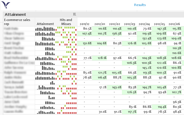
Note that you can have two columns for your data (two expressions in the straight table chart), one visible as a mini chart and the other with an average value.
Or if you really want both mini charts and the number for each month, you can layer a straight table with mini charts on top of a pivot table with numbers:
- Mark as New
- Bookmark
- Subscribe
- Mute
- Subscribe to RSS Feed
- Permalink
- Report Inappropriate Content
Thanks Deepak.
- Mark as New
- Bookmark
- Subscribe
- Mute
- Subscribe to RSS Feed
- Permalink
- Report Inappropriate Content
Hi Jonathan,
Is it possible to change color of dots depending upon result of expression.
for example
if result of expression is 1 then show dot of line mini chart in GREEN color
if it is 2 then show dot in RED
if it is 3 then show dot in BLUE
if it in 4 then show dot in ORANGE color
- Mark as New
- Bookmark
- Subscribe
- Mute
- Subscribe to RSS Feed
- Permalink
- Report Inappropriate Content
Unfortunately, no: you can only choose a default color, a max value color, and a min value color. Normally you can write formulae to control these things by expanding the expression in the list of expressions, but setting a calculation for Text Color or Line Style does not change the colors of the whiskers.
Unless maybe they've changed something; I'm using 11.20.
- Mark as New
- Bookmark
- Subscribe
- Mute
- Subscribe to RSS Feed
- Permalink
- Report Inappropriate Content
Or if you really want both mini charts and the number for each month, you can layer a straight table with mini charts on top of a pivot table with numbers:

Hi jonathan,
I have the similar requirement Can you please explain how the layering is done with straight table,pivot table with mini chart to show month/day wise split-ups?