Unlock a world of possibilities! Login now and discover the exclusive benefits awaiting you.
- Qlik Community
- :
- All Forums
- :
- QlikView App Dev
- :
- using class function
- Subscribe to RSS Feed
- Mark Topic as New
- Mark Topic as Read
- Float this Topic for Current User
- Bookmark
- Subscribe
- Mute
- Printer Friendly Page
- Mark as New
- Bookmark
- Subscribe
- Mute
- Subscribe to RSS Feed
- Permalink
- Report Inappropriate Content
using class function
Hello got a fact table against which I'm counting the number of regressions between two selected dates
my expression is as follows:
count
(DISTINCT
{
<
OFFICIAL=
,ROF_CATEGORY=
,TYPE={'reg'}
,RECORD_TYPE={'detection'}
,Year=
,MonthYear=
,Month=
,CALENDAR_DATE={'>= $(vFromDate) <=$(vToDate)'}
>
} ID
)
now what I want is to create a line chart that categorizes the above expression's result into brackets of 100 as length
I added a pivot table and added a dimension as follows:
=Class(TPK,100,'x')
and as expression the above expression yet I got the following:
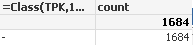
please advise
Accepted Solutions
- Mark as New
- Bookmark
- Subscribe
- Mute
- Subscribe to RSS Feed
- Permalink
- Report Inappropriate Content
Hello Ali
Heres an example using aggr and class. Hope the context is correct. KRegs John
- Mark as New
- Bookmark
- Subscribe
- Mute
- Subscribe to RSS Feed
- Permalink
- Report Inappropriate Content
Can you post sample app
- Mark as New
- Bookmark
- Subscribe
- Mute
- Subscribe to RSS Feed
- Permalink
- Report Inappropriate Content
Hello Ali
Is TPK a 'fact' value? You may need to use the aggr function eg aggr(nodistinct sum(TPK) , Yearorsomething)
- Mark as New
- Bookmark
- Subscribe
- Mute
- Subscribe to RSS Feed
- Permalink
- Report Inappropriate Content
ie class( aggr(nodistinct sum(TPK) , Year),100,'x')
- Mark as New
- Bookmark
- Subscribe
- Mute
- Subscribe to RSS Feed
- Permalink
- Report Inappropriate Content
yes it is a fact table column
- Mark as New
- Bookmark
- Subscribe
- Mute
- Subscribe to RSS Feed
- Permalink
- Report Inappropriate Content
Ok. Ill try and send you an example shortly
- Mark as New
- Bookmark
- Subscribe
- Mute
- Subscribe to RSS Feed
- Permalink
- Report Inappropriate Content
Hello Ali
Heres an example using aggr and class. Hope the context is correct. KRegs John