Unlock a world of possibilities! Login now and discover the exclusive benefits awaiting you.
- Qlik Community
- :
- All Forums
- :
- QlikView App Dev
- :
- Re: Compressing Line chart X axis dimensions
- Subscribe to RSS Feed
- Mark Topic as New
- Mark Topic as Read
- Float this Topic for Current User
- Bookmark
- Subscribe
- Mute
- Printer Friendly Page
- Mark as New
- Bookmark
- Subscribe
- Mute
- Subscribe to RSS Feed
- Permalink
- Report Inappropriate Content
Compressing Line chart X axis dimensions
Hi Everyone,
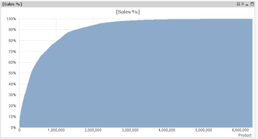
I have around 1,80,000 Products on X-axis and its sales on Y-axis.
I wanna compress the dimensions of X-axis and want to see a trend using Line chart in single screen.
I'm trying to get an output like the attached screenshot. Someone help me
- « Previous Replies
-
- 1
- 2
- Next Replies »
Accepted Solutions
- Mark as New
- Bookmark
- Subscribe
- Mute
- Subscribe to RSS Feed
- Permalink
- Report Inappropriate Content
- Mark as New
- Bookmark
- Subscribe
- Mute
- Subscribe to RSS Feed
- Permalink
- Report Inappropriate Content
Without using scroll bar
- Mark as New
- Bookmark
- Subscribe
- Mute
- Subscribe to RSS Feed
- Permalink
- Report Inappropriate Content
Could you post an example application?
- Mark as New
- Bookmark
- Subscribe
- Mute
- Subscribe to RSS Feed
- Permalink
- Report Inappropriate Content
HI,
Here is the application.
- Mark as New
- Bookmark
- Subscribe
- Mute
- Subscribe to RSS Feed
- Permalink
- Report Inappropriate Content
Hi,
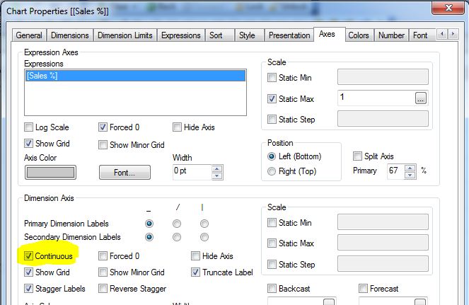
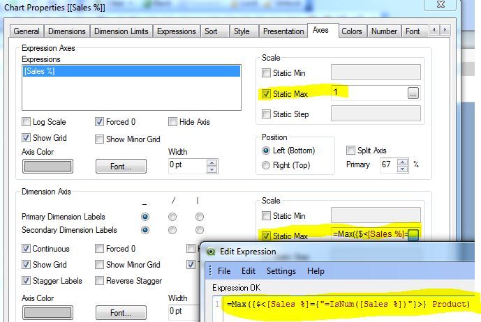
one solution could be to switch the dimension axis to "continuous" mode:
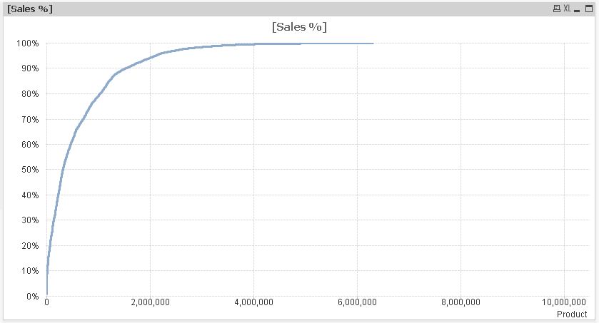
hope this helps
regards
Marco
- Mark as New
- Bookmark
- Subscribe
- Mute
- Subscribe to RSS Feed
- Permalink
- Report Inappropriate Content
Hi Marco,
Excellent.
It worked. But we have an issue here. As you observe its showing 10000000 as the product here.
How to eliminate it?
- Mark as New
- Bookmark
- Subscribe
- Mute
- Subscribe to RSS Feed
- Permalink
- Report Inappropriate Content
Hi Marco,
But why am i getting 120 % on y-axis and 10000000 in X-axis when those values are not available.
Can we eliminate those values?
- Mark as New
- Bookmark
- Subscribe
- Mute
- Subscribe to RSS Feed
- Permalink
- Report Inappropriate Content
Hi,
try like:
hope this helps
regards
Marco
- Mark as New
- Bookmark
- Subscribe
- Mute
- Subscribe to RSS Feed
- Permalink
- Report Inappropriate Content
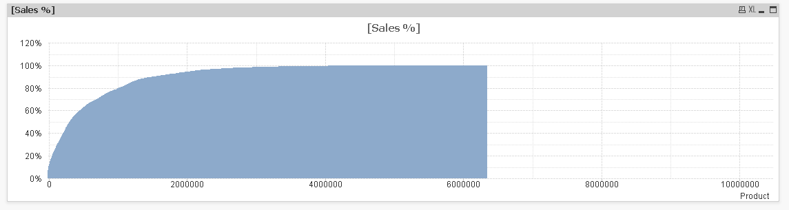
Hi Marco,
Its working independently.
But when i try with the original QVW which has loads and loads of data in it, it hangs and gives me this output.
Im confused.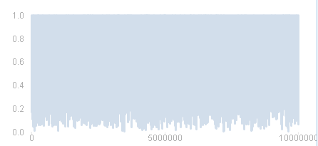
- Mark as New
- Bookmark
- Subscribe
- Mute
- Subscribe to RSS Feed
- Permalink
- Report Inappropriate Content
Mark,
First, line chart is not the best choice here. Line charts are first of all to show some process in time, that is the X-axis is for a time dimension (day, month, year, millisecond...). What information the line chart shows when the Product is the dimension?
Second, if you have millions of dimension values on chart, it will be slow.
I can't guess what exactly you trying to do and why, but you need to re-consider the way you present the data. Anyway, look at this bar chart. Here the dimension is using class() function, and expression is avg(). Performance is fine with your sample data. App is attached.

Regards,
Michael
- « Previous Replies
-
- 1
- 2
- Next Replies »