Unlock a world of possibilities! Login now and discover the exclusive benefits awaiting you.
- Qlik Community
- :
- All Forums
- :
- QlikView App Dev
- :
- Upper and lower bound limit
- Subscribe to RSS Feed
- Mark Topic as New
- Mark Topic as Read
- Float this Topic for Current User
- Bookmark
- Subscribe
- Mute
- Printer Friendly Page
- Mark as New
- Bookmark
- Subscribe
- Mute
- Subscribe to RSS Feed
- Permalink
- Report Inappropriate Content
Upper and lower bound limit
Hi Qlikview experts,
I have set of data several days worth of data with millions of records that have time stamps (e.g. every minute of 5 minute intervals) and several columns containing various information.
To simplify, the columns of interest are:
Time Stamp, User Name, network id, user status, region, throughput
Network status value is either IN or OUT
I am trying to create a chart showing number of distinct users accessing the network over the time (e.g. on hourly basis) or with variable interval and plotting upper and lower bound limit (w/ 95% confidence interval). In this case user status will need to be IN.
What I did was
Dimension = Hour (Time Stamp)
Expression is
count({<[user_status]={'*IN*'}>}distinct([User Name]))
While I can simply show the above expression in the chart, the lower and upper limit w/95% confidence is not properly shown.
Any suggestion how this should be done. Is there any aggregation function that should to be used here?
If I wanted to do the same thing for throughput (e.g. using sum(throughput)), will it be the same expression to be used?
Showing
Also I'd like to be able to show the same thing when changing the dimension to a calculated dimension like below
Timestamp((Ceil([Time Stamp],1/IntervalSize)),'DD-MMM-hh:mm')
The interval size for various period (15 min, 30 min , 1 hour, etc.) is predefined in the loading script.
- « Previous Replies
- Next Replies »
Accepted Solutions
- Mark as New
- Bookmark
- Subscribe
- Mute
- Subscribe to RSS Feed
- Permalink
- Report Inappropriate Content
For average, may be this:
Avg(TOTAL Count(DISTINCT{<[network status]={'*IN_NETWORK*'}>}([User Name]), [Time Stamp]))
- Mark as New
- Bookmark
- Subscribe
- Mute
- Subscribe to RSS Feed
- Permalink
- Report Inappropriate Content
Would you be able to provide a sample with what you are hoping to see 
- Mark as New
- Bookmark
- Subscribe
- Mute
- Subscribe to RSS Feed
- Permalink
- Report Inappropriate Content
Hi Sunny, please find attached the sample file.
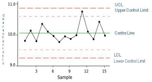
What i'd like to see is something like this
- Mark as New
- Bookmark
- Subscribe
- Mute
- Subscribe to RSS Feed
- Permalink
- Report Inappropriate Content
- Mark as New
- Bookmark
- Subscribe
- Mute
- Subscribe to RSS Feed
- Permalink
- Report Inappropriate Content
Hi Marco,
Thanks for the link. I followed the instruction in the link and plugged the numbers using my data but they are not showing the charts I am looking for. I can't show average, upper and lower bound lines using the suggested expression.
My daily expression for my data is count(DISTINCT{<[network status]={'*IN_NETWORK*'}>}([User Name]))
and my dimension is Timestamp((Ceil([Time Stamp],1/IntervalSize)),'DD-MMM-hh:mm')
What would be the correct expression for the average as Avg(Aggr(count( or Avg(Aggr(sum etc. are not working. Any suggestion or hint?
Thank you,
Fikri
- Mark as New
- Bookmark
- Subscribe
- Mute
- Subscribe to RSS Feed
- Permalink
- Report Inappropriate Content
For average, may be this:
Avg(TOTAL Count(DISTINCT{<[network status]={'*IN_NETWORK*'}>}([User Name]), [Time Stamp]))
- Mark as New
- Bookmark
- Subscribe
- Mute
- Subscribe to RSS Feed
- Permalink
- Report Inappropriate Content
How about SPC chart. Can you please provide your application
- Mark as New
- Bookmark
- Subscribe
- Mute
- Subscribe to RSS Feed
- Permalink
- Report Inappropriate Content
Tried that expression but it is showing error in expression. So, I think
it needs different expression?
On Sun, Sep 11, 2016 at 12:52 PM, Anil Babu <qcwebmaster@qlikview.com>
- Mark as New
- Bookmark
- Subscribe
- Mute
- Subscribe to RSS Feed
- Permalink
- Report Inappropriate Content
Hi Anil,
The data sample is in the attachment. I tried the expression that Sunny suggested but it said wrong expression, so I can't move forward to create the SPC chart. Do you have any suggestion?
Thanks!
- Mark as New
- Bookmark
- Subscribe
- Mute
- Subscribe to RSS Feed
- Permalink
- Report Inappropriate Content
I think I missed Aggr() function. Can you try this now
Avg(TOTAL Aggr(Count(DISTINCT{<[network status]={'*IN_NETWORK*'}>}([User Name]), [Time Stamp]))
- « Previous Replies
- Next Replies »