Unlock a world of possibilities! Login now and discover the exclusive benefits awaiting you.
- Qlik Community
- :
- All Forums
- :
- QlikView App Dev
- :
- Re: Re: want to build graph using dashboard from e...
- Subscribe to RSS Feed
- Mark Topic as New
- Mark Topic as Read
- Float this Topic for Current User
- Bookmark
- Subscribe
- Mute
- Printer Friendly Page
- Mark as New
- Bookmark
- Subscribe
- Mute
- Subscribe to RSS Feed
- Permalink
- Report Inappropriate Content
want to build graph using dashboard from excel
I have a data in an excel which has 1st three columns as project1, sub project and sub-sub project, and the fourth column is KPI metrics and the 5th column is target and the 6th column onwards are months and the data in each of the columns below.
| Header 1 | Header 2 | Header 3 | Header 4 | Header 5 | Header 6 |
|---|---|---|---|---|---|
| Project | Sub-Project | Sub-Sub-project | KPI | Target | Aug |
| A&A | A&A (Adam) | A&A (Adam - Aple) | Answerd | 90% | 93% |
| Abnd | <5% | 4.1% | |||
| FCR | 90% | 92% | |||
Want to show a graphical presentation of the above data with the multibox showing 'Project', 'Sub-Project'and 'Sub-Sub-project' and the values of all the KPI's show for Aug shown in the Bar graph.
Added a dummy data for reference herewith.
- Mark as New
- Bookmark
- Subscribe
- Mute
- Subscribe to RSS Feed
- Permalink
- Report Inappropriate Content
Create a load statement for the excel file using the file wizard. You can choose to fill the x-project fields with values from the row above if the cell is empty. And you can enable the CrossTable option so all the Month columns are transformed to a usable form with the Months in a Month field and the KPI values in a Value field. You can then use Month as dimension in the bar chart and select Aug if you want to see only the KPI's of Aug.
Feel free to post the excel file if you aren't able to get the result you want.
talk is cheap, supply exceeds demand
- Mark as New
- Bookmark
- Subscribe
- Mute
- Subscribe to RSS Feed
- Permalink
- Report Inappropriate Content
Hi,
Try the hierarchy function.

Rebeca
- Mark as New
- Bookmark
- Subscribe
- Mute
- Subscribe to RSS Feed
- Permalink
- Report Inappropriate Content
You'll have the example at hand for review
- Mark as New
- Bookmark
- Subscribe
- Mute
- Subscribe to RSS Feed
- Permalink
- Report Inappropriate Content
Hi Gysbert, we had tried this function earlier but didnt seem to work, anyways as suggested have attached a sample dummy data.
- Mark as New
- Bookmark
- Subscribe
- Mute
- Subscribe to RSS Feed
- Permalink
- Report Inappropriate Content
Hello, Following your requirement this is how I would do it:
Table:
CrossTable(Month, KPI,4)
LOAD
[Service Desk],
Vertical,
[SLA's of Project],
[SLA Target],
May,
June,
July,
Aug
FROM
\\YourFile.xlsx
(ooxml, embedded labels, table is Sheet1);
Sample app is attached
- Mark as New
- Bookmark
- Subscribe
- Mute
- Subscribe to RSS Feed
- Permalink
- Report Inappropriate Content
Hi Alberto,
It worked, but we also have some conditions and validations
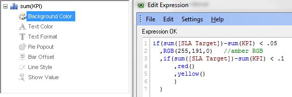
1) I am looking at the change of the color of the graph based on some thresholds for eg. if the Actual is <5% of the SLA Target then the bar graph should be Amber in color, if the Acutal if <10% of the SLA Target the barg graph should be in Red color.
2) Also this will be a continuous data, so we might have month wise columns being added after 'Aug' so how do we populate that. I guess you are using the value '4' in the crosstable function.
- Mark as New
- Bookmark
- Subscribe
- Mute
- Subscribe to RSS Feed
- Permalink
- Report Inappropriate Content
Hi,
For 1) Try something like this on the background colour for the expression
For 2) The 4 is identifying the number of fields preceding the table to be transformed, in other words that is your prj, sub-proj, sub-sub-proj and target. Just keep adding rows for the month in your load statement and it will work fine.