Unlock a world of possibilities! Login now and discover the exclusive benefits awaiting you.
- Qlik Community
- :
- All Forums
- :
- QlikView Administration
- :
- add two dimension and expression in one graph
- Subscribe to RSS Feed
- Mark Topic as New
- Mark Topic as Read
- Float this Topic for Current User
- Bookmark
- Subscribe
- Mute
- Printer Friendly Page
- Mark as New
- Bookmark
- Subscribe
- Mute
- Subscribe to RSS Feed
- Permalink
- Report Inappropriate Content
add two dimension and expression in one graph
Hi ,
I want to create graph where in i want to show two dimensions and expressions.
Employee not completing 8 Hrs and Dept not completing 8 hrs with percentage.
Dept whose 8 hrs percentage will less than 20%, Must be in Red same way more than 20% will be in Yellow. and more than 50% in Green.
Can i show it is same graph.
Please suggest.
I have attached the data.
DEPT_NO DEPT_NAME
1 Chairman
101 HR
102 IT
103 Inspector
120 Finance
121 Quality
Thanks and Regards,
- Tags:
- qlikview_deployment
- « Previous Replies
-
- 1
- 2
- Next Replies »
- Mark as New
- Bookmark
- Subscribe
- Mute
- Subscribe to RSS Feed
- Permalink
- Report Inappropriate Content
Hi,
you can also add this inline load :
LOAD * INLINE [
dimension
Departement
Employe
];
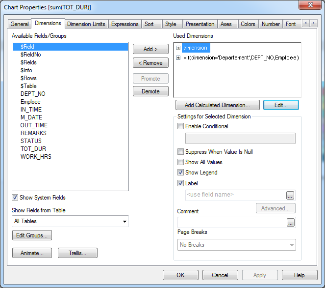
And then in you chart, you can use these two separated dimensions :
- Mark as New
- Bookmark
- Subscribe
- Mute
- Subscribe to RSS Feed
- Permalink
- Report Inappropriate Content
Hi
finally i have got the correct percentage to display on pivot table.
Please assist me how to display the same on graph where employees percentage is less than or equal to 20
should be display in RED and above 20% Yellow and 40% green in guage graph or any other graph with employees/
Thanks
- « Previous Replies
-
- 1
- 2
- Next Replies »