Unlock a world of possibilities! Login now and discover the exclusive benefits awaiting you.
- Qlik Community
- :
- Support
- :
- Support
- :
- Knowledge
- :
- Member Articles
- :
- Bar or Equalizer ! - A different Bar Chart for you...
- Edit Document
- Move Document
- Delete Document
- Subscribe to RSS Feed
- Mark as New
- Mark as Read
- Bookmark
- Subscribe
- Printer Friendly Page
- Report Inappropriate Content
Bar or Equalizer ! - A different Bar Chart for your viewing pleasure
- Move Document
- Delete Document and Replies
- Mark as New
- Bookmark
- Subscribe
- Mute
- Subscribe to RSS Feed
- Permalink
- Report Inappropriate Content
Bar or Equalizer ! - A different Bar Chart for your viewing pleasure
Hi,
The Following blog was inspired by a recent post that allowed me to exercise my brain into trying something new
(link to thread: Qlikview Chart)
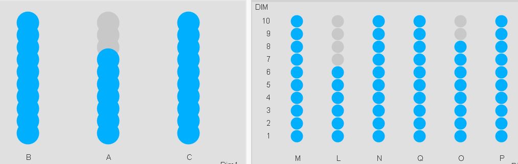
Below is one of the two charts to be achieved in Qlikview. This led / music equalizer style looked pretty cool so I had to try

I finished with a chart like this. Close enough I'd say.
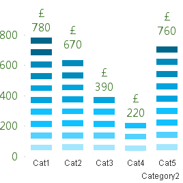
You can also adjust the number of bands you wish to see on the chart, but make sure you adjust the percentage scales for background colors

How did we achieve this chart?
The Idea is to break each value into multiple segments and then use background expression to make only alternate segments visible.
Simple isn't it.
So we've basically turned a simple single dimension one expression chart into a Stacked Chart with two Dimensions and one Expression.
Apply the same approach with Grid Charts which allow other visualization possibilities.
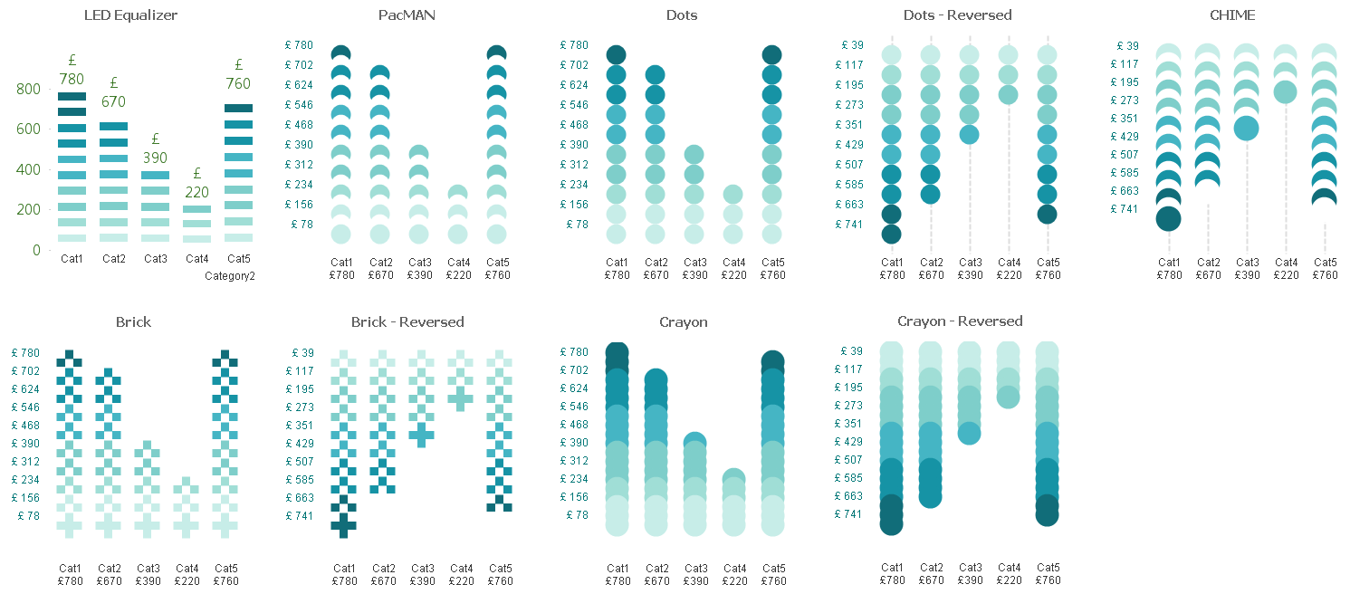
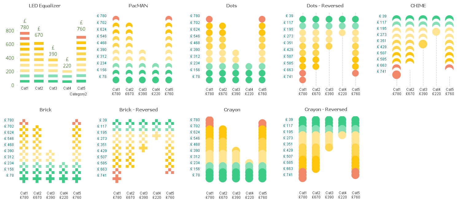
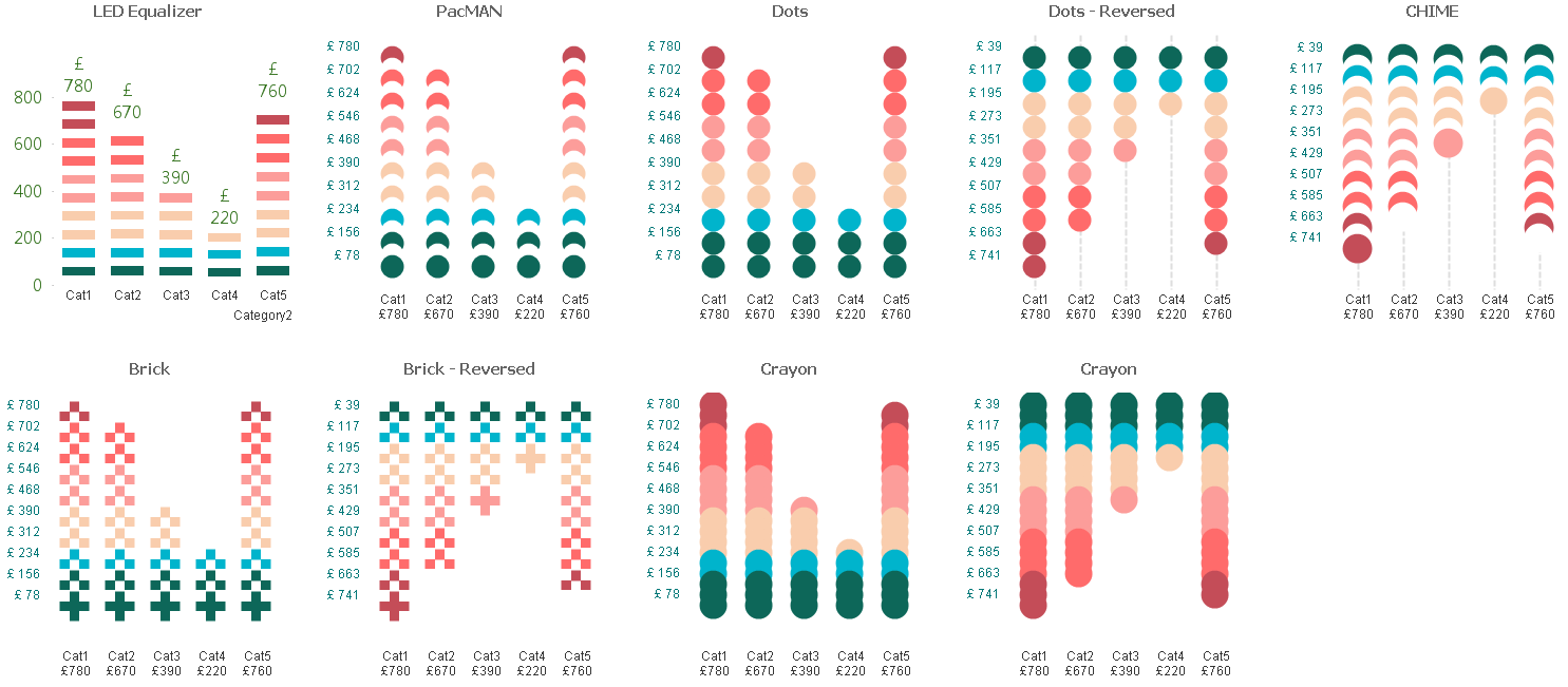
These are just for your viewing pleasure, hope you enjoy playing with them as much as I did.
Happy Qlik'in
Cheers
Vineeth
![]()
![]()
Vineeth Pujari
- Move Comment
- Delete Comment
- Mark as Read
- Mark as New
- Bookmark
- Permalink
- Report Inappropriate Content
I have used the default script (ctr + 00) and this expression :
If(DIM <= round(Sum(Expression1)/Max(TOTAL Aggr(Sum(Expression1), Dim1))*40),
Sum(Expression1)/round(Sum(Expression1)/Max(TOTAL Aggr(Sum(Expression1), Dim1))*40)
)
Color by expression :
if(even(RowNo())=0,argb(0,255,255,255),
if(DIM >= 40*.90 ,rgb(196, 77, 88),
if(DIM >= 40*.70 ,rgb(255, 107, 107),
if(DIM >= 40*.50 ,rgb(252, 157, 154),
if(DIM >= 40*.30 ,rgb(249, 205, 173),
if(DIM >= 40*.20 ,rgb(0, 180, 204),
if(DIM >= 40*.05 ,rgb(13, 103, 89),
)))))))
(replace 40 by a variable if you what)
- Move Comment
- Delete Comment
- Mark as Read
- Mark as New
- Bookmark
- Permalink
- Report Inappropriate Content
I've attached Qvf file to the post now
- Move Comment
- Delete Comment
- Mark as Read
- Mark as New
- Bookmark
- Permalink
- Report Inappropriate Content
Hi
Very interesting , thanks for sharing QliKsense app example
Bruno
- Move Comment
- Delete Comment
- Mark as Read
- Mark as New
- Bookmark
- Permalink
- Report Inappropriate Content
Seems very cool, thanks!
- Move Comment
- Delete Comment
- Mark as Read
- Mark as New
- Bookmark
- Permalink
- Report Inappropriate Content
G'day Vineeth,
The main example in your post looks nice and neat, clear and informative. Not much redundant 'ink' on the page. However, your 'Grid Chart' examples look very busy and would distract the viewer from the information that you're trying to convey.
Cheers,
Barnaby.
- Move Comment
- Delete Comment
- Mark as Read
- Mark as New
- Bookmark
- Permalink
- Report Inappropriate Content
Nice Chart !
- Move Comment
- Delete Comment
- Mark as Read
- Mark as New
- Bookmark
- Permalink
- Report Inappropriate Content
Very interesting, Thanks for posting!
- Move Comment
- Delete Comment
- Mark as Read
- Mark as New
- Bookmark
- Permalink
- Report Inappropriate Content
Very interesting,
- Move Comment
- Delete Comment
- Mark as Read
- Mark as New
- Bookmark
- Permalink
- Report Inappropriate Content
Hi barnaby
I've shown a trick; how you apply it is up to you.
In the post I have shown heat maps, you could also use it to show fill to value charts 
Cheers
V
- « Previous
-
- 1
- 2
- Next »