Unlock a world of possibilities! Login now and discover the exclusive benefits awaiting you.
- Qlik Community
- :
- Support
- :
- Support
- :
- Knowledge
- :
- Member Articles
- :
- How to - Double layout ("Sausage") gauge
- Edit Document
- Move Document
- Delete Document
- Subscribe to RSS Feed
- Mark as New
- Mark as Read
- Bookmark
- Subscribe
- Printer Friendly Page
- Report Inappropriate Content
How to - Double layout ("Sausage") gauge
- Move Document
- Delete Document and Replies
- Mark as New
- Bookmark
- Subscribe
- Mute
- Subscribe to RSS Feed
- Permalink
- Report Inappropriate Content
How to - Double layout ("Sausage") gauge
The native QV gauges are not very sexy but you can give them little makeover.
Please see below one on how to do that
(you can find out more her
Dislike gauge charts? You may want to give them a second chance)
The idea here is to have our scale started at 12 am (or pm).
We will need two gauges precisely layout out one on another.
The first gauge is just a circle, the second will hold calculation and segments.
Advice:
Turn on the " Design grid" option.
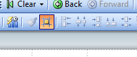
It is very helpful when deciding upon the size of the chart or adjusting the layout.
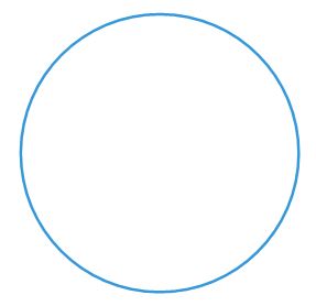
First Gauge
Press right button anywhere on the tab and from option choose "Create New Sheet Object.." and then "Chart..."
a) Tab : General :-
Choose gauge from the chart options.
b) Dimension:
Skip
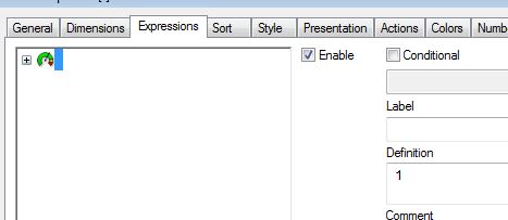
c) Expressions:
Add '1' as expression
d) Sort:
Skip
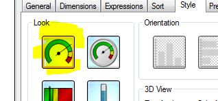
e) Style:
Choose the first top left corner chart
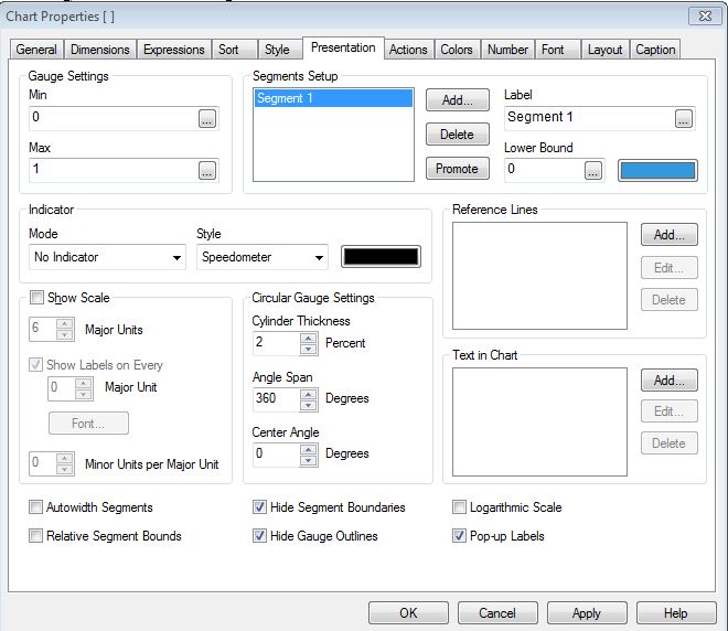
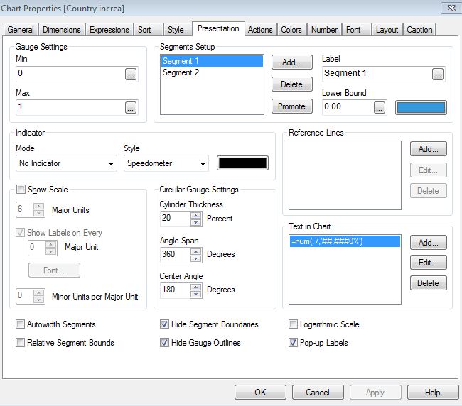
f) Presentation:
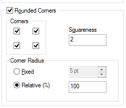
Fallow the picture below:
g) Actions:
Skip
h) Colors:
The "Color Background" and the "Frame Background " "Transparency" must be set to 100%
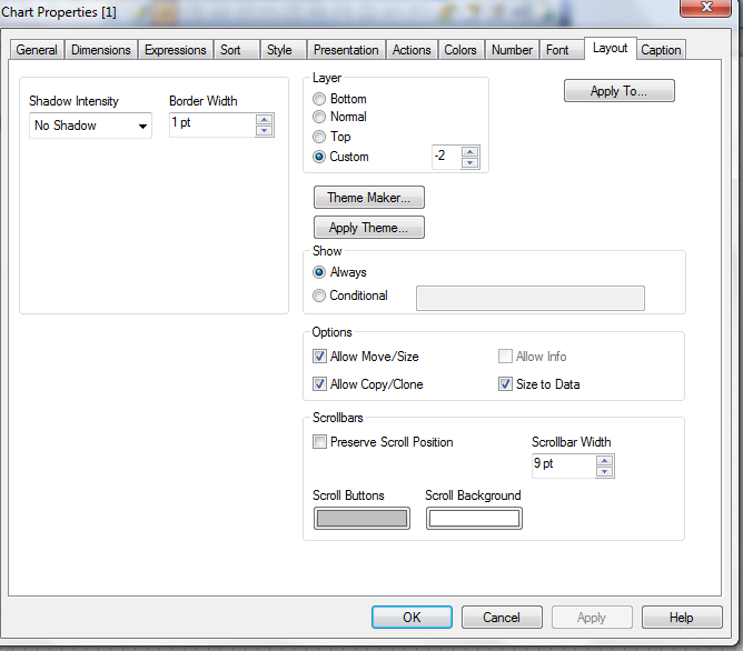
i) Layout:
The "Use Borders " box must be empty
j) Caption:
The "Show Caption" box must be empty
The final result is a blue circle.
Second gauge
Points a-e
(Follow instruction on first chart)
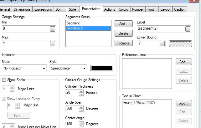
f) Presentation:
Follow the picture below.
Where Segment 1 Lower Bound is 0 and color is Blue and Segment 2 Lower Bound is is your expression
(in this example only decimal number is use but normally you will need to enter an expression in form x/y)
and the color is transparent.
Add Text in "Text in Chart" option and format it as %.
| Segment 1 | Segment 2 |
|---|---|
 |  |
Points g-j
Follow instruction for the first chart.
The final result:
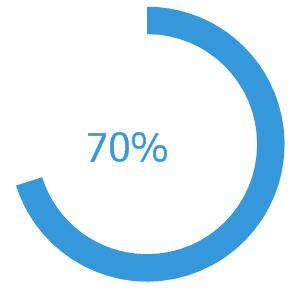
And the two gauges joined together:
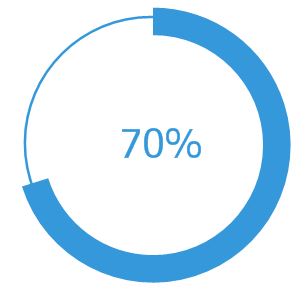
and a small visualization
----------------------------
Did You like it?
Feeling Qlikngry?
How To /Missing Manual(18 articles)
- Move Comment
- Delete Comment
- Mark as Read
- Mark as New
- Bookmark
- Permalink
- Report Inappropriate Content
Nice presentation of Guage chart.
- Move Comment
- Delete Comment
- Mark as Read
- Mark as New
- Bookmark
- Permalink
- Report Inappropriate Content
excellent idea...
- Move Comment
- Delete Comment
- Mark as Read
- Mark as New
- Bookmark
- Permalink
- Report Inappropriate Content
Very great idea
- Move Comment
- Delete Comment
- Mark as Read
- Mark as New
- Bookmark
- Permalink
- Report Inappropriate Content
Robert_MikaVery useful stuff, thanks for sharing. I tried it and got one issue, on layout tab I can't see 'Use Borders' box. In fact, several other options are missing. In your qvw, I can see the those option which you mentioned above like 'Use Borders' box . Where am I going wrong ? Please see the picture below:
Taha
- Move Comment
- Delete Comment
- Mark as Read
- Mark as New
- Bookmark
- Permalink
- Report Inappropriate Content
Good idea, but if your first gauge is just for create the circle, you can create with text object with this characteristics and the put the gauge over it.
- Move Comment
- Delete Comment
- Mark as Read
- Mark as New
- Bookmark
- Permalink
- Report Inappropriate Content
Jolivares ...or a simple text object with an embedded picture.
- Move Comment
- Delete Comment
- Mark as Read
- Mark as New
- Bookmark
- Permalink
- Report Inappropriate Content
You are right but once you start to resize the the picture you will lose some control on the quality of the object
- Move Comment
- Delete Comment
- Mark as Read
- Mark as New
- Bookmark
- Permalink
- Report Inappropriate Content
Good idea.
- Move Comment
- Delete Comment
- Mark as Read
- Mark as New
- Bookmark
- Permalink
- Report Inappropriate Content
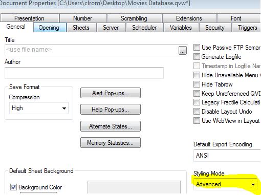
Go first to Settings -->Document Properties -->General and turn on Advance Mode under Styling
- Move Comment
- Delete Comment
- Mark as Read
- Mark as New
- Bookmark
- Permalink
- Report Inappropriate Content
Robert_Mika Thanks, it appeared.