Unlock a world of possibilities! Login now and discover the exclusive benefits awaiting you.
- Qlik Community
- :
- All Forums
- :
- QlikView App Dev
- :
- 100% Stacked column chart
Options
- Subscribe to RSS Feed
- Mark Topic as New
- Mark Topic as Read
- Float this Topic for Current User
- Bookmark
- Subscribe
- Mute
- Printer Friendly Page
Turn on suggestions
Auto-suggest helps you quickly narrow down your search results by suggesting possible matches as you type.
Showing results for
Not applicable
2013-12-02
11:17 AM
- Mark as New
- Bookmark
- Subscribe
- Mute
- Subscribe to RSS Feed
- Permalink
- Report Inappropriate Content
100% Stacked column chart
Hi,
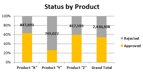
Does anyone know how to create a '100% stacked column' chart in a way, that tool compares the % not to the total, but to the reported groups? I.e.: sum(Product "X")=100%
| Product "X" | Product "Y" | Product "Z" | Grand Total | |
| Approved | 1,427,075 | 267,717 | 1,189,907 | 2,884,699 |
| Rejected | 847,693 | 765,022 | 817,593 | 2,430,308 |
And is it possible in any way to have both, the values and the % visible in the same chart? Or at least add the values into a % bar chart? Many thanks for your help!
375 Views
0 Replies