Unlock a world of possibilities! Login now and discover the exclusive benefits awaiting you.
- Qlik Community
- :
- All Forums
- :
- QlikView App Dev
- :
- Align x axis labels with bars of vertical bar char...
- Subscribe to RSS Feed
- Mark Topic as New
- Mark Topic as Read
- Float this Topic for Current User
- Bookmark
- Subscribe
- Mute
- Printer Friendly Page
- Mark as New
- Bookmark
- Subscribe
- Mute
- Subscribe to RSS Feed
- Permalink
- Report Inappropriate Content
Align x axis labels with bars of vertical bar chart?
Hi,
Been flogging what I would have thought was elementary to do but I've tried most of the chart properties settings to no avail. Excel does this type of thing automatically. Searching QV forums hasnt brought resolution. Running QV10SR4
I have simple bar chart. How can I get the x axis labels to align with the centre of its respective plotted bar - at the moment the chart is effectively unreadable because the bars don't align with their corresponding labels.
I created the bar chart using defaults for everything as far as possible. If I change the chart type to line, the data points align perfectly with the label.
Thanks
Accepted Solutions
- Mark as New
- Bookmark
- Subscribe
- Mute
- Subscribe to RSS Feed
- Permalink
- Report Inappropriate Content
Thanks you got me on the right track, with some more trial and error I figured it out. I had the 2 chart dimensions both in the Dimensions and in the Expressions.
When I placed the X-axis only field (WCL) in the Dimensions and the Y-axis only field (UnCutDays) in the Expression, I get a plot that works as expected.

Thanks for your assistance. Issue now resolved.
- Mark as New
- Bookmark
- Subscribe
- Mute
- Subscribe to RSS Feed
- Permalink
- Report Inappropriate Content
Hi,
It seems that you have more than one expression..?
If its true then you must have to check that the expression have 0 values or not. If they have o value then thats the reason for such a look, cause every expression has a space for that on every dimension, and due to 0 value you can not see them.
Regards,
Kaushik Solanki
- Mark as New
- Bookmark
- Subscribe
- Mute
- Subscribe to RSS Feed
- Permalink
- Report Inappropriate Content
Hi Kaushik,
Thanks for a very prompt reply. You're right I do have 2 expressions but even if I reduce it to one I get the same misaligned results.
OK lets try this as a self-contained worked example then. If I keep it all in house and I create an inline table with the data I want to plot:
Data:
LOAD * INLINE [
WCL,UncutDays
L01, 0
L02, 2
L03, 1.9
L04, 0.9
L05, 1.7
L06, 0.4
];
Now I create a basic table and bar chart object (as much left default as possible) I get this (see attached)
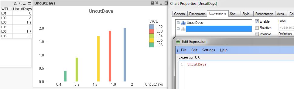
Bars still not aligned with X-axis labels. Any more ideas? Thanks
- Mark as New
- Bookmark
- Subscribe
- Mute
- Subscribe to RSS Feed
- Permalink
- Report Inappropriate Content
Thanks you got me on the right track, with some more trial and error I figured it out. I had the 2 chart dimensions both in the Dimensions and in the Expressions.
When I placed the X-axis only field (WCL) in the Dimensions and the Y-axis only field (UnCutDays) in the Expression, I get a plot that works as expected.
Thanks for your assistance. Issue now resolved.