Unlock a world of possibilities! Login now and discover the exclusive benefits awaiting you.
- Qlik Community
- :
- All Forums
- :
- QlikView App Dev
- :
- Re: Average Rate of Total on Chart
- Subscribe to RSS Feed
- Mark Topic as New
- Mark Topic as Read
- Float this Topic for Current User
- Bookmark
- Subscribe
- Mute
- Printer Friendly Page
- Mark as New
- Bookmark
- Subscribe
- Mute
- Subscribe to RSS Feed
- Permalink
- Report Inappropriate Content
Average Rate of Total on Chart
I'm having some difficulties getting the average rate of a cost to show up on a chart. In the attached screenshot, I show the chart I have with the total amount (red line) graphed against the average daily rate (blue line - expression Sum(DailySpendRate), this value is calculated in the load script by the total amout divided by the duration of the project). I've verified that the average rate is right for the project but cannot determine why this expression doesn't give me a linear line that ends at the total project amount. I've included some list boxes on the right in the screenshot so you can see the values. The dimension the chart is calculated on is the Date. Can someone please give me some idea of how I can achieve this effect? Thank you in advance!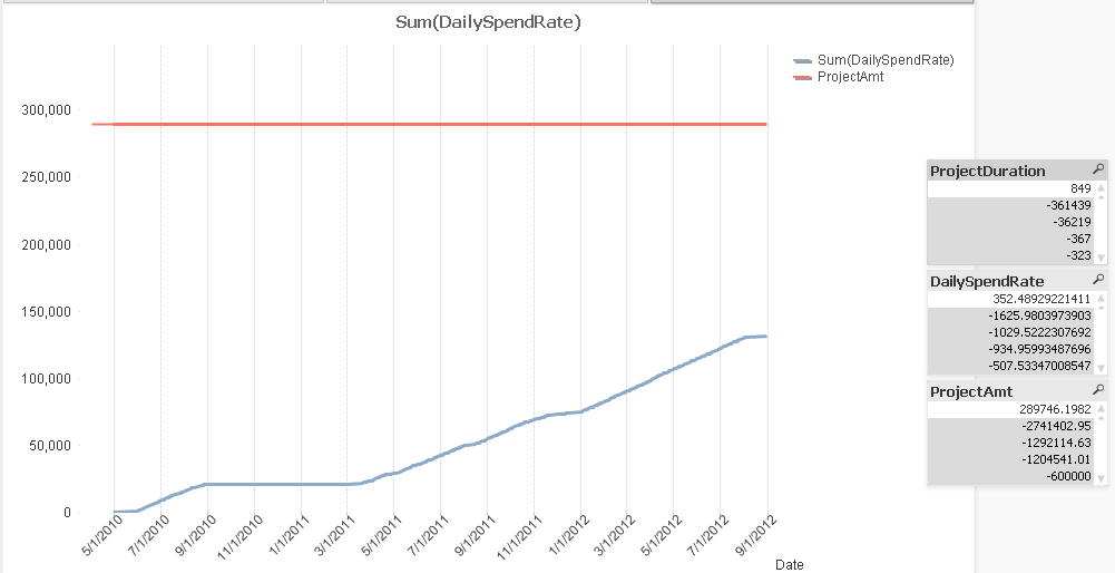
- Mark as New
- Bookmark
- Subscribe
- Mute
- Subscribe to RSS Feed
- Permalink
- Report Inappropriate Content
Could you post a sample app or your load script? I am unclear how your project duration is defined and calculated and how these fields are related to your time axis.
- Mark as New
- Bookmark
- Subscribe
- Mute
- Subscribe to RSS Feed
- Permalink
- Report Inappropriate Content
Project duration is just the project end date minus the project start date so in this scenario it's just 9/10/2012 - 5/15/2010 but calculated as a number to get the total number of days in the time frame. I can post the snippets from the load script if there are still questions on this.
- Mark as New
- Bookmark
- Subscribe
- Mute
- Subscribe to RSS Feed
- Permalink
- Report Inappropriate Content
And you have one record per date? It seems to me that you are using a continuous axis, but you don't have data for every single date. And you probably use a full accumulation option? If so you will only add up value for the dates you have records for (that's why I asked above how fields are linked and created).
If you could post a small sample file with mock up data, I believe it will makes things much clearer for me.
- Mark as New
- Bookmark
- Subscribe
- Mute
- Subscribe to RSS Feed
- Permalink
- Report Inappropriate Content
Ahhh ok. I did have continuous axis on - when I deselect that option I get a linear line but it still doesn't go all the way up to the total amount. Is there any way to get a linear line that goes from the project start at zerio to the total project amount (based on how far into the project I am) without having to generate line items for every date from project start to project end? My apolgies for my description of DailySpendRate earlier, it uses the number of days into the project you are - not the project end date but I don't know that that changes anything. Attached is an example that has been simplified based on the chart I showed earlier. Appreciate your help so far!!! Thank you.
- Mark as New
- Bookmark
- Subscribe
- Mute
- Subscribe to RSS Feed
- Permalink
- Report Inappropriate Content
Try this as expression for a reference line :
=if(Date = min(total Date),
0,
if(Date=max(total Date),only(total ProjectPARAmt))
)
See also attached.
- Mark as New
- Bookmark
- Subscribe
- Mute
- Subscribe to RSS Feed
- Permalink
- Report Inappropriate Content
Swuehl, thank you for all your help with this! I was able to achieve the intended result using the expression: PARDailySpendRate*(Date-BCStartDate) on a continuous x-axis. Thanks for getting me going in the right direction with your reference line suggestion.