Unlock a world of possibilities! Login now and discover the exclusive benefits awaiting you.
- Qlik Community
- :
- All Forums
- :
- QlikView App Dev
- :
- Bar Chart difference between Values in Dimension
- Subscribe to RSS Feed
- Mark Topic as New
- Mark Topic as Read
- Float this Topic for Current User
- Bookmark
- Subscribe
- Mute
- Printer Friendly Page
- Mark as New
- Bookmark
- Subscribe
- Mute
- Subscribe to RSS Feed
- Permalink
- Report Inappropriate Content
Bar Chart difference between Values in Dimension
Hey,
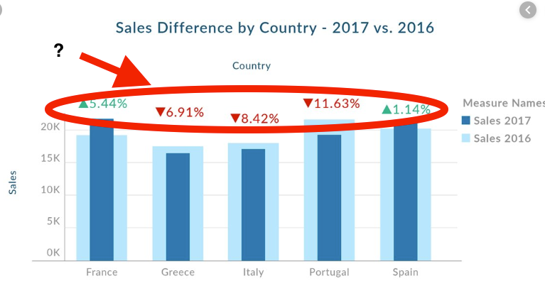
i found an Image of a Tableau Bar Chart with a pretty helpful feature.
Has anyone an idea how two build the %-move of the values?
I tried Text on Axis, but this ends up in overlapping my dimension.
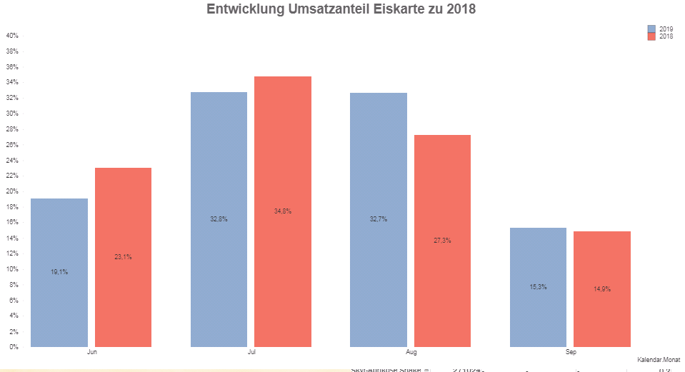
This is my actual chart so far
Accepted Solutions
- Mark as New
- Bookmark
- Subscribe
- Mute
- Subscribe to RSS Feed
- Permalink
- Report Inappropriate Content
Hello Dominikkeller,
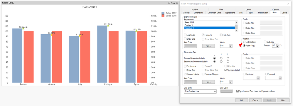
Here is how you can plot symbols (positive / negative):
1. You need to use the Combo Chart.
2. You need to create 4 measures as follows:
Sales 2016, Sales 2017 , Positive %, Negative %
3. Sales 2016 and Sales 2016 -> Set them as bars from the Chart Properties -> Expressions -> Display Options segment
4. Positive % and Negative % -> Set them as Symbol >> But those use different symbol types (triangle up and triangle down) , so you need to write the expression like this:
Positive % = if([Sales 2017]>[Sales 2016],[Sales 2017]/[Sales 2016], null())
Negative % = if([Sales 2017]<=[Sales 2016],[Sales 2017]/[Sales 2016], null())
5. Uncheck the checkbox for Expressions as Legend for the % measures
6. Chart Properties -> Presentation tab -> Increase size to 8pt
7. Chart Properties -> Axes -> Expressions Postivie and Negative % should be set to Position Right (Top)
Result:

Hope that helps!
S. T.
- Mark as New
- Bookmark
- Subscribe
- Mute
- Subscribe to RSS Feed
- Permalink
- Report Inappropriate Content
Hello Dominikkeller,
Here is how you can plot symbols (positive / negative):
1. You need to use the Combo Chart.
2. You need to create 4 measures as follows:
Sales 2016, Sales 2017 , Positive %, Negative %
3. Sales 2016 and Sales 2016 -> Set them as bars from the Chart Properties -> Expressions -> Display Options segment
4. Positive % and Negative % -> Set them as Symbol >> But those use different symbol types (triangle up and triangle down) , so you need to write the expression like this:
Positive % = if([Sales 2017]>[Sales 2016],[Sales 2017]/[Sales 2016], null())
Negative % = if([Sales 2017]<=[Sales 2016],[Sales 2017]/[Sales 2016], null())
5. Uncheck the checkbox for Expressions as Legend for the % measures
6. Chart Properties -> Presentation tab -> Increase size to 8pt
7. Chart Properties -> Axes -> Expressions Postivie and Negative % should be set to Position Right (Top)
Result:

Hope that helps!
S. T.
- Mark as New
- Bookmark
- Subscribe
- Mute
- Subscribe to RSS Feed
- Permalink
- Report Inappropriate Content
Yeah, perfect! This is pretty close perfect.
Now i have to play with the split axes to make it readable.
Thank you!

