Unlock a world of possibilities! Login now and discover the exclusive benefits awaiting you.
- Qlik Community
- :
- All Forums
- :
- QlikView App Dev
- :
- Bar graph cuts first and last bar on x-axis in hal...
- Subscribe to RSS Feed
- Mark Topic as New
- Mark Topic as Read
- Float this Topic for Current User
- Bookmark
- Subscribe
- Mute
- Printer Friendly Page
- Mark as New
- Bookmark
- Subscribe
- Mute
- Subscribe to RSS Feed
- Permalink
- Report Inappropriate Content
Bar graph cuts first and last bar on x-axis in half (horizontally)
Hello community,
I am trying to build some (in my mind) relatively simple visualizations:
I have a bunch of data columns with values ranging from 1 to 5 and want to display them in individual bar charts concerning the count of each value. I also want to display the data points for which there exists no values. (e.g. the column "A1" has only "2"s and "3"s as data, I still want to display 1,4,5 on the axis.
I tried to select "continuous" on the X-Axis (dimension) with the scala min =1, max= 5, interval = 1.
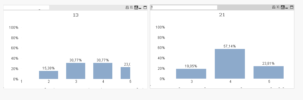
However, once I select continuous, the last bar of the chart is cut in half... Below you can see two individual charts:
1) the one on the left is continuous, but cuts the last bar in half (sizing with strg+shift doesnt help). The same thing happens with the first bar.
2) the one on the right is not continuous, displays the full bars, but does not display the values 1 & 2 as there is no data.
How can I either:
1) fully visualize the bars on the left graph?
2) display the remaining "empty" values on the right graph?
Best regards,
Victor
Data Example for column A1:
A1
2
2
3
4
4
2
5
- Mark as New
- Bookmark
- Subscribe
- Mute
- Subscribe to RSS Feed
- Permalink
- Report Inappropriate Content
Press Ctrl-Shift inside the Chart and you will see red borders. Then drag and increase or decrease the borders.
hope this helps
- Mark as New
- Bookmark
- Subscribe
- Mute
- Subscribe to RSS Feed
- Permalink
- Report Inappropriate Content
as mentioned above: "(sizing with strg+shift doesnt help)". The cut off point (in the middle of bar) is just sized along with it.
- Mark as New
- Bookmark
- Subscribe
- Mute
- Subscribe to RSS Feed
- Permalink
- Report Inappropriate Content
sorry, Ididnt read that.
can u upload a sample maybe with scrambled data?
- Mark as New
- Bookmark
- Subscribe
- Mute
- Subscribe to RSS Feed
- Permalink
- Report Inappropriate Content
Hello!
If you've missed some bars you can add them manually with Valuelist() function. PFA