Unlock a world of possibilities! Login now and discover the exclusive benefits awaiting you.
- Qlik Community
- :
- All Forums
- :
- QlikView App Dev
- :
- Bar graph is NOT using all its allocated space, an...
- Subscribe to RSS Feed
- Mark Topic as New
- Mark Topic as Read
- Float this Topic for Current User
- Bookmark
- Subscribe
- Mute
- Printer Friendly Page
- Mark as New
- Bookmark
- Subscribe
- Mute
- Subscribe to RSS Feed
- Permalink
- Report Inappropriate Content
Bar graph is NOT using all its allocated space, anyone now why?
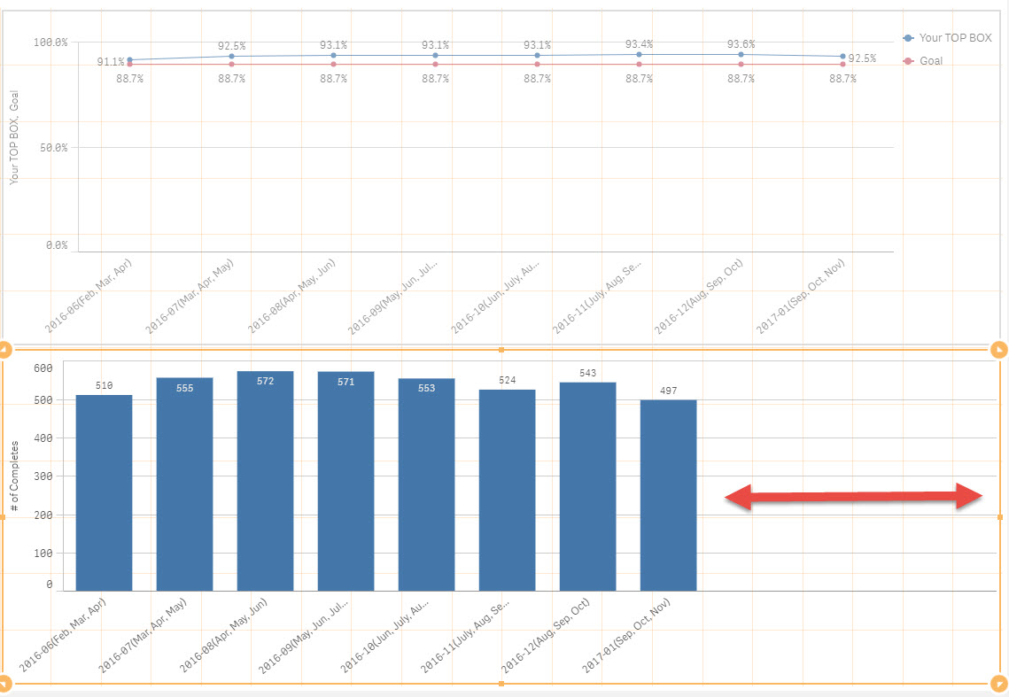
Anyone have found that bar graph uses only like 3/4 of the allocated layout area - no matter how large or small you make the area? I cannot figure out why when if you use the line graph, it uses 100% of the same allocated area. See red arrow in screen shot below.
Again, if I change the exact data to line graph, it WILL fill up the container completely. Strange indeed! Thanks if anyone has any ideas or pointers.
- Mark as New
- Bookmark
- Subscribe
- Mute
- Subscribe to RSS Feed
- Permalink
- Report Inappropriate Content
I think it's the Responsive Design feature that's responsible for this. If the bars are a certain width then they won't be made bigger and spread over the x-axis when you give the chart more space on the canvas.
talk is cheap, supply exceeds demand
- Mark as New
- Bookmark
- Subscribe
- Mute
- Subscribe to RSS Feed
- Permalink
- Report Inappropriate Content
Any solution though?
Normally, I'd think bars would stay that size while white space between just increases. That would seem logical first step in building such a responsive design.
Thanks for thinking about it and letting me know.