Unlock a world of possibilities! Login now and discover the exclusive benefits awaiting you.
- Qlik Community
- :
- All Forums
- :
- QlikView App Dev
- :
- Bug in line chart?
- Subscribe to RSS Feed
- Mark Topic as New
- Mark Topic as Read
- Float this Topic for Current User
- Bookmark
- Subscribe
- Mute
- Printer Friendly Page
- Mark as New
- Bookmark
- Subscribe
- Mute
- Subscribe to RSS Feed
- Permalink
- Report Inappropriate Content
Bug in line chart?
I noticed a strange behavior in line charts when expression is "empty".
Here is a basic example.
I load this :
| Date | Type | Value |
| 1 | Blue | 1 |
| 2 | Blue | 2 |
| 3 | Blue | 3 |
| 4 | Blue | 2 |
| 5 | Blue | 5 |
| 6 | Blue | 3 |
| 1 | Red | 2 |
| 2 | Red | 5 |
| 3 | Red | 3 |
| 4 | Red | 1 |
Notice that for some "dates" Type "Red" is missing.
The basic line chart (displaying Value) works :
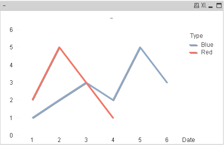
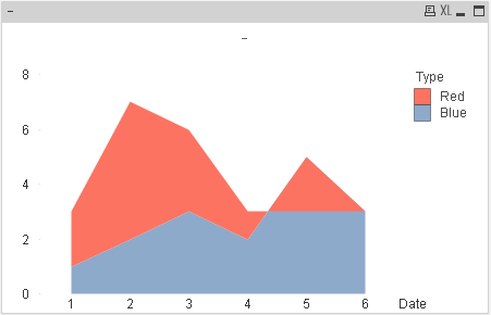
But if I change its style, bug with the colors!
At the date "5" I should have just the "Blue" area at 5 and no "Red" area
At the date "6" I should have just the "Blue" area at 3 and no "Red" area
Question is : Am I doing something wrong or is it a real bug?
- Mark as New
- Bookmark
- Subscribe
- Mute
- Subscribe to RSS Feed
- Permalink
- Report Inappropriate Content
No it is not a bug see the data for Red it is only for 1,2,3,4 Date
| 1 | Red | 2 |
| 2 | Red | 5 |
| 3 | Red | 3 |
| 4 | Red | 1 |
Same as for Blue it is for 1,2,3,4,5,6 Date that s why when you draw a line chart it shows only for 4 dates for Red. For same chart convert this into Bar Chart then you see the difference.
Regards
- Mark as New
- Bookmark
- Subscribe
- Mute
- Subscribe to RSS Feed
- Permalink
- Report Inappropriate Content
Seems like a bug to me. The behaviour is different when you add dimension values for Red for those dates.
- Mark as New
- Bookmark
- Subscribe
- Mute
- Subscribe to RSS Feed
- Permalink
- Report Inappropriate Content
I don't get your answer.
As you noticed, Red has no value for dates 5 and 6 so why is there a red area for dates 5 and 6?
(And I don't want another type of chart I really want this style of line chart).
If I put 0 values on Red for dates "5" and "6" the second style line chart is still wrong.
| Date | Type | Value |
| 1 | Blue | 1 |
| 2 | Blue | 2 |
| 3 | Blue | 3 |
| 4 | Blue | 2 |
| 5 | Blue | 5 |
| 6 | Blue | 3 |
| 1 | Red | 2 |
| 2 | Red | 5 |
| 3 | Red | 3 |
| 4 | Red | 1 |
| 5 | Red | 0 |
| 6 | Red | 0 |
I have to do this to bet the real thing but it seems awfully far fetched
| e | Type | Value |
| 1 | Blue | 1 |
| 2 | Blue | 2 |
| 3 | Blue | 3 |
| 4 | Blue | 2 |
| 5 | Blue | 5 |
| 6 | Blue | 3 |
| 1 | Red | 2 |
| 2 | Red | 5 |
| 3 | Red | 3 |
| 4 | Red | 1 |
| 5 | Red | 0.00001 |
| 6 | Red | 0.00001 |
- Mark as New
- Bookmark
- Subscribe
- Mute
- Subscribe to RSS Feed
- Permalink
- Report Inappropriate Content
Looks like others have experienced this too.
Line chart (stacked area's as Style) - empty (no-data) area is filled up
- Mark as New
- Bookmark
- Subscribe
- Mute
- Subscribe to RSS Feed
- Permalink
- Report Inappropriate Content
I will agree with that, you should open a case with QlikView Support:
- Mark as New
- Bookmark
- Subscribe
- Mute
- Subscribe to RSS Feed
- Permalink
- Report Inappropriate Content
Yes you are right it looks different for the Red values i notice this in another chart thanks for understanding.
- Mark as New
- Bookmark
- Subscribe
- Mute
- Subscribe to RSS Feed
- Permalink
- Report Inappropriate Content
Reported as a bug and accepted in this thread