Unlock a world of possibilities! Login now and discover the exclusive benefits awaiting you.
- Qlik Community
- :
- All Forums
- :
- QlikView App Dev
- :
- Chart Percents
- Subscribe to RSS Feed
- Mark Topic as New
- Mark Topic as Read
- Float this Topic for Current User
- Bookmark
- Subscribe
- Mute
- Printer Friendly Page
- Mark as New
- Bookmark
- Subscribe
- Mute
- Subscribe to RSS Feed
- Permalink
- Report Inappropriate Content
Chart Percents
Hello,
I'm trying to make a chart that work like this:
Let's say I have 3 suppliers that supply the products of any category.
I'm making a bar chart where the bars display the percents of product of each category, so far, no problem with this.
In my filters, I have the supplier option, my suppliers have a percent of volume of product (not considering the category).
| Supplier | Percent of Product |
|---|---|
| A | 50% |
| B | 10% |
| C | 20% |
| D | 20% |
With this information, if the users selects a Supplier in the filter option (Supplier A), the chart shouldn't take all the whole product volume as a 100% (which is the most logical process), it should use the 50%, and the sum of the percent of each category should give me the result of 50%.
Any ideas of how to make it work like this?
Thanks
Accepted Solutions
- Mark as New
- Bookmark
- Subscribe
- Mute
- Subscribe to RSS Feed
- Permalink
- Report Inappropriate Content
Surely you can work with properties of the chart, I should prefer to add as many colums as suppliers where in each column i compute the product of the original value multiplied by 50%, 10% and so on in order to use new columns to make graph
- Mark as New
- Bookmark
- Subscribe
- Mute
- Subscribe to RSS Feed
- Permalink
- Report Inappropriate Content
What is your expression for the chart above?
- Mark as New
- Bookmark
- Subscribe
- Mute
- Subscribe to RSS Feed
- Permalink
- Report Inappropriate Content
Surely you can work with properties of the chart, I should prefer to add as many colums as suppliers where in each column i compute the product of the original value multiplied by 50%, 10% and so on in order to use new columns to make graph
- Mark as New
- Bookmark
- Subscribe
- Mute
- Subscribe to RSS Feed
- Permalink
- Report Inappropriate Content
I'm using a sum(amount)/sum(total amount)
- Mark as New
- Bookmark
- Subscribe
- Mute
- Subscribe to RSS Feed
- Permalink
- Report Inappropriate Content
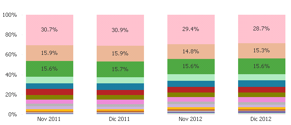
See either of these two graphs help. Not sure I am entirely clear on what you are looking for.
- Mark as New
- Bookmark
- Subscribe
- Mute
- Subscribe to RSS Feed
- Permalink
- Report Inappropriate Content
that's, the type of chart I'm looking for, but instead the units on the y axis, i need the percent of the selected supplier.
- Mark as New
- Bookmark
- Subscribe
- Mute
- Subscribe to RSS Feed
- Permalink
- Report Inappropriate Content
Something like this?
- Mark as New
- Bookmark
- Subscribe
- Mute
- Subscribe to RSS Feed
- Permalink
- Report Inappropriate Content
Mmm no, let me see if I can explain it better.
The chart using the product category will show me the data based on a 100%
Category | Percent |
|---|---|
| A | 40% |
| B | 25% |
| C | 35% |
We get the 100%
However, each product have their supplier and a supplier can provide products of each category.
Supplier 1 supplies the 50% of my products, in this part we're not taking in count the category of the product.
If I select Supplier 1, the chart gets this information:
| Category | Percent |
|---|---|
| A | 50% |
| B | 20% |
| C | 30% |
But the way it need to be show is like this:
So, if i select the Supplier 1, the chart should show me the next information
| Category | Percent |
|---|---|
| A | 25% |
| B | 10% |
| C | 15% |
This gives me the 50% of the Supplier 1, instead of taking it like 'a whole 100%'
- Mark as New
- Bookmark
- Subscribe
- Mute
- Subscribe to RSS Feed
- Permalink
- Report Inappropriate Content
For anyone who might need something like this, it worked the advice of multiply the result for the percent of the supplier, it ended looking like this:
(sum(Amount)/sum(TOTAL <Year_Month> Amount)) * $(vSupplierPercent)
Where vSupplierPercent is for getting the decimal part of the supplier:
sum(Amount)/sum({<Supplier=>}Amount)