Unlock a world of possibilities! Login now and discover the exclusive benefits awaiting you.
- Qlik Community
- :
- All Forums
- :
- QlikView App Dev
- :
- Re: Coloured dots in a table_chart
- Subscribe to RSS Feed
- Mark Topic as New
- Mark Topic as Read
- Float this Topic for Current User
- Bookmark
- Subscribe
- Mute
- Printer Friendly Page
- Mark as New
- Bookmark
- Subscribe
- Mute
- Subscribe to RSS Feed
- Permalink
- Report Inappropriate Content
Coloured dots in a table_chart
Hi,
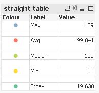
I have a straight_table that has no Dimension, but five formulas, each one calculated differently, below each other.
To make more intuitive and obvious the association with the stacked elements of a barchart, I want to introduce some coloured dots in front of the formula_Labels.
That would be quite easy, but the Thing is, the entire table is inside a Container_box - so I cannot just introduce some coloured textboxes ...
Does anyone know a way how to do this?
I was thinking of using "Wingdings" to create a blob to put in front of every Label - but then I'd have to find a way to make the font of that different from the rest of the text - the Label of a formula in "Wingdings" would hardly make it more legible 😉
Just now I have another idea: I could make yet another Container_box with five elements in a vertical row - five coloured text_boxes and maybe one White one inbetween, that would be nine - that's going to be a fuzz - and put that into the larger Container_box - even more, I already have a Container inside the large Container, so that would include one more Container ...
Does anyone have any simpler idea?
Thanks a lot!
Best regards,
DataNibbler
Accepted Solutions
- Mark as New
- Bookmark
- Subscribe
- Mute
- Subscribe to RSS Feed
- Permalink
- Report Inappropriate Content
Hello DataNibbler,
I'm glad it worked for you.
Here is one example of the intermittent blank row approach you described:
hope this helps
Marco
- Mark as New
- Bookmark
- Subscribe
- Mute
- Subscribe to RSS Feed
- Permalink
- Report Inappropriate Content
Hi,
one solution might be;
hope this helps
regards
Marco
- Mark as New
- Bookmark
- Subscribe
- Mute
- Subscribe to RSS Feed
- Permalink
- Report Inappropriate Content
Hello Marco,
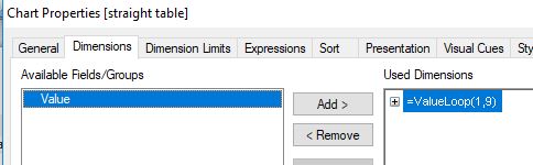
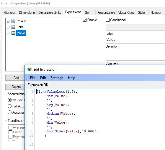
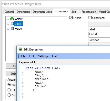
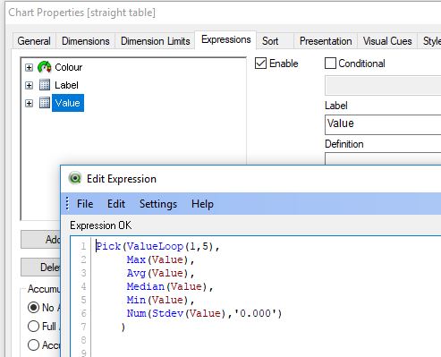
that Looks very good. I'll try it out.For that I Need a Dimension - I don't have one as yet in that particular table, but I am already experimenting with different possibilities and I have tried that out, I can just about do that.
The only Thing that's not clear to me here: What does that >> ValueLoop << do? Would not a simple formula >> 1 << do?
Best regards,
DataNibbler
- Mark as New
- Bookmark
- Subscribe
- Mute
- Subscribe to RSS Feed
- Permalink
- Report Inappropriate Content
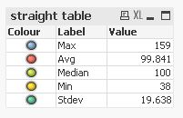
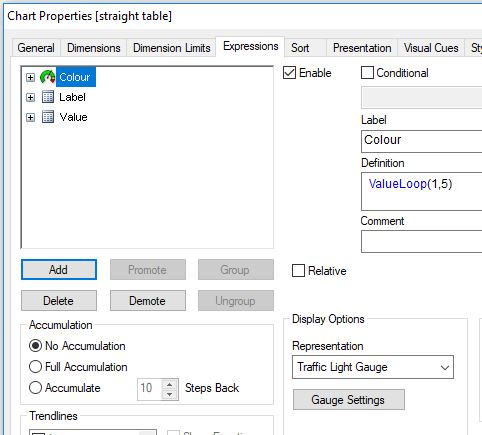
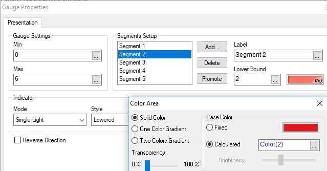
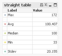
Ah, I got it - that assigns a different value to each of the five "Dimension_points" and a corresponding colour for the traffic_light_gauge.
Just one more question - I'll look at your qvw, maybe I can find out - how did you hide the necessary Dimension?
P.S.: As a first shot, the answer to that is Kind of obvious - it's easy to do in a straight table. I currently have a Pivot_table, I'll see if I can do the same Thing using a straight_table - Looks like it, seemingly you have done it, so ...
- Mark as New
- Bookmark
- Subscribe
- Mute
- Subscribe to RSS Feed
- Permalink
- Report Inappropriate Content
Hi,
it took me a while to rebuild this, but now I've got it - only one Piece left:
The way it once was - before all this - there was some space inbetween the formulas - probably because there were five formulas, but no Dimension. I'd like to have this effect again to make it somewhat more legible ... I guess I have to Change it to >> ValueLoop(1, 9) << (five "dimension_points" with four spaces inbetween) and adapt all the formulas correspondingly?
- Mark as New
- Bookmark
- Subscribe
- Mute
- Subscribe to RSS Feed
- Permalink
- Report Inappropriate Content
Hello DataNibbler,
I'm glad it worked for you.
Here is one example of the intermittent blank row approach you described:
hope this helps
Marco
- Mark as New
- Bookmark
- Subscribe
- Mute
- Subscribe to RSS Feed
- Permalink
- Report Inappropriate Content
Thanks a lot!
That with the intermittent blank rows didn't work - not like that, I tried - and somehow I got that effect in another way, don't ask me exactly how I did it - that might prove a bit of a Problem going Forward ... Anyway, it works!
Best regards,
DataNibbler
- Mark as New
- Bookmark
- Subscribe
- Mute
- Subscribe to RSS Feed
- Permalink
- Report Inappropriate Content
HI Marco,
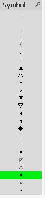
I know this has been a while. The traffic_light_Buttons work fine in that context. My Boss, however, said I might want to try making them a bit smaller and more discrete - just Little hints as to the colour that is used in another Chart.
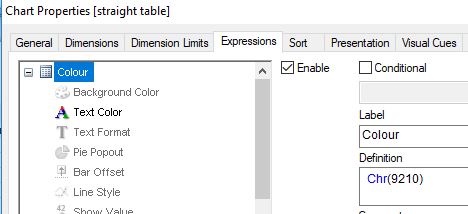
I have found a possible way: In >> Wingdings3 << I can Display a Little triangle (letter 'u') and I can colour that, depending on the value of that ValueLoop() function.
<=> The only obstacle to this is, I cannot set the font for the entire table to Wingdings because there are Labels that should of course remain legible => so I would have to set the font in the formula_properties.
I'm sure that info is somewhere to be found, I'll have a look. Could you maybe Point me at something?
Thanks a lot!
Best regards,
DataNibbler
- Mark as New
- Bookmark
- Subscribe
- Mute
- Subscribe to RSS Feed
- Permalink
- Report Inappropriate Content
Okay.
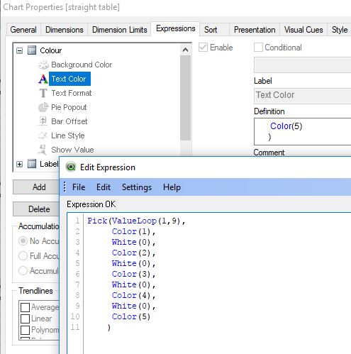
I figured out I can just Play around with different ASCII characters using the chr() function and when I find one that is solid (just now I have stars, using 9733), I can control ist colour depending on the ValueLoop().
That will be that I guess.
Thanks a lot!
Best regards,
DataNibbler
- Mark as New
- Bookmark
- Subscribe
- Mute
- Subscribe to RSS Feed
- Permalink
- Report Inappropriate Content
Hi,
I'd also go for another symbol instead of a different font.
One example that lets you switch between different characters to test its acceptance might be:
Maybe also helpful:
hope this helps
regards
Marco