Unlock a world of possibilities! Login now and discover the exclusive benefits awaiting you.
- Qlik Community
- :
- All Forums
- :
- QlikView App Dev
- :
- Combochart
Options
- Subscribe to RSS Feed
- Mark Topic as New
- Mark Topic as Read
- Float this Topic for Current User
- Bookmark
- Subscribe
- Mute
- Printer Friendly Page
Turn on suggestions
Auto-suggest helps you quickly narrow down your search results by suggesting possible matches as you type.
Showing results for
Anonymous
Not applicable
2017-07-06
02:52 AM
- Mark as New
- Bookmark
- Subscribe
- Mute
- Subscribe to RSS Feed
- Permalink
- Report Inappropriate Content
Combochart
Hi
I have the dimension 'Datentyp' with 3 different values. I want to visualize fact-data for these 3 like this (Excel):
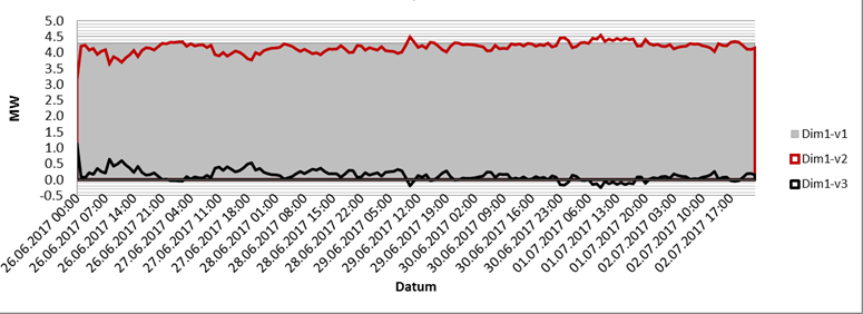
Now my question is, I didnt manage to do the same in QV. Either its all lines, or its all bars. How to set the chart type for the different values of the same dimension? And how to set a custom sort order in displaying the values?
Thanks for your help!
Christoph
283 Views
0 Replies