Unlock a world of possibilities! Login now and discover the exclusive benefits awaiting you.
- Qlik Community
- :
- All Forums
- :
- QlikView App Dev
- :
- Creating a Chart
- Subscribe to RSS Feed
- Mark Topic as New
- Mark Topic as Read
- Float this Topic for Current User
- Bookmark
- Subscribe
- Mute
- Printer Friendly Page
- Mark as New
- Bookmark
- Subscribe
- Mute
- Subscribe to RSS Feed
- Permalink
- Report Inappropriate Content
Creating a Chart
Lately I having a problem trying to remember how to do this. I know it is simple but just need some guidance.
I have a data set similar to this.
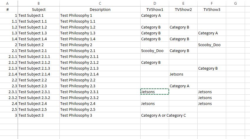
What I want to do is create a chart out of columns D, E and F
I need to have on the horizontal access how many times the item occurs such if you select all rows you will see Scooby_Doo appears twice but once under column D and once under Column F.
So horizontal access who have the major labels of TVShow1, TVShow2, and TVShow3.
Sub axis would be one for each of the pieces of data in the column and the data would be the count of how many times appears.
For example the first set of bars would be for TVShow1. There would be five bars with values Category A (2), Category B (4), Category C (1), Scooby_Doo(1) and Jetsons(1). Yes we have to parse the or statement.
Any ideas?
~Norm
- Mark as New
- Bookmark
- Subscribe
- Mute
- Subscribe to RSS Feed
- Permalink
- Report Inappropriate Content
Hi,
You can try to use Cross Load of your data. Like
CrossTable(ShowName, Category, 3)
LOAD #,
     Subject,
     Description,
     TVShow1,
     TVShow2,
     TVShow3
FROM
Source;
Then, Create the Pivot chart, Put your Dimension.
The expression should be Count(Category)
Drag your ShowName and Catagory Field to top of Pivot.
I believe, this is what you need. Let us know, if this not suits