Unlock a world of possibilities! Login now and discover the exclusive benefits awaiting you.
- Qlik Community
- :
- All Forums
- :
- QlikView App Dev
- :
- Description inside a bar in the bar chart
- Subscribe to RSS Feed
- Mark Topic as New
- Mark Topic as Read
- Float this Topic for Current User
- Bookmark
- Subscribe
- Mute
- Printer Friendly Page
- Mark as New
- Bookmark
- Subscribe
- Mute
- Subscribe to RSS Feed
- Permalink
- Report Inappropriate Content
Description inside a bar in the bar chart
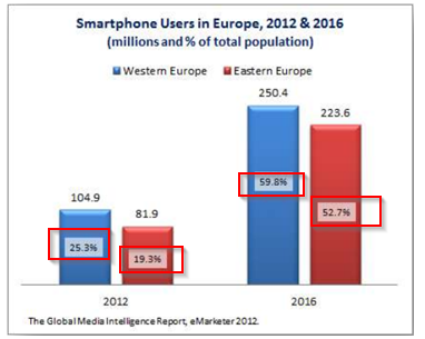
How can I generate this graph in QlikView?
More specifically, how can I generate the percantage of the entire population (red rectangle in the image)?
Thanks!
D.
- Mark as New
- Bookmark
- Subscribe
- Mute
- Subscribe to RSS Feed
- Permalink
- Report Inappropriate Content
Add another expression to calculate your percentage then ask QlikView to show the result as "values on data points" and uncheck "bar" ("expression" tab in your chart properties).
On "presentation" tab, check "plot values inside segments". 
- Mark as New
- Bookmark
- Subscribe
- Mute
- Subscribe to RSS Feed
- Permalink
- Report Inappropriate Content
add same expression another time and make sure it as relative and also check the box it is invisible ....
for help please follow below link
http://community.qlik.com/docs/DOC-3939
regards
premhas
- Mark as New
- Bookmark
- Subscribe
- Mute
- Subscribe to RSS Feed
- Permalink
- Report Inappropriate Content
Thank you for your replies.
I am having trouble with getting the same output.
In addition, here is how my table looks like:
Tbl:
LOAD * INLINE [
Year, Region, Amt, Pct
2012, WE, 104, 25.3
2012, EE, 81, 19.3
2016, WE, 250, 59.8
2016, EE, 223, 52.7
];
I have noticed in your document that second expression is as "Line" marked. In my case that option is not available (I can´t click on it because it is faded.). How can I make it a line expression?
One more question - how can I add "%" sign to expression?
- Mark as New
- Bookmark
- Subscribe
- Mute
- Subscribe to RSS Feed
- Permalink
- Report Inappropriate Content
according to my knowledge it is possible in this way...
find attachment
...
regards
Premhas
- Mark as New
- Bookmark
- Subscribe
- Mute
- Subscribe to RSS Feed
- Permalink
- Report Inappropriate Content
Thanks for your reply!
Sorry, but I can't find the attachment.
Furthermore, I have found out why I could not select "Line" for the second dimension - I was using bar chart and I needed to use combo chart.
I hope your attachment answers my other questions.
- Mark as New
- Bookmark
- Subscribe
- Mute
- Subscribe to RSS Feed
- Permalink
- Report Inappropriate Content
If you were referring to the previously sent QVW, could you please generate the same chart by talking the inline table I sent?
I was having troubles generating bars with different colors.
I still have problems with setting percentage inside the middle of the bar, and adding "%" sign to the amount of percentage.
- Mark as New
- Bookmark
- Subscribe
- Mute
- Subscribe to RSS Feed
- Permalink
- Report Inappropriate Content
I would like to know also if it is possible to display every value in the stacked bar.
For example, if in bar chart I have three different values stacked on top of one another to form one bar in the bar chart, is it possible to display in the middle of every part the corresponding value? If yes, please how?
- Mark as New
- Bookmark
- Subscribe
- Mute
- Subscribe to RSS Feed
- Permalink
- Report Inappropriate Content
Using a bar chart you cannot replicate the same format you have in your image. You can place values only on top or inside the bars, however if you have more than one expression, all values will be on top or inside, you cannot choose different places for each plotted expression.
What you can do is
- Place one expresion values in the X axis
- Do not plot the second expression and place its values on top or inside the bars, Or show the values only as a popup.
Review the attached.
Also, if you create a stacked chart, you cannot force all values to be shown since this depends on whether each part is big enough so that the text is shown. I haven't found a workaround to solve this.