Unlock a world of possibilities! Login now and discover the exclusive benefits awaiting you.
- Qlik Community
- :
- All Forums
- :
- QlikView App Dev
- :
- Formatting Labels on Datapoints in a Geo Scatter C...
- Subscribe to RSS Feed
- Mark Topic as New
- Mark Topic as Read
- Float this Topic for Current User
- Bookmark
- Subscribe
- Mute
- Printer Friendly Page
- Mark as New
- Bookmark
- Subscribe
- Mute
- Subscribe to RSS Feed
- Permalink
- Report Inappropriate Content
Formatting Labels on Datapoints in a Geo Scatter Chart
Hi folks,
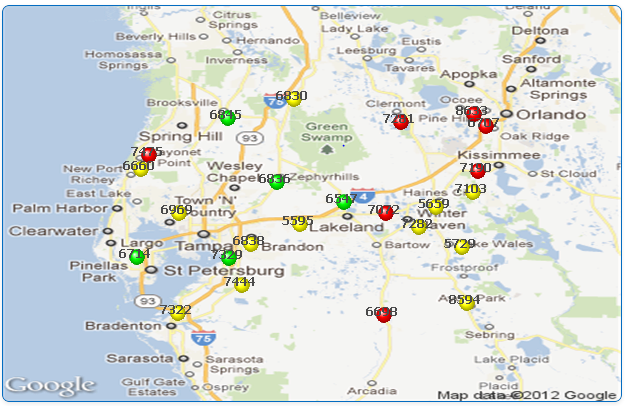
I need some help in formatting the lables on datapoints here.
You can see that my map has various numbers of different color dots. Can you suggest me how I can make this look better?
I could bold the text but not change its color. Thanks in advance!
- Mark as New
- Bookmark
- Subscribe
- Mute
- Subscribe to RSS Feed
- Permalink
- Report Inappropriate Content
I would make the background map more transparent and make the dots 2-D.
Karl
- Mark as New
- Bookmark
- Subscribe
- Mute
- Subscribe to RSS Feed
- Permalink
- Report Inappropriate Content
Thanks Karl, it helped somewhat. Marked as helpful.
Any more suggestion ppl?
- Mark as New
- Bookmark
- Subscribe
- Mute
- Subscribe to RSS Feed
- Permalink
- Report Inappropriate Content
How are you generating the data point labels? I don't understand why the label overlaps the point.
Karl
- Mark as New
- Bookmark
- Subscribe
- Mute
- Subscribe to RSS Feed
- Permalink
- Report Inappropriate Content
The variable bubble size looks better than numbers, IMHO.
- Mark as New
- Bookmark
- Subscribe
- Mute
- Subscribe to RSS Feed
- Permalink
- Report Inappropriate Content
May I ask you how did you manage to get the text bold? (I'm using QV10 by the way)
I have played around with text format and text color of my dimension, but without any luck.
Thank you