Unlock a world of possibilities! Login now and discover the exclusive benefits awaiting you.
- Qlik Community
- :
- All Forums
- :
- QlikView App Dev
- :
- Gauge Chart - 2nd Segment Fill Help
- Subscribe to RSS Feed
- Mark Topic as New
- Mark Topic as Read
- Float this Topic for Current User
- Bookmark
- Subscribe
- Mute
- Printer Friendly Page
- Mark as New
- Bookmark
- Subscribe
- Mute
- Subscribe to RSS Feed
- Permalink
- Report Inappropriate Content
Gauge Chart - 2nd Segment Fill Help
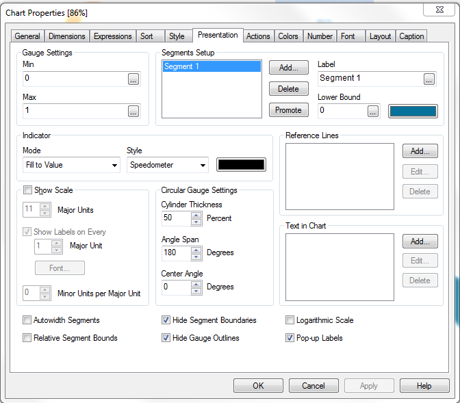
Hi, I have a simple Gauge chart that is showing 86% correctly.
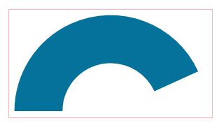
What would like to do is add a second segment to show the 14% remaining as a lighter shade as shown on this example :

Any help appreciated!
Tom
Accepted Solutions
- Mark as New
- Bookmark
- Subscribe
- Mute
- Subscribe to RSS Feed
- Permalink
- Report Inappropriate Content
Hi Tom,
Two ways to do it
1) create the same chart to sit underneath it that always has a segment returning a total value (so the whole chart is the lighter colour) and then overlay your chart on top,
2) if your chart is based on an expression that calculates something like the percentage of X that is Y, then create a second segment that is your total X count. Put the 'lower bound' for this segment as your expression that works out X of Y and it should colour the rest of the gauge.