Unlock a world of possibilities! Login now and discover the exclusive benefits awaiting you.
- Qlik Community
- :
- All Forums
- :
- QlikView App Dev
- :
- Re: color ranges
Options
- Subscribe to RSS Feed
- Mark Topic as New
- Mark Topic as Read
- Float this Topic for Current User
- Bookmark
- Subscribe
- Mute
- Printer Friendly Page
Turn on suggestions
Auto-suggest helps you quickly narrow down your search results by suggesting possible matches as you type.
Showing results for
Not applicable
2014-06-26
01:43 PM
- Mark as New
- Bookmark
- Subscribe
- Mute
- Subscribe to RSS Feed
- Permalink
- Report Inappropriate Content
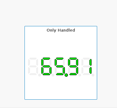
Gauge chart color ranges and displayof "%" symbol
hi
i am trying to display values as shown in the below image .
1. this is the percentage value that is been shown is there any way i could add the "%" symbol next to the value???
2. i have a similar chart just only showing the numbers(count).. is there any possible way to assign a color range??
ex: 1-100 green, 100-1000 orange and 1000 and above in red..
i want to display the values according to the color range is it possible???
would highly appreciate the help plz if some one knows how to get this done plz help me out plzz
thank you in advance 
2,312 Views
- « Previous Replies
-
- 1
- 2
- Next Replies »
10 Replies
Not applicable
2014-06-29
07:59 AM
Author
- Mark as New
- Bookmark
- Subscribe
- Mute
- Subscribe to RSS Feed
- Permalink
- Report Inappropriate Content
The correct is:
if(sum(sal)<100,LightGreen(),if(sum(sal)) >1000,LightRed(),RGB(255,140,0)))
1,268 Views
- « Previous Replies
-
- 1
- 2
- Next Replies »