Unlock a world of possibilities! Login now and discover the exclusive benefits awaiting you.
- Qlik Community
- :
- All Forums
- :
- QlikView App Dev
- :
- Re: Grouping dimension wrt their values
- Subscribe to RSS Feed
- Mark Topic as New
- Mark Topic as Read
- Float this Topic for Current User
- Bookmark
- Subscribe
- Mute
- Printer Friendly Page
- Mark as New
- Bookmark
- Subscribe
- Mute
- Subscribe to RSS Feed
- Permalink
- Report Inappropriate Content
Grouping dimension wrt their values
Hi Everyone,
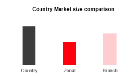
I've to create chart as shown in the below image however, these are 3 different dimensions viz., Country, Zone and Branch respectively.
How can i group the values at each dimension and show them as 3 different bars in a bar chart? Please advise ASAP.
Regards,
Zain Shaikh
- Mark as New
- Bookmark
- Subscribe
- Mute
- Subscribe to RSS Feed
- Permalink
- Report Inappropriate Content
Not sure I understand, can you post some sample data records and your expected result?
In general, you can create a bar chart without any dimensions, just create some expressions, one for each bar.
- Mark as New
- Bookmark
- Subscribe
- Mute
- Subscribe to RSS Feed
- Permalink
- Report Inappropriate Content
Hello, Zain!
If you have field which indicates what is "Country" and what is "Branch" so use it as the dimension in a bar chart.
If you don't have such field you can use three expressions with set analysis:
sum({<condition1>} val), sum({<condition2>} val), sum({<condition3>} val) and name them Country, Zonal, Branch.
Or you can create a phony dimension using ValueList() function and set expressions for each value in it
- Mark as New
- Bookmark
- Subscribe
- Mute
- Subscribe to RSS Feed
- Permalink
- Report Inappropriate Content
I think you are looking for something like this, Please refer attached.

- Mark as New
- Bookmark
- Subscribe
- Mute
- Subscribe to RSS Feed
- Permalink
- Report Inappropriate Content
You don't even need a dimension, just add three expressions, for example
Sum(TOTAL <Country> fieldname)
Sum(TOTAL <Zonal> fieldname)
Sum(TOTAL <Branch> fieldname)
If a post helps to resolve your issue, please accept it as a Solution.
- Mark as New
- Bookmark
- Subscribe
- Mute
- Subscribe to RSS Feed
- Permalink
- Report Inappropriate Content
I just got this as a mockup and don't have sample data (only image received)
On the Y axis, it's the Market size values which is then consolidated at each Country, Zone and Branch level.
The y axis is hidden in this chart. Could you please try to help me out.
Thanks,
Zain
- Mark as New
- Bookmark
- Subscribe
- Mute
- Subscribe to RSS Feed
- Permalink
- Report Inappropriate Content
This looks like the solution i required.
Could you please explain the solution in written format. The reason is i'm working on a non-licensed application currently and won't be able to open this file.
Sorry for the inconvenience. Thanks.
- Mark as New
- Bookmark
- Subscribe
- Mute
- Subscribe to RSS Feed
- Permalink
- Report Inappropriate Content
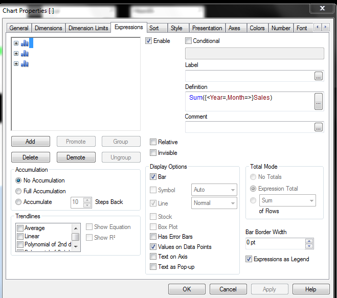
Expression :
1. Sum({<Year=,Month=>}Sales)
2. Sum({<Year=,SalesMan=>}Sales)
3. Sum({<Month=,SalesMan=>}Sales)
- Mark as New
- Bookmark
- Subscribe
- Mute
- Subscribe to RSS Feed
- Permalink
- Report Inappropriate Content
Just create three expression:
Sum({<Year=,Month=>}Sales) - > This will avoid bar to change if any selection is made for Year,Month
Sum({<Year=,SalesMan=>}Sales) - > This will avoid bar to change if any selection is made for Year,SalesMan
Sum({<Month=,SalesMan=>}Sales) - > This will avoid bar to change if any selection is made for Month,SalesMan
You will need to replace your fields which Year, Month & Sales.
Now, Just press one space in Label Box to clear the expression coming on chart as title.
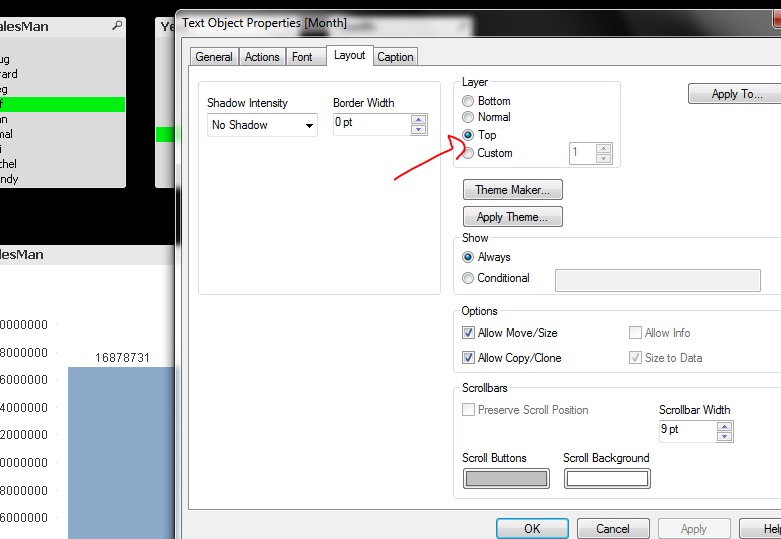
Since, we have not used any dimension you will not see labels below your bars. Now, to create those labels use text objects type your text make them transparent (Set the Transparency property to 100%). And then Place these transparent objects below their respective bars.
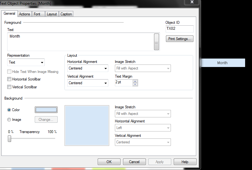
One more thing you have to set the Layer to Top for the text objects otherwise they will go below the chart and will not be visible.