Unlock a world of possibilities! Login now and discover the exclusive benefits awaiting you.
- Qlik Community
- :
- All Forums
- :
- QlikView App Dev
- :
- Heat Map
- Subscribe to RSS Feed
- Mark Topic as New
- Mark Topic as Read
- Float this Topic for Current User
- Bookmark
- Subscribe
- Mute
- Printer Friendly Page
- Mark as New
- Bookmark
- Subscribe
- Mute
- Subscribe to RSS Feed
- Permalink
- Report Inappropriate Content
Heat Map
I am in the process of creating a Heat Map in an 'Always Fully Expanded' pivot table.
The problem is when the user scrolls down the heat map, the dimensions change color to which ever color is at the top of the Spend Variance column.
example; If you use the scrollbar and scroll down to Area = East, County = AA, Level = RRRRRR and
Cost Centre = 99222. The Area colour of East turns to 'Green' even though East should be 'Red'.What i want is to show is;
Area = East (RED)
County = AA (RED)
Level = RRRRRR (RED)
Cost Centre = 99222 (GREEN)
Any ideas??? 😕
Accepted Solutions
- Mark as New
- Bookmark
- Subscribe
- Mute
- Subscribe to RSS Feed
- Permalink
- Report Inappropriate Content
You need to use TOTAL in your sums and then <Dimension> based on the level the dimension sits.
eg.On the County dimension put
=IF(SUM(TOTAL <County> [Spend Variance]) < 0, rgb(225,36,38), rgb(36,145,64))
This calculates across the whole dimension rather than just row that you have scrolled down to.
- Mark as New
- Bookmark
- Subscribe
- Mute
- Subscribe to RSS Feed
- Permalink
- Report Inappropriate Content
Brilliant.
Do you know how i would put this Set Analysis in as well;
{1<Year={'$(vYearSelected)'},Month={'$(vMonthSelected)'>}
- Mark as New
- Bookmark
- Subscribe
- Mute
- Subscribe to RSS Feed
- Permalink
- Report Inappropriate Content
Hi All,
GIS/Maps Analytics in QlikView is a very interesting topic and "Heat Maps" are one of the ways to display QlikVIew KPI indicators and to represent a density on a Geografic map (ex: population, deliveries, etc.)
QlikView customers and channel parners are interested in displaying their QlikView KPI indicators on Geographic maps but also sometimes on a Building Plan (ex: logistic warehouse, supermarket, hospital, etc).
Business Geografic has developed a mapping extension for QlikView (V9, V10, V11) namely "GeoQlik" and we have been a Technology Partner of QlikTech since 2006 starting with QlikView 8!
I hereby suggest you to have a look at our new mapping extension for QlikView 11 "SR1": GeoQlik v11.6:
http://www.geoqlik.com/en/geoqlik-for-qlikview/geoqlik-v11.html
Please find hereafter a few "Heat Maps" screenshots of GeoQlik V11.6 using WMS/TMS services to display QlikView KPIs:
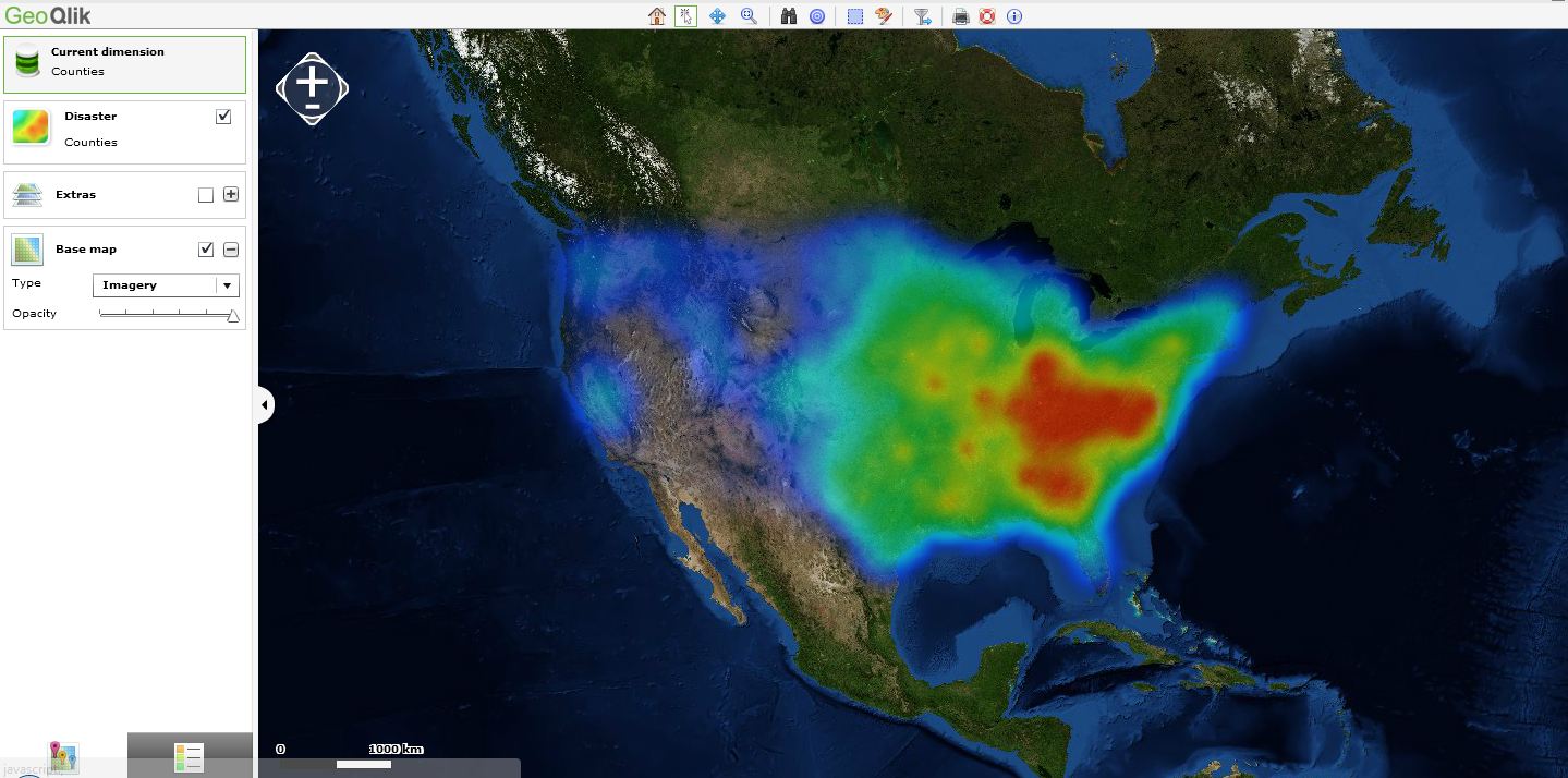
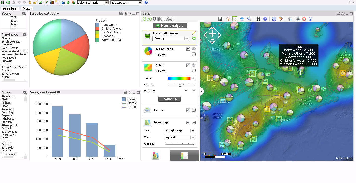
Thanks and best regards,
David
@ Business Geografic
- Mark as New
- Bookmark
- Subscribe
- Mute
- Subscribe to RSS Feed
- Permalink
- Report Inappropriate Content
Does anybody know how to add the following Set Analysis to the solution provided by B.Sarcich?
{1<Year={'$(vYearSelected)'},Month={'$(vMonthSelected)'>}
You need to use TOTAL in your sums and then <Dimension> based on the level the dimension sits.
eg.On the County dimension put
=IF(SUM(TOTAL <County> [Spend Variance])<0, rgb(225,36,38), rgb(36,145,64))
This calculates across the whole dimension rather than just row that you have scrolled down to.