Unlock a world of possibilities! Login now and discover the exclusive benefits awaiting you.
- Qlik Community
- :
- All Forums
- :
- QlikView App Dev
- :
- Help with Symbol/Line on each bar
Options
- Subscribe to RSS Feed
- Mark Topic as New
- Mark Topic as Read
- Float this Topic for Current User
- Bookmark
- Subscribe
- Mute
- Printer Friendly Page
Turn on suggestions
Auto-suggest helps you quickly narrow down your search results by suggesting possible matches as you type.
Showing results for
Not applicable
2013-02-05
04:12 PM
- Mark as New
- Bookmark
- Subscribe
- Mute
- Subscribe to RSS Feed
- Permalink
- Report Inappropriate Content
Help with Symbol/Line on each bar
Hi Qlikview professionals.
I have a table with Month as dimension and different expressions in QV. The left Y-axis is for the Volume while the Y-axis on the right is for Price $/t. I just use some random number as volume and price. I have searched the QlikCommunity but could not find anything similar.
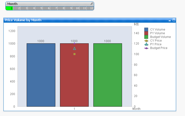
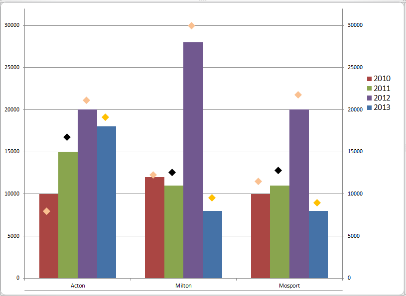
As you can see, all of the three prices (represented by symbols) are in the middle rather than on the relevant bars. The desired output is something similar as below in Excel.
Does anyone have any idea?
Thank you very much for your time and help.
Best regards.
Roger.
141 Views
0 Replies