Unlock a world of possibilities! Login now and discover the exclusive benefits awaiting you.
- Qlik Community
- :
- All Forums
- :
- QlikView App Dev
- :
- Re: Help with idea
- Subscribe to RSS Feed
- Mark Topic as New
- Mark Topic as Read
- Float this Topic for Current User
- Bookmark
- Subscribe
- Mute
- Printer Friendly Page
- Mark as New
- Bookmark
- Subscribe
- Mute
- Subscribe to RSS Feed
- Permalink
- Report Inappropriate Content
Help with idea
Hello,
I have 10 variables with score and 1 variable string.
I want to make chart like showen in picture.
I don't want to use 30 expressions.
Do you have any ideas how to do it?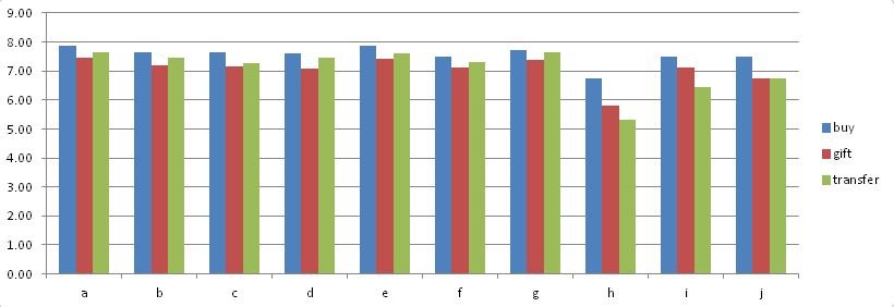
Please find my attached file.
Accepted Solutions
- Mark as New
- Bookmark
- Subscribe
- Mute
- Subscribe to RSS Feed
- Permalink
- Report Inappropriate Content
Try using a CROSSTABLE LOAD of your input data:
RESULT:
CrossTable (Dim1, Score,1) LOAD * resident Test$;
drop table Test$;
Then your chart is just a bar chart with dimensions Dim1, A and an expression like avg(Score). See also attached.
Regards,
Stefan
- Mark as New
- Bookmark
- Subscribe
- Mute
- Subscribe to RSS Feed
- Permalink
- Report Inappropriate Content
Transform your data with the crosstable function
crosstable(Key,Value,1)
LOAD A,
a,
b,
c,
d,
e,
f,
g,
h,
i,
j
FROM
C:\Users\Desktop\Test.xls
(biff, embedded labels);
You can then use Key as the first dimension and A as the second dimension and avg(Value) as expression. See attached example
talk is cheap, supply exceeds demand
- Mark as New
- Bookmark
- Subscribe
- Mute
- Subscribe to RSS Feed
- Permalink
- Report Inappropriate Content
Hi Stefan,
Thank you for your help.
I didn't work with crosstab. I have also other variables in my file. It makes crosstab with other variables.
How can I fix it?
Regards,
Vladimir
- Mark as New
- Bookmark
- Subscribe
- Mute
- Subscribe to RSS Feed
- Permalink
- Report Inappropriate Content
Hi Gysbert,
Thank you for your help.
I didn't work with crosstab. I have also other variables in my file. It makes crosstab with other variables.
How can I fix it?
Regards,
Vladimir
- Mark as New
- Bookmark
- Subscribe
- Mute
- Subscribe to RSS Feed
- Permalink
- Report Inappropriate Content
Thanks guys. Your both issues are right.
I found out how to do it.