Unlock a world of possibilities! Login now and discover the exclusive benefits awaiting you.
- Qlik Community
- :
- All Forums
- :
- QlikView App Dev
- :
- How to Combine labeled and blank cells into a sing...
- Subscribe to RSS Feed
- Mark Topic as New
- Mark Topic as Read
- Float this Topic for Current User
- Bookmark
- Subscribe
- Mute
- Printer Friendly Page
- Mark as New
- Bookmark
- Subscribe
- Mute
- Subscribe to RSS Feed
- Permalink
- Report Inappropriate Content
How to Combine labeled and blank cells into a single bar within a bar chart.
Hi,
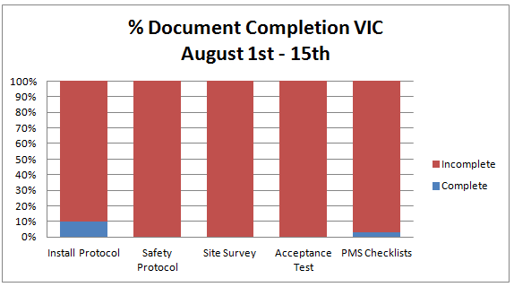
I am new to QlikView and am trying to create a bar graph that presents the % completion of work documents.
I want to display my data so that each document's percentage completion are in separate columns with the rows that have incomplete documents stacked on top of the completed to make up 100% (see below for excel mockup).
However, in QlikView, I have my associations setup so that documents that haven't been completed are blank rows and my resulting graph ends up having a dash as a column. (The below graph is only for one of the documents)
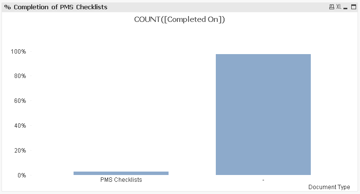
I want to be able to stack all of my blank rows on top of my "PMS Checklists" bar to replicate something similar to my mockup above.
I know this is easily possible with some back end work with the data, but i have been asked to make weekly reports, and being able to simply reload my data (from Sharepoint and Access) without any manipulation would save a lot of time.
Any help would be greatly appreciated.
- Matt
- Mark as New
- Bookmark
- Subscribe
- Mute
- Subscribe to RSS Feed
- Permalink
- Report Inappropriate Content
I'm not sure about your datamodel and if I understand the question right but I think you need two expressions like these:
First:
count({< State = {'Complete'}>} [Document Type]) /
count({< State = {'Complete', 'Incomplete'}>} [Document Type])
Second:
count({< State = {'Incomplete'}>} [Document Type]) /
count({< State = {'Complete', 'Incomplete'}>} [Document Type])
Maybe these expressions need an additional total and the chart needs settings by "show all values" and "suppress null-values".
- Marcus