Unlock a world of possibilities! Login now and discover the exclusive benefits awaiting you.
- Qlik Community
- :
- All Forums
- :
- QlikView App Dev
- :
- How to create cumulated cross tab chart with diffe...
- Subscribe to RSS Feed
- Mark Topic as New
- Mark Topic as Read
- Float this Topic for Current User
- Bookmark
- Subscribe
- Mute
- Printer Friendly Page
- Mark as New
- Bookmark
- Subscribe
- Mute
- Subscribe to RSS Feed
- Permalink
- Report Inappropriate Content
How to create cumulated cross tab chart with different colors for each year?
Hello QV Community,
First, I have to say that not a day goes by in my QV development that I am without you;-) This is one of the best developer community sites I have ever seen!
So my question:
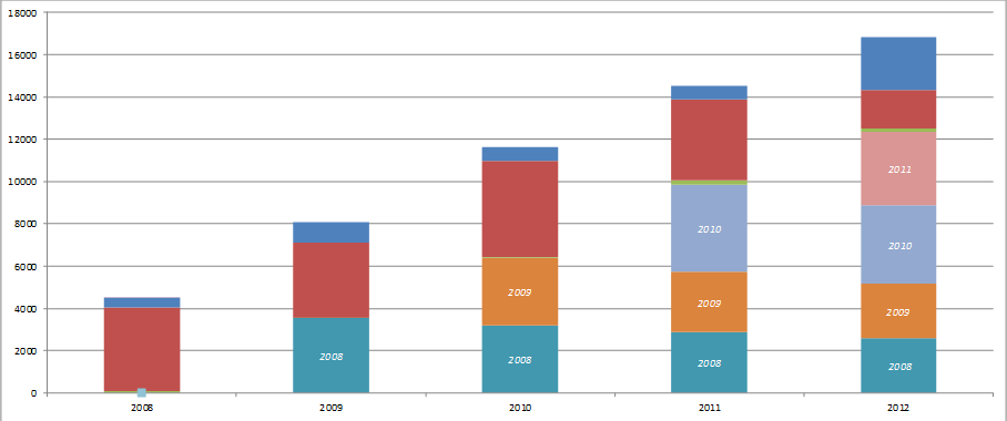
I want to create a simple chart that looks like this where each year is identified by it's color and cumulates and 10% decline in sales each year...
Currently I can use rangesum to get the accumulation, but having two problems:
1) 10% is not applied to each year, only the first,
2) I don't know how to get chart colors to work so it looks stacked for each year.
My very simple (boiled down for example) data table looks like this:
LOAD * INLINE [
Year, Amount
2005, "$5,358,219 "
2006, "$6,287,505 "
2008, "$5,284,788 "
2009, "$5,223,151 "
2010, "$2,540,630 "
2011, "$3,956,128 "
2012, "$4,177,531 "
2013, "$4,859,928 "
2014, "$389,112 "
];
Accepted Solutions
- Mark as New
- Bookmark
- Subscribe
- Mute
- Subscribe to RSS Feed
- Permalink
- Report Inappropriate Content
- Mark as New
- Bookmark
- Subscribe
- Mute
- Subscribe to RSS Feed
- Permalink
- Report Inappropriate Content
See attached example.
talk is cheap, supply exceeds demand
- Mark as New
- Bookmark
- Subscribe
- Mute
- Subscribe to RSS Feed
- Permalink
- Report Inappropriate Content
Wow! Thank you Gysbert - this is great example and very useful to apply different colors to each year!