Unlock a world of possibilities! Login now and discover the exclusive benefits awaiting you.
- Qlik Community
- :
- All Forums
- :
- QlikView App Dev
- :
- Re: How to generate a Whale Curve and Cumulative P...
- Subscribe to RSS Feed
- Mark Topic as New
- Mark Topic as Read
- Float this Topic for Current User
- Bookmark
- Subscribe
- Mute
- Printer Friendly Page
- Mark as New
- Bookmark
- Subscribe
- Mute
- Subscribe to RSS Feed
- Permalink
- Report Inappropriate Content
How to generate a Whale Curve and Cumulative Profit graph from unsorted raw sales data
Hi,
I have a set of data whereby I need to generate 2 types of graphs - a whale curve and a cumulative graph.
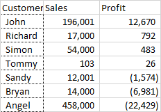
This is the raw data I have which consists of Customer , Sales and Profit. Assume data is unsorted, so this means I need to use the rank function on some expression later on...
These are the 2 graphs which is what I eventually need as an output:
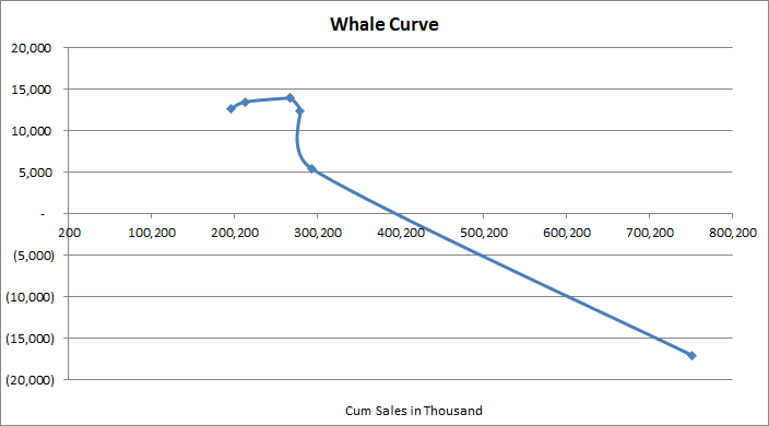
X-axis = Cumulative Sales, Y-axis = Cumulative Profit
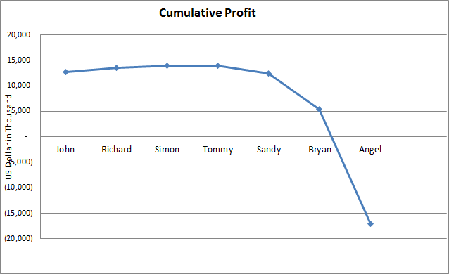
X-axis = Customers (sorted according to profitability), Y-axis = Cumulative Profit
Can someone pls share what should I be using for the Dimensions, Expressions and Sort values for each graph?
For the 1st whale curve, I checked out Barry's helpful blog (Visualizing customer profitability with a whale curve - The Qlik Fix! The Qlik Fix!) for reference but I'm not getting the graph I expected 
Dimension: aggr(num(rank(sum(Sales),4)),Customer)
Expression: rangesum(above(total ROUND(sum( Profit)),0,RowNo(TOTAL)))
Sort: which maps default to dimension (aggr(num(rank(sum(Sales),4)),Customer)), that I set as "Ascending".
In addition, how do I return a corresponding field e.g. "John", "Richard", etc... for the X-axis?
Thank you!
Accepted Solutions
- Mark as New
- Bookmark
- Subscribe
- Mute
- Subscribe to RSS Feed
- Permalink
- Report Inappropriate Content
Hi Oleg,
Thanks for getting back to me on this! And I sure wished I had a copy of ur new book 
Actually, I've managed to solve it using rangesum as an alternative to using full accumulation.
To elaborate on my earlier scenario which I didn't show in my example above, I had a Customer-ID field as a unique key and I use "Customer" as a field name above to designate customer names
Graph 1:
Y-Axis:Rangesum(above(total ROUND(sum(Profit)),0,RowNo(TOTAL)))
X-Axis: aggr(Rangesum(above(total ROUND(sum(Sales)),0,RowNo(TOTAL))),Customer-ID)
Sort: Rangesum(above(total ROUND(sum(Sales)),0,RowNo(TOTAL)))
Graph 2:
Y-Axis Expression: Rangesum(above(total ROUND(sum(Profit)),0,RowNo(TOTAL)))
X-Axis: Customer
Sort: aggr(num(rank(sum(Profit),4)),Entity_Cust), Ascending
Generally speaking, this met my requirement .
I would also play around with your instructions above to see any new graphs I can plot!
Thanks!
- Mark as New
- Bookmark
- Subscribe
- Mute
- Subscribe to RSS Feed
- Permalink
- Report Inappropriate Content
Hi William.
I wish my new book QlikView Your Business was already out!!! It's coming out in April. In the book, I am giving very detailed step-by-step instructions on building the Whale Tail chart. You'll get to build one as part of the tutorial.
Assuming that you don't want to wait till April to buy the book, let me give you some abbreviated instructions here:
Chart Type: Scatter Chart.
Dimension: Customer
X-Axis Expression: Cumulative Sales = Sum(Sales), using Full Accumulation.
Y-Axis Expression: Cumulative Profit Amount = sum(Profit), using Full Accumulation
Sorting Expression: Profit Margin Percent, Descending = sum(Profit)/Sum(Sales)
In order to enhance the chart, you can add four Reference Lines:
1. Actual Total Sales
2. Sales for the products with positive Profit margins (Sales to reach maximum profit)
3. Actual Profit
4. Maximum possible Profit (sum of all the positive profits)
These calculations are a bit tricky, and I'll leave these extra details for you to discover in the book. Check it out, it's already listed on Amazon with a discounted pre-order price.
cheers,
Oleg Troyansky
www.masterssummit.com - take your QlikView skills to the next level!
- Mark as New
- Bookmark
- Subscribe
- Mute
- Subscribe to RSS Feed
- Permalink
- Report Inappropriate Content
Hi Oleg,
Thanks for getting back to me on this! And I sure wished I had a copy of ur new book
Actually, I've managed to solve it using rangesum as an alternative to using full accumulation.
To elaborate on my earlier scenario which I didn't show in my example above, I had a Customer-ID field as a unique key and I use "Customer" as a field name above to designate customer names
Graph 1:
Y-Axis:Rangesum(above(total ROUND(sum(Profit)),0,RowNo(TOTAL)))
X-Axis: aggr(Rangesum(above(total ROUND(sum(Sales)),0,RowNo(TOTAL))),Customer-ID)
Sort: Rangesum(above(total ROUND(sum(Sales)),0,RowNo(TOTAL)))
Graph 2:
Y-Axis Expression: Rangesum(above(total ROUND(sum(Profit)),0,RowNo(TOTAL)))
X-Axis: Customer
Sort: aggr(num(rank(sum(Profit),4)),Entity_Cust), Ascending
Generally speaking, this met my requirement .
I would also play around with your instructions above to see any new graphs I can plot!
Thanks!