Unlock a world of possibilities! Login now and discover the exclusive benefits awaiting you.
- Qlik Community
- :
- All Forums
- :
- QlikView App Dev
- :
- How to plot the bar graph for 2 dimensions
- Subscribe to RSS Feed
- Mark Topic as New
- Mark Topic as Read
- Float this Topic for Current User
- Bookmark
- Subscribe
- Mute
- Printer Friendly Page
- Mark as New
- Bookmark
- Subscribe
- Mute
- Subscribe to RSS Feed
- Permalink
- Report Inappropriate Content
How to plot the bar graph for 2 dimensions
Hi ,
I have a requirement where in I have to plot a bar graph considering group and name as dimensions and the number of days required to resolve that ticket.The bar graph should display the group and the name of the person who are present in that group.i am facing an issue to display the same in the bar graph.
| Name | Group | >=90 Days | 60-89 Days | 30-59 Days |
| Chris | A | 14 | 2 | 7 |
| Chris | B | 2 | 1 |
For Chris,he has 2 different groups but when i plot the graph,it is considering all other groups present and not displaying properly.Is there any way to ignore the other groups and display only relevant groups for that name in bar graph.
I have attached the sample excel sheet and the sample qvw required for this requirement.Please help to resolve the same.
Regards,
Rekha
Accepted Solutions
- Mark as New
- Bookmark
- Subscribe
- Mute
- Subscribe to RSS Feed
- Permalink
- Report Inappropriate Content
Hi Sunny,
Thank you for the reply!
We have created a key in the script level by concatenating name and group and displaying that key in the x axis.
- Mark as New
- Bookmark
- Subscribe
- Mute
- Subscribe to RSS Feed
- Permalink
- Report Inappropriate Content
Don't think QlikView would allow you to get rid of those extra groups, but may be you can look at this chart in slightly different way
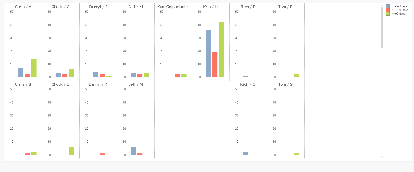
I used the Trellis option here. May be it is not what you need, but just throwing out ideas out there 
- Mark as New
- Bookmark
- Subscribe
- Mute
- Subscribe to RSS Feed
- Permalink
- Report Inappropriate Content
Hi Sunny,
Thank you for the reply!
We have created a key in the script level by concatenating name and group and displaying that key in the x axis.