Unlock a world of possibilities! Login now and discover the exclusive benefits awaiting you.
- Qlik Community
- :
- All Forums
- :
- QlikView App Dev
- :
- How to show the salary values in this Bar Chart in...
- Subscribe to RSS Feed
- Mark Topic as New
- Mark Topic as Read
- Float this Topic for Current User
- Bookmark
- Subscribe
- Mute
- Printer Friendly Page
- Mark as New
- Bookmark
- Subscribe
- Mute
- Subscribe to RSS Feed
- Permalink
- Report Inappropriate Content
How to show the salary values in this Bar Chart in Percentage (%)?
Hello all,
I have the following bar chart:
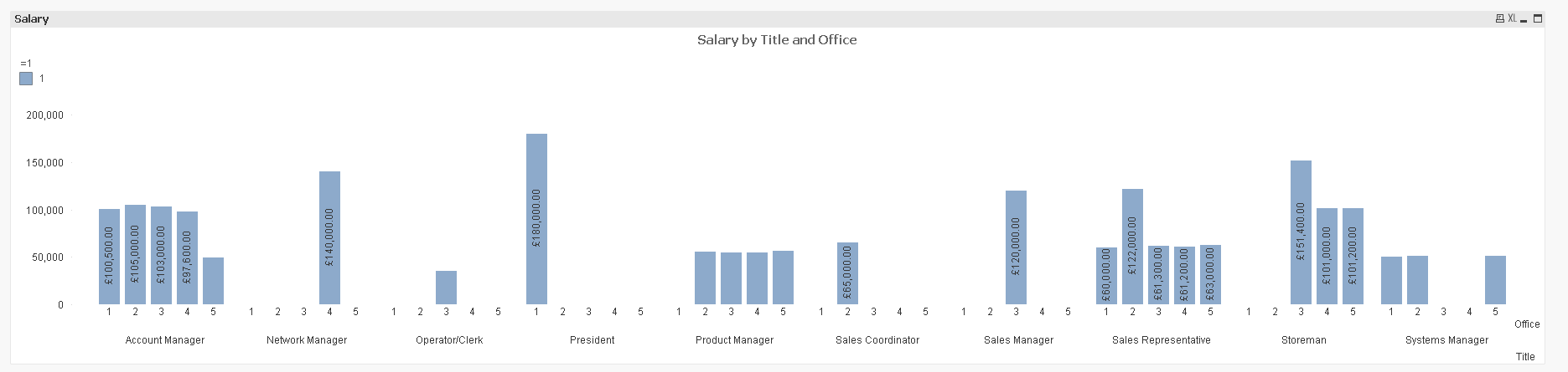
Dimensions:
Title
Office
1 (added as a Calculated Dimension so that Office values appear under each bar)
Measure:
Sum(Salary)
What I want to do is turn these values into Percentages per Title.
I tried to do this below with this expression:
Sum([Salary])
/
Sum(Total [Salary])
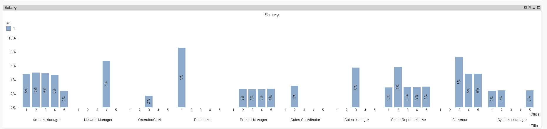
But it creates percentages across all dimensions. Whereas I need it to be per TItle. E.g. 25% office 1, 30% office 2, 15% office 3 by the Title.
The idea is to understand which offices have the highest earners by a title.
How can I achieve this?
Accepted Solutions
- Mark as New
- Bookmark
- Subscribe
- Mute
- Subscribe to RSS Feed
- Permalink
- Report Inappropriate Content
- Mark as New
- Bookmark
- Subscribe
- Mute
- Subscribe to RSS Feed
- Permalink
- Report Inappropriate Content
did you do aggr()?
sample data please?
- Mark as New
- Bookmark
- Subscribe
- Mute
- Subscribe to RSS Feed
- Permalink
- Report Inappropriate Content
Instead of using Grouped Bar use stacked bar and enable the Value on data points. That will work.
- Mark as New
- Bookmark
- Subscribe
- Mute
- Subscribe to RSS Feed
- Permalink
- Report Inappropriate Content
Hi,
Attached is some sample data.
- Mark as New
- Bookmark
- Subscribe
- Mute
- Subscribe to RSS Feed
- Permalink
- Report Inappropriate Content
Hi,
I cannot use stacked bar as the users want to see it in a Grouped format.
Also with this type of chart Stacked bar is not an available option.
- Mark as New
- Bookmark
- Subscribe
- Mute
- Subscribe to RSS Feed
- Permalink
- Report Inappropriate Content
I solved it myself.
It is:
Sum([Salary])
/
Sum(Total <Office> [Salary])