Unlock a world of possibilities! Login now and discover the exclusive benefits awaiting you.
- Qlik Community
- :
- All Forums
- :
- QlikView App Dev
- :
- Re: Is there a better way to show 3 expressions in...
- Subscribe to RSS Feed
- Mark Topic as New
- Mark Topic as Read
- Float this Topic for Current User
- Bookmark
- Subscribe
- Mute
- Printer Friendly Page
- Mark as New
- Bookmark
- Subscribe
- Mute
- Subscribe to RSS Feed
- Permalink
- Report Inappropriate Content
Is there a better way to show 3 expressions in one chart?
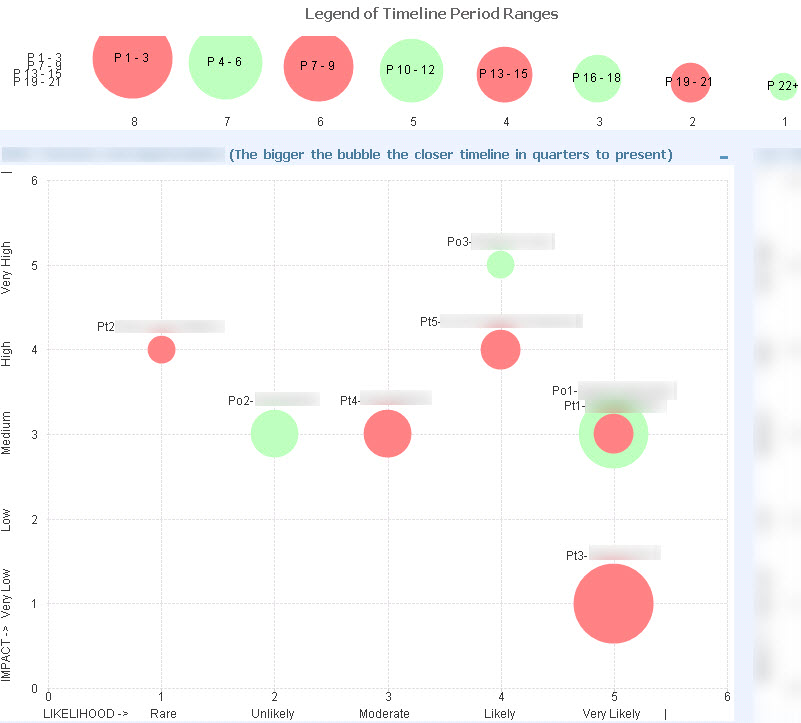
For example, I am not too much satisfied with the readability of this example:
The Legend part enables dynamics, but it is not ideal in terms of taking less space.
- Mark as New
- Bookmark
- Subscribe
- Mute
- Subscribe to RSS Feed
- Permalink
- Report Inappropriate Content
Is this extension that you are using?
In this case, only the author can answer the question.
Feeling Qlikngry?
- Mark as New
- Bookmark
- Subscribe
- Mute
- Subscribe to RSS Feed
- Permalink
- Report Inappropriate Content
No, it is not the extension. Plain vanilla QlikView 11 SR12
- Mark as New
- Bookmark
- Subscribe
- Mute
- Subscribe to RSS Feed
- Permalink
- Report Inappropriate Content
No ideas so far. There is also an issue of having two items getting the same scores, i.e. overlapping.
To make it more readable I am thinking to build this using mini-charts for 3 expressions.
- Mark as New
- Bookmark
- Subscribe
- Mute
- Subscribe to RSS Feed
- Permalink
- Report Inappropriate Content
Why not replace the categories with different colors. Is there some additional quality indication in those Period Ranges, like P1-P3 being worse than the others?
For the overlapping data points, there may not be a simple solution. Maybe you should check out the D3 library site for inspiration?
- Mark as New
- Bookmark
- Subscribe
- Mute
- Subscribe to RSS Feed
- Permalink
- Report Inappropriate Content
Thanks Peter.
I am already using two colors to distinguish between two measures.
Period range is the third measure, which shows the timeline, i.e. the closer to present the bigger the bubble.
D3 Library? I'll google it as I've never heard of it.
- Mark as New
- Bookmark
- Subscribe
- Mute
- Subscribe to RSS Feed
- Permalink
- Report Inappropriate Content
The site can be found at https://d3js.org/
D3 is an OSS JavaScript Data Visualisation library. Many of the visualisations have been translated to QlikView Extensions. See the Examples page for a boatload of alternatives to the QlikView chart formats.