Unlock a world of possibilities! Login now and discover the exclusive benefits awaiting you.
- Qlik Community
- :
- All Forums
- :
- QlikView App Dev
- :
- Labels on Mekko-chart made of a Scatter chart?
- Subscribe to RSS Feed
- Mark Topic as New
- Mark Topic as Read
- Float this Topic for Current User
- Bookmark
- Subscribe
- Mute
- Printer Friendly Page
- Mark as New
- Bookmark
- Subscribe
- Mute
- Subscribe to RSS Feed
- Permalink
- Report Inappropriate Content
Labels on Mekko-chart made of a Scatter chart?
The initial challenge was to get a numeric x-axis? That was solved by building the Mekko using a scatter chart. Now, the problem is to get labels on the boxes. Can that be solved?
Christian
- « Previous Replies
-
- 1
- 2
- Next Replies »
- Mark as New
- Bookmark
- Subscribe
- Mute
- Subscribe to RSS Feed
- Permalink
- Report Inappropriate Content
Regarding the chart with reference to the waterfall thread. What if I am presented with a situation where volume sold is the same as another country. Would they overlap or would it be presented in a 3d dimensional way? I just find this visual very hard to interpret and takes some cognitively thinking to understand what it is that I am seeing.
Otherwise, I did try and give a bash, but was unable to get the same visual output 
Cheers,
Byron Van Wyk
qlikviewramblings.blogspot
- Mark as New
- Bookmark
- Subscribe
- Mute
- Subscribe to RSS Feed
- Permalink
- Report Inappropriate Content
Byron,
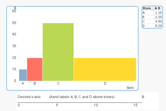
I agree with you if it is a waterfall. I do not want a waterfall (I don't think the illustration is a waterfall, I think they used the wrong term), simply a Mekko-chart with numbers of the x-axis, and preferable the labels that normally is on the x axis above the boxes. Like this:
- Mark as New
- Bookmark
- Subscribe
- Mute
- Subscribe to RSS Feed
- Permalink
- Report Inappropriate Content
Off topic, but really like your valueloop discussion that has been making the rounds  Very nice dude!!!
Otherwise, really have no idea how to achieve what you want above Will follow and hopefully someone comes up with ingenious way of doing it
Cheers,
Byron
- Mark as New
- Bookmark
- Subscribe
- Mute
- Subscribe to RSS Feed
- Permalink
- Report Inappropriate Content
Many thanks Byron!
I have a plan how to solve the above... Just wait and see (I hope...)
Christian
- Mark as New
- Bookmark
- Subscribe
- Mute
- Subscribe to RSS Feed
- Permalink
- Report Inappropriate Content
I am slowly getting there. Still haven't solved the label issue. Will need to think some more...
 Christian
- Mark as New
- Bookmark
- Subscribe
- Mute
- Subscribe to RSS Feed
- Permalink
- Report Inappropriate Content
Not bad at all It's actually looking very close to what you wanted. Upload this so long if you want to. Would love to have a look at it and see what you did
Cheers,
Byron
- Mark as New
- Bookmark
- Subscribe
- Mute
- Subscribe to RSS Feed
- Permalink
- Report Inappropriate Content
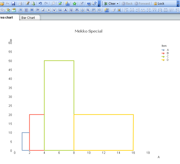
My pleasure! It is attached. I guess you will be a bit surprised when you discover what type of chart it is . I got stuck with the traditional Mekko-chart, so I needed to think a little bit outside the box.
Still, a new label challenge remains. So far, I haven't got a clue on how to solve it, and I do not wish to overlay a transparent chart only for the labels. That's cheating.
Any creative ideas?
/Christian
- Mark as New
- Bookmark
- Subscribe
- Mute
- Subscribe to RSS Feed
- Permalink
- Report Inappropriate Content
If I could I would like this 10 times as much. Serious Christian, I am very impressed by your ingenuity! I am still wrapping my head around how you figured this out and knew that, that particular style of a scatter chart would give you this visual output. Absolutely brilliant!
I look forward to seeing your update on this
Cheers,
Byron
- Mark as New
- Bookmark
- Subscribe
- Mute
- Subscribe to RSS Feed
- Permalink
- Report Inappropriate Content
Thanks Byron. The secret sauce is that a scatter charts could be used to draw lines, This opens up an ocean of possibilities. I was initially inspired by a really great blog post by Matthew Crowther (New Qlikview Indexed Explosion Quadrant Chart | QVDesign) where he introduced Value List and Value Loop (I recommend his blog if you have not read it). It made me realize that you can more or less can create any type of graph using Scatter charts. I started off experimenting with Re: Is there an artist in you? just to play around. I followed up by this; New variant of Scatter: Overlapping Box Areas, as an attempt to make something useful of this insight (not succeeding since the application of the Box Area graph is very limited). From there, the step of transforming the Area graph into a Mekko chart should have been short, but it took me a while before a realized the obvious. I think these examples will prove interesting for anyone wanting to explore more about Qlikview. Still, as mentioned, the label issue remains for someone to solve.
So, how does it work? The chart draws squares, using fields X and Y for coordinates (0,0 -> 0,1 -> 1,1 -> 1,0 -> 0,0), where field X is used in the first dimension and then both fields X and Y are used as first and second expressions. Basically, the coordinates are looped through. To create the Mekko, a second dimension, here the Item field, is added to get different boxes. Field X (X-coordinates) is scaled with field A and is then offset with the above sum of the first expression (the previous rows blocks - much like a waterfall). The same is done for field Y (Y-Coordinates) that is multiplied by field B, but it is not offset. In a real application, A could be price per unit and B could be # of units. So, why the 1.00000001 etc? Because otherwise Qlikview would have summarized the Y-coordinates on X=0 and X=1. Due to the tiny decimals, the X-coordinates are different, hence not summarized, even though the difference is so small that the Y-values still graphically appear to be on the same X-location. Hope that clarifies! Quite simple once you get your head around it.
Now, let's hope that someone clever can figure out the label challenge. I don't have a clue how to solve it. I have only succeed in displaying x-values, and that is not so useful. I wold like left aligned labels above the top left corner (the 4th coordinate ) of each box.
Christian
- « Previous Replies
-
- 1
- 2
- Next Replies »