Unlock a world of possibilities! Login now and discover the exclusive benefits awaiting you.
- Qlik Community
- :
- All Forums
- :
- QlikView App Dev
- :
- Legend Color when using BG color expressions in ba...
- Subscribe to RSS Feed
- Mark Topic as New
- Mark Topic as Read
- Float this Topic for Current User
- Bookmark
- Subscribe
- Mute
- Printer Friendly Page
- Mark as New
- Bookmark
- Subscribe
- Mute
- Subscribe to RSS Feed
- Permalink
- Report Inappropriate Content
Legend Color when using BG color expressions in bar chart
Hi Qlik Community
I have a bar chart with sales by month, with two expressions; this year (Flag_TY=1) and last year (Flag_LY=1). This works.
However I also have an additional flag field for a fiscal year: Flag_FY. I want to indicate this in the chart by fading the color for months without Flag_FY=1.
By using expressions in the background color for the expressions this works now, but I simply can't figure out how the legend color is determined?
I want the legend to follow the "base" color from the color tab and not the faded version I apply by expression - see following screenshot:
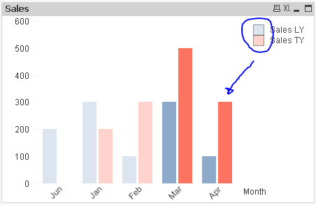
If I change the sorting of the Dimension - the legend color becomes correct. I would prefer it sorted like the above. And I would really like to understand why the sorting has an effect.
So it must evaluate the background color expression somehow to create the legend? Maybe someone can suggest a workaround?
I tried to create a copy of both expressions and let one pair be NULL for Flag_FY=1 and the other pair be NULL for Flag_FY=0. Unfortunately this creates a lot of empty white space in the chart and 4 expressions in the legend, so it is also a poor workaround.
I attached a QlikView document with the dummy data demonstrating my issue.
My QV version is 11.20 SR12.
Thank you in advance.
Accepted Solutions
- Mark as New
- Bookmark
- Subscribe
- Mute
- Subscribe to RSS Feed
- Permalink
- Report Inappropriate Content
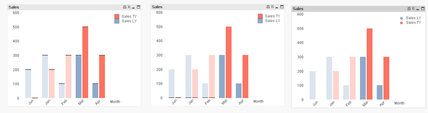
Here are few work arounds... they are not perfect, but you can try them out....
- Mark as New
- Bookmark
- Subscribe
- Mute
- Subscribe to RSS Feed
- Permalink
- Report Inappropriate Content
Here are few work arounds... they are not perfect, but you can try them out....
- Mark as New
- Bookmark
- Subscribe
- Mute
- Subscribe to RSS Feed
- Permalink
- Report Inappropriate Content
I don't think it's evaluating the expression at all. Rather, I think it's taking the color of whatever the leftmost dimension value in your chart happens to be. That's why sorting or selecting can affect the color.
Another imperfect workaround is to create a simple second chart, remove everything but the legend from it, remove the legend from your original chart, and put the new chart on top of the old. See attached.
Or you can build a legend from four text boxes. I've resorted to that at least once before.
- Mark as New
- Bookmark
- Subscribe
- Mute
- Subscribe to RSS Feed
- Permalink
- Report Inappropriate Content
It works! For some reason when I open your attached document, I don't see those black lines in chart 1 + 2. So they are perfect.
I tried with NULL expression to create something like this, but Qlik just hide legends.
- Mark as New
- Bookmark
- Subscribe
- Mute
- Subscribe to RSS Feed
- Permalink
- Report Inappropriate Content
That is a clever use of multiple charts.
I have had some other legend layout issues before, where this could have solved it.