Unlock a world of possibilities! Login now and discover the exclusive benefits awaiting you.
- Qlik Community
- :
- All Forums
- :
- QlikView App Dev
- :
- Losing colour in chart when I add a second express...
- Subscribe to RSS Feed
- Mark Topic as New
- Mark Topic as Read
- Float this Topic for Current User
- Bookmark
- Subscribe
- Mute
- Printer Friendly Page
- Mark as New
- Bookmark
- Subscribe
- Mute
- Subscribe to RSS Feed
- Permalink
- Report Inappropriate Content
Losing colour in chart when I add a second expression
I have a 2 dimensional combo chart in Qlikview. First dimension is department, second is financial year.
I have an expression to show number of hours worked by department members, this is represented as a grouped bar on the combo chart, so for each dept, we get a coloured bar for each financial year, as expected.
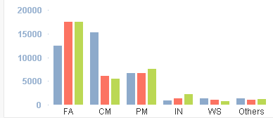
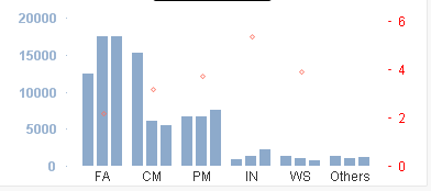
However, when I add in a second expression for a symbol on the chart, the bars all change to blue. this is rather confusing as it no longer matches the colour coding on other charts. This new expression uses AGGR to calculate a single average for each Dimension 1 value (department) rather than doing a separte value for each combination of dept and financial year.
Can anyone suggest a way to keep the colours of Dimension 2 on the first expression when I add this second expression?
Many thanks
Steve
- « Previous Replies
-
- 1
- 2
- Next Replies »
- Mark as New
- Bookmark
- Subscribe
- Mute
- Subscribe to RSS Feed
- Permalink
- Report Inappropriate Content
Hi Martin, thanks for all you're help so far, it's starting to take shape.
I'm noow using the line :
=Color(FieldIndex('Calendar.NexusYear',Calendar.NexusYear))
This is giving me the problem that each financial year is associated with one colour and this does not change according to which years have been selected. So if I select years 2013/14. 2012/13 and 2011/12, the graph at the top of the chart uses colours 1-3 (blue,red & green), but the one using the method above uses colours 6-8 (brown, pink & grey for the same years.
Can you suggest an adjustment I can make to the line above to force it to restrict the FieldIndex value returned so that it takes into account only the ones selected?
If you can't, thanks for helping anyway, I've learned a lot from this and I'll continue working on it.
- Mark as New
- Bookmark
- Subscribe
- Mute
- Subscribe to RSS Feed
- Permalink
- Report Inappropriate Content
Hi Stephen,
do you use the formula in both expressions?
If financial year 2011/12 is the 6. year in your datas it will get the 6. color.
But in a "normal" selection it will the the first dimension and so the first color.
You can also use the function in a chart with only one dimension / formula by adding it in the dimension paramaters.
- Mark as New
- Bookmark
- Subscribe
- Mute
- Subscribe to RSS Feed
- Permalink
- Report Inappropriate Content
Thanks Nitha, this is also very helpful. This demonstrates that another way to do this would be to have a variable along the lines you've suggested but with more years and colours, and use this variable to control the colouring of financial year dimwensions on all the charts that use it
- Mark as New
- Bookmark
- Subscribe
- Mute
- Subscribe to RSS Feed
- Permalink
- Report Inappropriate Content
The colouring is only important in the first expression, which manifests itself as a bar for each dept/fin year combination. The other expression returns only a single value for each dept, so defaulting to a single colour is fine.
Thanks for all your help with this, I really feel I have a few strong leads to work with now.
Regards
Steve
- Mark as New
- Bookmark
- Subscribe
- Mute
- Subscribe to RSS Feed
- Permalink
- Report Inappropriate Content
I have resolved this.
I ended up using a solution along the lines of that suggested by Martin, but using GetFieldSelections rather than Fieldindex.
=Color (((index(GetFieldSelections(Calendar.NexusYear, ',' , 14), Calendar.NexusYear ) -1) /8) +1)
Here, if I have 3 financial years selected (which don't need to be in sequence, The GetFieldSelections function will give me a string like "2008/09,2011/12,2012/13". I then use index to find the position of the financial year I need the colour for and use the remaining addition, subtraction and division to convert the position (1, 9, 17 etc.) to a colour index (1, 2, 3 etc.)
If you're using this, please be aware that if no years are selected, GetFieldSelections returns an empty string. I will need to test GetSelectedCount to check this and if so, use the string "2007/08,2008/09,2009/10......" etc.
Thanks to Nuno, Martin and Nitha, who all planted seeds that allowed me to reach this highly satisfactory solution.
- Mark as New
- Bookmark
- Subscribe
- Mute
- Subscribe to RSS Feed
- Permalink
- Report Inappropriate Content
Good solution. Respect!
- « Previous Replies
-
- 1
- 2
- Next Replies »