Unlock a world of possibilities! Login now and discover the exclusive benefits awaiting you.
- Qlik Community
- :
- All Forums
- :
- QlikView App Dev
- :
- Re: Multiple aggregations in straight charts
- Subscribe to RSS Feed
- Mark Topic as New
- Mark Topic as Read
- Float this Topic for Current User
- Bookmark
- Subscribe
- Mute
- Printer Friendly Page
- Mark as New
- Bookmark
- Subscribe
- Mute
- Subscribe to RSS Feed
- Permalink
- Report Inappropriate Content
Multiple aggregations in straight charts
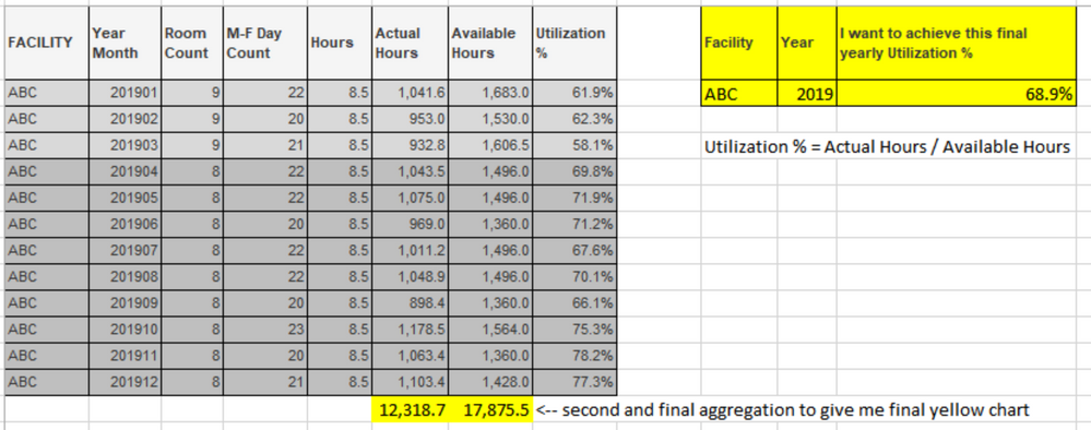
I'm wondering if it is possible to do multiple levels of aggregations in a straight chart. I can probably achieve this via script but am looking for confirmation if that is my only option. See below. The gray chart is the first level of aggregation, and the yellow chart is what I ultimately need to show. Thanks.
Accepted Solutions
- Mark as New
- Bookmark
- Subscribe
- Mute
- Subscribe to RSS Feed
- Permalink
- Report Inappropriate Content
Thank you for your feedback, I appreciate it. For now I did build what I needed in the script, but might try your suggestion out of curiosity.
- Mark as New
- Bookmark
- Subscribe
- Mute
- Subscribe to RSS Feed
- Permalink
- Report Inappropriate Content
I'm not sure what your limitations are, but this looks like it would be achieved using:
Aggr(Sum([Actual Hours])/Sum(Available Hours),Facility,Year)
If you're trying to put this in the same columns of the original table, though, you'd have to somehow generate the extra rows first (let's call them RowType = Summary), and then presumably use something like:
If(RowType = 'Summary',Aggr(Sum([Actual Hours])/Sum(Available Hours),Facility,Year),Sum([Actual Hours])/Sum(Available Hours))
Not sure if there's any good way to achieve these extra rows at the chart level - if I had to do this, I'd put them in the script.
- Mark as New
- Bookmark
- Subscribe
- Mute
- Subscribe to RSS Feed
- Permalink
- Report Inappropriate Content
Thank you for your feedback, I appreciate it. For now I did build what I needed in the script, but might try your suggestion out of curiosity.
