Unlock a world of possibilities! Login now and discover the exclusive benefits awaiting you.
- Qlik Community
- :
- All Forums
- :
- QlikView App Dev
- :
- Re: Re: My Parallel Coordinates Chart
- Subscribe to RSS Feed
- Mark Topic as New
- Mark Topic as Read
- Float this Topic for Current User
- Bookmark
- Subscribe
- Mute
- Printer Friendly Page
- Mark as New
- Bookmark
- Subscribe
- Mute
- Subscribe to RSS Feed
- Permalink
- Report Inappropriate Content
My Parallel Coordinates Chart
Please look at the picture below:
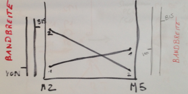
The idea is to make a parallel coordinates chart.
This is the background information. M2 represents the quantity we promised our customers. M5 represents the quantity te customer got. The parallel coordinates chart should have 2 Y axes, namely one for M2 and another for M5.
The corresponding lines should be drawn from M2 to M5.
(There should be also 2 slieders on both sides in order to allow the end-user to filter the specific range both from M2 and M5.)
For M2 there is a field in our data model: Field_M2 (it contains numerical values, such as: 8000, 12213, 14099...)
Fro M5 there is a field as well in the data model: Field_M5 (it contains numerical values, such as: 3232, 13433, 15455...)
Both fields are contained inside one table.
First question is - do I have everything (data) in order to make the described chart?
And can anybody help me please with this chart? Thanks!
UPDATE:
The challenge I see is with the dimension (X axis). How to display M2 and M5?
UPDATE_1:
As mentioned before, both fields (Field_M2 and Field_M5) are contained insde on table.
Sothe tables looks something like this:
Field_M2 Field_M5
10000 15000
8000 10000
12000 9000
...
Now I have no idea how to make a dimension (X axis) that contains only two values M2 and M5.
Any suggestion?
UPDATE_2:
So the first question to clear would be - what are the minumum necessary conditions in order to make a parallel coordinate chart?
Does anybody have experience with parallel coordinates chart?
- Mark as New
- Bookmark
- Subscribe
- Mute
- Subscribe to RSS Feed
- Permalink
- Report Inappropriate Content
See if this helps:
- Mark as New
- Bookmark
- Subscribe
- Mute
- Subscribe to RSS Feed
- Permalink
- Report Inappropriate Content
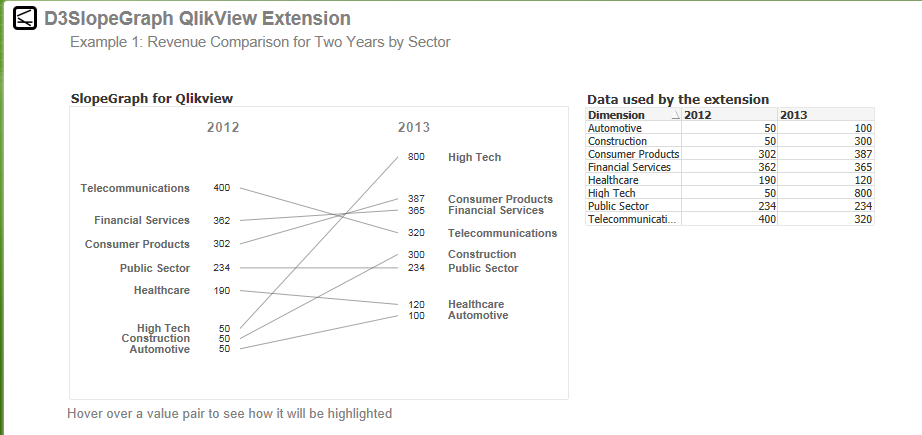
The 'Slope Graph' extension from Stefan Walther may be close:
Take a look at the extension (and other wonderful creations) here:
- Mark as New
- Bookmark
- Subscribe
- Mute
- Subscribe to RSS Feed
- Permalink
- Report Inappropriate Content
If you haven't already, check this out. It is easy to implement and works well. Note that this chart does not work well prior to 11.2 SR4.
This is a qvw derived from this site: qvdesign.wordpress.com/2012/01/31/brilliant-qlikview-parallel-co-ordinates-chart/
- Mark as New
- Bookmark
- Subscribe
- Mute
- Subscribe to RSS Feed
- Permalink
- Report Inappropriate Content
Thanks for the feedback.
I am not sure that an extension is the solution to my problem, because end-users always ask additional functionalities.
It would be more helpful, if you could help me understand the parallel coordinates chart, and to help me get the dimensions on the X axis. Here I am completely clueless.
In addition, I did not see an example in the links you sent me (only the description of the extension).
Looking forward to hearing from you.
- Mark as New
- Bookmark
- Subscribe
- Mute
- Subscribe to RSS Feed
- Permalink
- Report Inappropriate Content
The extension .QAR and a sample .QVW with the extension is in the blog. Below is a paste of the links in the blog and the resulting QVW screenshot below that.
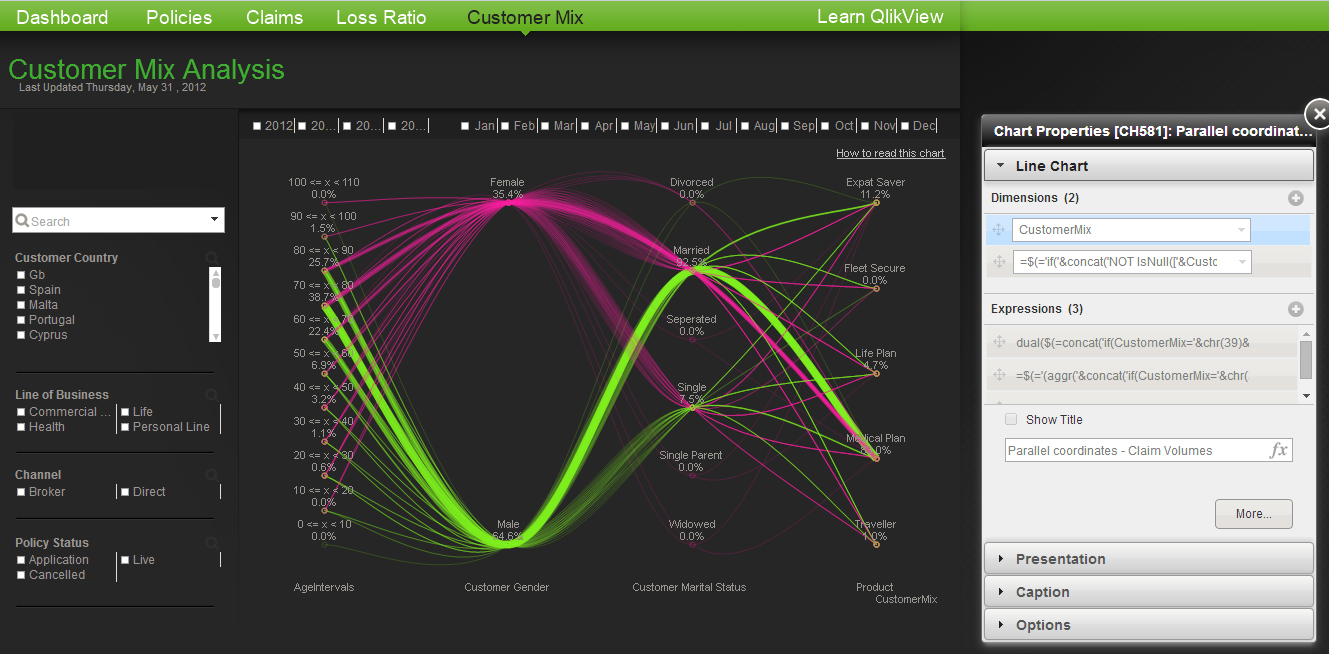
As for a 'parallel coordinates chart' i have seen an out of box example that uses a 'line chart' in the 'Customer Mix' tab of the qlikview insurance demo here:
http://us-d.demo.qlik.com/QvAJAXZfc/opendoc.htm?document=qvdocs%2FInsurance.qvw&host=demo11
The technique for this chart is quite involved but it is 'out of box'.

- Mark as New
- Bookmark
- Subscribe
- Mute
- Subscribe to RSS Feed
- Permalink
- Report Inappropriate Content
I'll look it up in detail later.
Now I need confirmation in regard to this:
- it seems to me that the parallel coordinates chart HAS to have the following and ONLY the following building blocks:
2 dimensions
and 1 expression.
The first of the two dimensions is for the values on th X axis. The second dimension is for the Y axis.
AND it seems to me important to state that we will have so many Y axis (with values from second dimension) as there are different values on the x axis.
Calculation of the expression is made for the combination (Value on the X axis, value on the Y axis). Depending on that the it is positioned on the Y axis.
This is done for every Y axis and the SAME Y values on every Y axes are connected.
Is this correct?
- Mark as New
- Bookmark
- Subscribe
- Mute
- Subscribe to RSS Feed
- Permalink
- Report Inappropriate Content
Not sure i completely follow but it sounds roughly accurate.
For the slope graph extension here are the properties: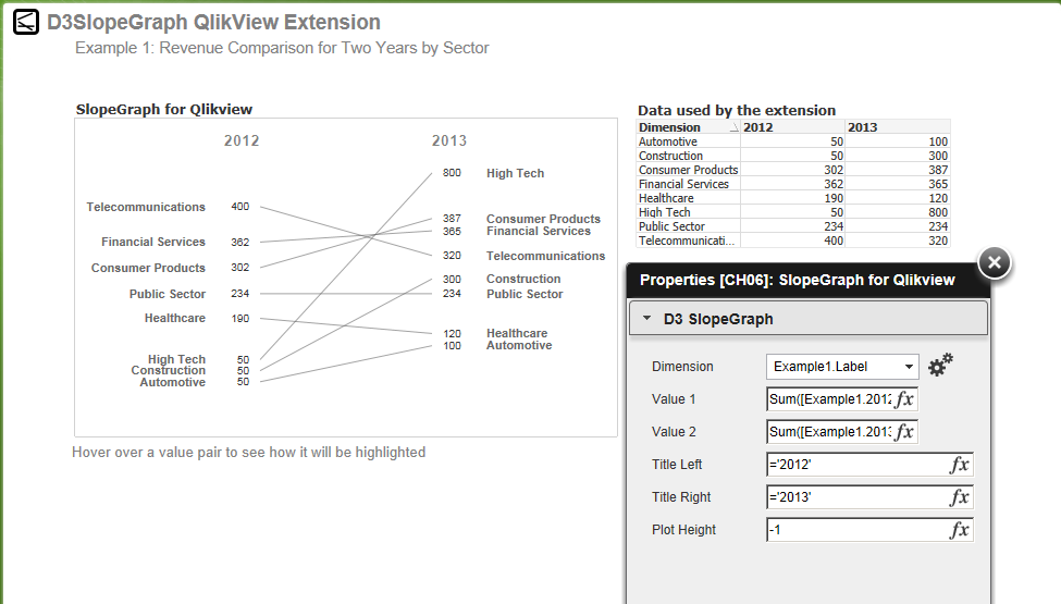
For the 'CustomerMix' example , its more complex and here is what the properties look like to adapt the line chart accordingly. For both of these i would suggest working with the samples directly. To be clear I am merely opening up the examples and exploring them myself in order to answer your questions.
- Mark as New
- Bookmark
- Subscribe
- Mute
- Subscribe to RSS Feed
- Permalink
- Report Inappropriate Content
Thanks for your reply - it is very helpful.
The problem I am having with your chart is that it is always necessary to manually select the dimensions.
Would it be possible to make that ONLY two dimensions are always displayed on the X-axis?
If yes, do you maybe know how?
UPDATE - OK - this is solved by deleting calculation condition in 'General' tab.
My next question is - could you please explain the first expression in the 'Expression Tab'?
(The name of the expression is 'Parallel coordinates chart (generic expressions)')
What does it do, and why does it put '%' signs?
The thing is - what I want my chart to do is only to take the values contained in the first dimension (M2) and connect them with the corresponding values in the second dimension (M5)
UPDATE_1:
So for example, if my table looks something like:
Field_M2 Field_M5
10000 15000
8000 10000
12000 9000
the chart looks in this phase as follows:
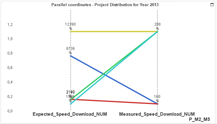
M2 = Expected_Speed_Download_NUM
M5 = Measured_Speed_Download_NUM
The line calculation should be as follows:
for the dimension M2 take the values you find in the table in the column 'M2'.
Do the same with M5.
So only the values have to be taken, without any transformations.
Any suggestion on how to do this?