Unlock a world of possibilities! Login now and discover the exclusive benefits awaiting you.
- Qlik Community
- :
- All Forums
- :
- QlikView App Dev
- :
- Re: My quest for the best way to visualize figures...
- Subscribe to RSS Feed
- Mark Topic as New
- Mark Topic as Read
- Float this Topic for Current User
- Bookmark
- Subscribe
- Mute
- Printer Friendly Page
- Mark as New
- Bookmark
- Subscribe
- Mute
- Subscribe to RSS Feed
- Permalink
- Report Inappropriate Content
My quest for the best way to visualize figures on different scales
Hi,
I have two figures, both out of an Excel_list, that I want to display in a barchart. Sounds simple, no? Well, take this:
- The first figure is "lorries arriving on a given day" which usually numbers in the dozens or so.
- The second is "boxes arriving on a given day" which usually numbers in the hundreds (every lorry can contain any number of boxes)
I want to display the two as close as possible so that it is clear at first sight which two figures (a # of lorries and a # of boxes) are associated with a given day.
- I cannot use one chart with the Trellis_option (which would effectually give me two charts) as the two scales are so different - the axes
automatically adapt to the largest figure (which would be a # of boxes), so the # of lorries would be hardly visible.
- Putting two separate charts side by side is quite ok, but it still requires "looking twice", so to speak, to notice the two different figures
associated with one day.
One thing that would be a solution if I can do it which I don't know is creating a horizontal barchart with the 0_line in the middle and with the bars for the lorries going right and the bars for boxes going left - but I don't know if I could use two different scales with that - I rather doubt it.
Now I came up with the idea of using two separate charts below each other and turning the lower one around - with the columns going down, not up. Then I just have to deactivate the display of the dimension for one of them and move them close to each other and get rid of a part of the frames.
Maybe someone here has some idea that could help me to further improve this visualization? There are also some more figures to come, I don't know whether it will be possible/ sensible to display those in the same diagram(s).
Thanks a lot!
Best regards,
DataNibbler
- « Previous Replies
- Next Replies »
Accepted Solutions
- Mark as New
- Bookmark
- Subscribe
- Mute
- Subscribe to RSS Feed
- Permalink
- Report Inappropriate Content
Okay,
I'm giving up on this and doing it differently, the way I already had it working. It's not quite as nice, but nearly, and that way I can finish that whole thing today.
- Mark as New
- Bookmark
- Subscribe
- Mute
- Subscribe to RSS Feed
- Permalink
- Report Inappropriate Content
Hi DataNibbler,
I'm not sure if it's suitable for your wanted usability of the first sight to see which belonged together but you could use two different axis-scales (left and right) and also split the axis by a certain percentage. Further possible might be to use an logarithm scale.
- Marcus
- Mark as New
- Bookmark
- Subscribe
- Mute
- Subscribe to RSS Feed
- Permalink
- Report Inappropriate Content
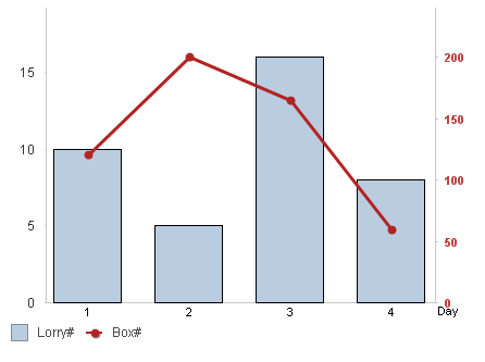
This is my thought, too. I have done this before but it isn't always easy for the user to decipher. I tend to use a combi-chart with a bar for one expression and a line for the other, THEN colour the axes to match the bar or line accordingly, using two distinct colours.
flipside
- Mark as New
- Bookmark
- Subscribe
- Mute
- Subscribe to RSS Feed
- Permalink
- Report Inappropriate Content
Hi Marcus,
Using two axes in the same chart was the very first thing I tried 😉 That is quite a good way to see both categories simultaneously, but then you need a hint somewhere to tell the user which bars he has to "read" on the left axis and which on the right - or can you somehow color the axes?
What I did now looks quite good - I can upload a Screenshot, there's no harm in that. I guess putting the two charts side by side would look better.
Of course, this method has its downsides - the dimensions are not synchronized, so I have to fiddle around with the exact positioning so the bars are as neatly aligned as possible - and the axis of the lower chart displays negative values.Well, I did make the values negative to have the columns upside_down, so I guess there's not too much I can do about that.
- Mark as New
- Bookmark
- Subscribe
- Mute
- Subscribe to RSS Feed
- Permalink
- Report Inappropriate Content
Using a line and associated axis colouring helps associate the measure. Also moving the Legend to the foot as well.
flipside
- Mark as New
- Bookmark
- Subscribe
- Mute
- Subscribe to RSS Feed
- Permalink
- Report Inappropriate Content
Hi flipside,
yep, that also looks good.
Could you tell me how I can color the axes? I haven't found that yet.
I guess I will create several possible visualizations and send screenshots to our CR manager to pick the one he thinks our customer will like best. - and then, as I said, there are more figures to come and I might find out at some point that some possibility will allow for the integration of further measures while others do not.
Thanks a lot!
- Mark as New
- Bookmark
- Subscribe
- Mute
- Subscribe to RSS Feed
- Permalink
- Report Inappropriate Content
If the most important point that the users could easily understand the chart and that there is (nearly) no possibility to misinterpret anything I would tend to the suggestion from flipside. Two use two charts beside or overlapping each other should be possible, too with the efforts to synchronize the scales which you need to fix to a certain maximum, minimum and step-wide (of course calculable but it would be not so smooth work like the qv automatic of scaling).
An alternatively might be to use a straight-table in a butterfly mode.
- Marcus
- Mark as New
- Bookmark
- Subscribe
- Mute
- Subscribe to RSS Feed
- Permalink
- Report Inappropriate Content
In the Axes properties, the top section will have two expressions (Lorry# and Box# in my example). Highlight the one you want to configure and then make the changes in the top half of the properties page (the bottom half changes the Dimension properties). To change font colour just click the Font button. I usually colour the axis line as well to match.
Getting the legend to display is sometimes difficult. You need to click Ctrl+Shift and drag it to the foot, then resize the height. For me, it usually crops the legend to the right, so I then have to drag it back out so it is floating, resize it so it isn't cropped, then re-drag it back to the foot.
- Mark as New
- Bookmark
- Subscribe
- Mute
- Subscribe to RSS Feed
- Permalink
- Report Inappropriate Content
Hi Marcus,
I have seen the straight table in butterfly mode, that also looks quite good. I've never used it, though - I have created a barchart with bars going left and right, I guess it's pretty similar. But I will have a look at the blogs and documents here in the Community. Learning something new is always worthwhile.
As for simplicity, you're probably right, flipside's suggestion would be the easiest for me and certainly among the best possible for the user. I just have a tendency to not go for the easiest possibility - why do things easy if it's possible in a complicated way 😉
Best regards,
DataNibbler
- Mark as New
- Bookmark
- Subscribe
- Mute
- Subscribe to RSS Feed
- Permalink
- Report Inappropriate Content
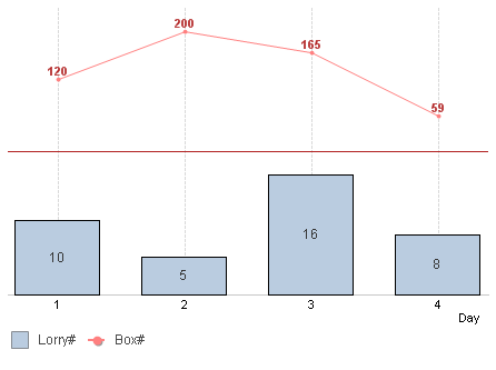
Here's a version using Split axis (50%).
- « Previous Replies
- Next Replies »