Unlock a world of possibilities! Login now and discover the exclusive benefits awaiting you.
- Qlik Community
- :
- All Forums
- :
- QlikView App Dev
- :
- Re: Normal probability plot
- Subscribe to RSS Feed
- Mark Topic as New
- Mark Topic as Read
- Float this Topic for Current User
- Bookmark
- Subscribe
- Mute
- Printer Friendly Page
- Mark as New
- Bookmark
- Subscribe
- Mute
- Subscribe to RSS Feed
- Permalink
- Report Inappropriate Content
Normal probability plot
Hi Guys,
Can anyone help with an example of a "normal probability plot" ?
Thanks in advance,
Aldo.
- « Previous Replies
-
- 1
- 2
- Next Replies »
Accepted Solutions
- Mark as New
- Bookmark
- Subscribe
- Mute
- Subscribe to RSS Feed
- Permalink
- Report Inappropriate Content
Hi Aldo, by "normal probability plot" I guess you mean one of these?
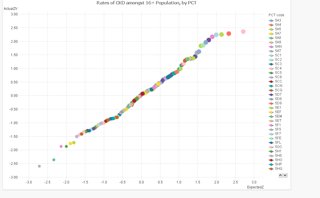
These are used to determine how well a dataset fits the normal distribution, important before you decide whether to base other statistical indicators on it.
The idea here is that for each data point, you plot the actual Z value (the number of standard deviations above/ below the mean), and then the Z value you would expect from that point in the cumulative distribution. The x axis are "simulated" Z values and the y axis are the actual Z values for that dataset.
If the dataset is fantastically normal, you will find that they fit a straight line diagonally along the centre of the plot, IE where X=Y. The way that the plotted line skews from the centre can also tell you more about the distribution. See http://www.skymark.com/resources/tools/normal_test_plot.asp for more information.
These charts are great for an "at a glance" view of telling whether the data fits or not.
So how to plot one? Start with a new chart, set the type to Scatter plot and select your dimension.
We then need to calculate 2 expressions, the "actual" Z score and "estimated" Z score.
Actual Z score:
this is the (value - average) / standard deviation. You can work this out with functions in Qlikview.
EG if your data point is quantity, your expression would look like this:
=(quantity- average(total quantity)) / stdev(total quantity)
Estimated Z score
This is the Z score that the point should correspond to, based on it's cumulative percentile within the distribution. Qlikview has an inverse normal function, so once you work out the percentile, you can calculate what the Z score should be from that.
It also has a rank function, so I have used that to calculate the percentile. NB, it ranks highest to lowest, so you need to deduct the percentage from 1 in order to reverse it.
=NORMINV( 1-(rank(quantity) - 0.5) / count(distinct total [dimension]) , 0,1)
~~~~~~~~~~~~~~~~~~~~~~~~~~~~~~~~~~~~~
(Percentile) ~~~
0 and 1 standardise the normal
distribution to plain z-scores
Set the Expected Z to your x axis by placing it first in the expressions, and the actual z to your Y axis.
The chart should then plot something similar to above.
I am not sure however, how to get a diagonal reference line. Perhaps someone else could help with that!
The best work arounds I have for that is to either base the chart as a line chart, with the "expected Z" as an aggregate dimension, or to float another chart with exactly the same dimensions on top with a diagnonal line throught it. Or just draw a line. But that is for another post.
Hope that helps
Erica
- Mark as New
- Bookmark
- Subscribe
- Mute
- Subscribe to RSS Feed
- Permalink
- Report Inappropriate Content
Hi Aldo, by "normal probability plot" I guess you mean one of these?
These are used to determine how well a dataset fits the normal distribution, important before you decide whether to base other statistical indicators on it.
The idea here is that for each data point, you plot the actual Z value (the number of standard deviations above/ below the mean), and then the Z value you would expect from that point in the cumulative distribution. The x axis are "simulated" Z values and the y axis are the actual Z values for that dataset.
If the dataset is fantastically normal, you will find that they fit a straight line diagonally along the centre of the plot, IE where X=Y. The way that the plotted line skews from the centre can also tell you more about the distribution. See http://www.skymark.com/resources/tools/normal_test_plot.asp for more information.
These charts are great for an "at a glance" view of telling whether the data fits or not.
So how to plot one? Start with a new chart, set the type to Scatter plot and select your dimension.
We then need to calculate 2 expressions, the "actual" Z score and "estimated" Z score.
Actual Z score:
this is the (value - average) / standard deviation. You can work this out with functions in Qlikview.
EG if your data point is quantity, your expression would look like this:
=(quantity- average(total quantity)) / stdev(total quantity)
Estimated Z score
This is the Z score that the point should correspond to, based on it's cumulative percentile within the distribution. Qlikview has an inverse normal function, so once you work out the percentile, you can calculate what the Z score should be from that.
It also has a rank function, so I have used that to calculate the percentile. NB, it ranks highest to lowest, so you need to deduct the percentage from 1 in order to reverse it.
=NORMINV( 1-(rank(quantity) - 0.5) / count(distinct total [dimension]) , 0,1)
~~~~~~~~~~~~~~~~~~~~~~~~~~~~~~~~~~~~~
(Percentile) ~~~
0 and 1 standardise the normal
distribution to plain z-scores
Set the Expected Z to your x axis by placing it first in the expressions, and the actual z to your Y axis.
The chart should then plot something similar to above.
I am not sure however, how to get a diagonal reference line. Perhaps someone else could help with that!
The best work arounds I have for that is to either base the chart as a line chart, with the "expected Z" as an aggregate dimension, or to float another chart with exactly the same dimensions on top with a diagnonal line throught it. Or just draw a line. But that is for another post.
Hope that helps
Erica
- Mark as New
- Bookmark
- Subscribe
- Mute
- Subscribe to RSS Feed
- Permalink
- Report Inappropriate Content
Erica,
It is exacly what I was looking for.
Great explanation.
Thanks a lot.
First of all, thanks for your answer.
What about the diagonal line?
Another thing... I also need to plot a "Gauss Bell" (I don't know the exact denomination in english). Any chance you know how to solve it?
Thanks again,
Aldo.
Message was edited by: Aldo Liaks
- Mark as New
- Bookmark
- Subscribe
- Mute
- Subscribe to RSS Feed
- Permalink
- Report Inappropriate Content
Erica,
very nice explanation!
Aldo, you were asking for a diagonal line indicating a normal distribution with mean 0 and stdev 1, as Erica said, I think this could be done using a line chart and expected as an aggregated dimension. Maybe like attached?
Have a nice weekend,
Stefan
- Mark as New
- Bookmark
- Subscribe
- Mute
- Subscribe to RSS Feed
- Permalink
- Report Inappropriate Content
Thanks Stefan!
- Mark as New
- Bookmark
- Subscribe
- Mute
- Subscribe to RSS Feed
- Permalink
- Report Inappropriate Content
Thanks stefan - I have to admit I enjoyed doing that explanation, I love seeing people use and understand statistics properly, better still incorportae them into reports that are accessed by many, ie via Qlikview!
Aldo: Gaussian functions are a type of equation that produce a bell-shaped curve, the normal distribution being the most "famous" member of this family. A gauss bell simply describes the curve that is plotted on a graph. What exactly are you trying to do?
Are you trying to plot your own data and see if it is bell-shaped? This is very simple. In this case use a bar chart to plot the count of your data, but with a calculated dimension using a class() function.
EG in my example of kidney disease rates above I set the dimension as =class(Rate,0.01) and the expression is simply a count of each group. The result is shown below, roughly bell shaped, typical of a lot of data (but never to be assumed!!!)
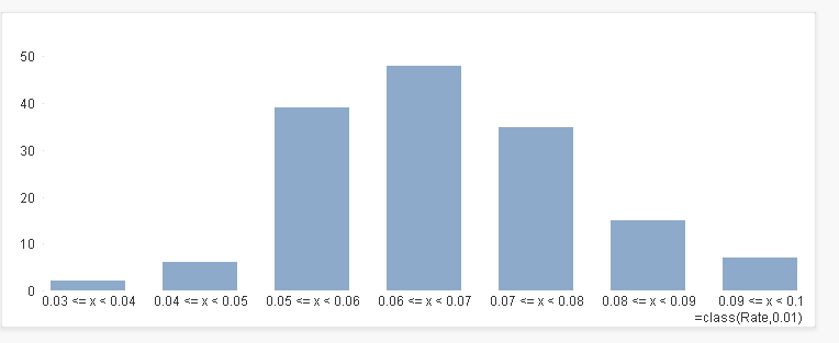
Is this what you are looking for?
- Mark as New
- Bookmark
- Subscribe
- Mute
- Subscribe to RSS Feed
- Permalink
- Report Inappropriate Content
I think the example is exactly what I was talking about, cheers.
- Mark as New
- Bookmark
- Subscribe
- Mute
- Subscribe to RSS Feed
- Permalink
- Report Inappropriate Content
Your example is exactly what I was looking for.
I believe can be pretty fun (and usefull) adding statistical analysis to several QV models.
Thanks.
Aldo.
- Mark as New
- Bookmark
- Subscribe
- Mute
- Subscribe to RSS Feed
- Permalink
- Report Inappropriate Content
Hi Erica.
Can you explain how you make this graph?
Can you give me your qvw ? I have lot of data and i want to see if the distribution is following a normal probability plot ?
Thanks a lot.
Regards.
- Mark as New
- Bookmark
- Subscribe
- Mute
- Subscribe to RSS Feed
- Permalink
- Report Inappropriate Content
Wow, you guys are helpful. I am trying to build a Z table in order to generate a Probability plot. But then...when I do some research on this forum. I found the answer. Thank you guys.
- « Previous Replies
-
- 1
- 2
- Next Replies »