Unlock a world of possibilities! Login now and discover the exclusive benefits awaiting you.
- Qlik Community
- :
- All Forums
- :
- QlikView App Dev
- :
- Re: Re: Overlapping data values in a chart
- Subscribe to RSS Feed
- Mark Topic as New
- Mark Topic as Read
- Float this Topic for Current User
- Bookmark
- Subscribe
- Mute
- Printer Friendly Page
- Mark as New
- Bookmark
- Subscribe
- Mute
- Subscribe to RSS Feed
- Permalink
- Report Inappropriate Content
Overlapping data values in a chart
Hello,
my chart consists of a bar chart and a line chart.
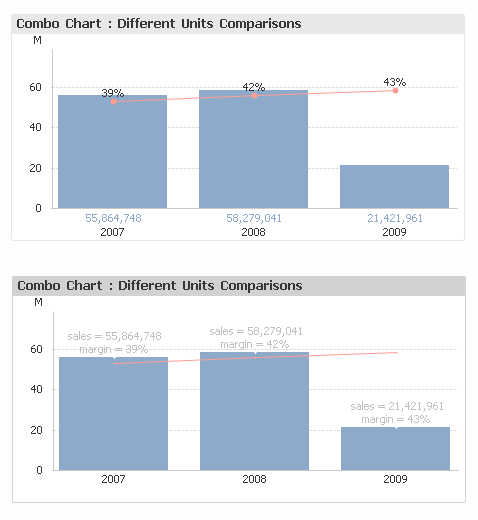
With some data selections bar chart value point overlaps with line chart value point and both become unreadable. (please refer to attachment - example in red box).
Is there any way QV recognizes the overlap and presents value points so both could be visible?
Thanks.
- Mark as New
- Bookmark
- Subscribe
- Mute
- Subscribe to RSS Feed
- Permalink
- Report Inappropriate Content
Hi.
That is impossible to take away.
You can hide values of 2nd expresión and put them in segments. Presentation, data on segments.
You can enlarge scale and trunk origin to make room between data, if it's possible.
You can play with the show value box, under every expression. Use a variable to show and hide. First you need to uncheck Show values on daata points.
- Mark as New
- Bookmark
- Subscribe
- Mute
- Subscribe to RSS Feed
- Permalink
- Report Inappropriate Content
Hi Przemyslaw,
sorry, I cannot help here - I cannot imagine how QlikView would recognize that - but I have the same issue and would be interested if there was a solution.
Do you have two separate charts? Why not just use a combochart?
=> Maybe you could set one of the two overlapping whatchamacallits to display the value only if the other value is not within a certain range of it (that range would depend on the font_size)? In that case, you would, in certain cases, have only one of the two values displayed, but it would avoid the overlapping.
HTH
Best regards,
DataNibbler
- Mark as New
- Bookmark
- Subscribe
- Mute
- Subscribe to RSS Feed
- Permalink
- Report Inappropriate Content
as I've said, you can save one by placing values in segments.
- Mark as New
- Bookmark
- Subscribe
- Mute
- Subscribe to RSS Feed
- Permalink
- Report Inappropriate Content
Hi,
I'm actually facing with the same problem, and finally I decided to show values only for an expression. However I'm already in trouble because I would like the user to see the values on the pop-ups but the labels are not visible. This labels for the expressions are calculated labels, such as =max(Anno) and =Max(Anno)-1, while there is a third label (not calculated) that is simply BUDGET. do you have any idea why the calculated labels don't work?
Thank you so much
Bye
IB
- Mark as New
- Bookmark
- Subscribe
- Mute
- Subscribe to RSS Feed
- Permalink
- Report Inappropriate Content
Qlikview don't recognizes the overlap (if I'm not wrong Qlikview next can do that)
Some workaround, if you like it I can post the Qlik doc
- Mark as New
- Bookmark
- Subscribe
- Mute
- Subscribe to RSS Feed
- Permalink
- Report Inappropriate Content
Wow, I really like the second solution!!! How you can create it?
I'm really interested in your QV doc... if you liked to share it, I'd really enjoy it! Thanks
ps: what about the labels I was complaining of? Still, I can't find a way out... when I move the mouse on the chart the following label appear:
BDG = 1
100
200
rather than
BDG=1
2014=100
2013=200
- Mark as New
- Bookmark
- Subscribe
- Mute
- Subscribe to RSS Feed
- Permalink
- Report Inappropriate Content
qlik doc
- Mark as New
- Bookmark
- Subscribe
- Mute
- Subscribe to RSS Feed
- Permalink
- Report Inappropriate Content
Hi splitting the axis may work as well.
rgds
Artur
- Mark as New
- Bookmark
- Subscribe
- Mute
- Subscribe to RSS Feed
- Permalink
- Report Inappropriate Content
I don't see how putting it in segments will help (except for the specific example where the line is above the bar). If the line for some reason crosses the segment next month, you could face the exact same issue with overlap, or?