Unlock a world of possibilities! Login now and discover the exclusive benefits awaiting you.
- Qlik Community
- :
- All Forums
- :
- QlikView App Dev
- :
- Re: Percentage on top of stacked bar chart & color...
- Subscribe to RSS Feed
- Mark Topic as New
- Mark Topic as Read
- Float this Topic for Current User
- Bookmark
- Subscribe
- Mute
- Printer Friendly Page
- Mark as New
- Bookmark
- Subscribe
- Mute
- Subscribe to RSS Feed
- Permalink
- Report Inappropriate Content
Percentage on top of stacked bar chart & color question(s)
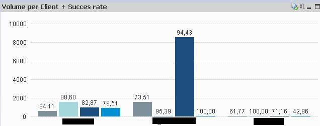
im facing some difficulties getting a bar chart to look a certain way. hope someone here can point me in the right direction.
Starting point is as follows:
2 Dimensions:
1. input type
2. client
2 Expressions:
1. one count to count the number of occurrences per input type & client
2. a success rate (percentage)
So far so good:
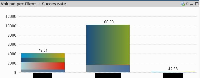
Now comes the tricky part. I would like to stack the bar charts. When I try to do so, the following happens:
Question 1: it seems the percentage of just one of the clients (light blue in the first screenshot) is displayed on top of the stacked barchart. How do I set it up in such a way, that it shows the total succes rate? It should only show the percentage for a single client, when this one client is filtered out.
Question 2: The colors changed. Until this point i 'forced' the use of colors by typing:
pick(match("CLIENT",'Client1','Client2','Client3','Client4'),rgb(126,144,154),rgb(165,216,221),rgb(28,78,128),rgb(0,145,213))
into the Background Color definition from Expression 1. I suppose I have to extend this code with all possible combinations between Dimension1 and Dimension2. How would the code of such a combination look? is there a better way?
Thanks in advance!!
Accepted Solutions
- Mark as New
- Bookmark
- Subscribe
- Mute
- Subscribe to RSS Feed
- Permalink
- Report Inappropriate Content
managed to find a solution on this forum. What is apparently the best(/only?) way to do this is to work with a single dimension only, and then create expressions instead of the dimension you removed - in my case I created 4 expressions as bar charts, one for each of my clients. That way a stacked bar chart in combination with the succes rate works.
just the color thing is still very unclear to me. I 'solved' it by changing Data appearance / colors 1-4 to the same colors I selected in the Background Color of the expressions. But this makes me wonder why I used the Background Color in the first place.

