Unlock a world of possibilities! Login now and discover the exclusive benefits awaiting you.
- Qlik Community
- :
- All Forums
- :
- QlikView App Dev
- :
- Re: Plotting the Highest and Lowest Values on a Ch...
- Subscribe to RSS Feed
- Mark Topic as New
- Mark Topic as Read
- Float this Topic for Current User
- Bookmark
- Subscribe
- Mute
- Printer Friendly Page
- Mark as New
- Bookmark
- Subscribe
- Mute
- Subscribe to RSS Feed
- Permalink
- Report Inappropriate Content
Plotting the Highest and Lowest Values on a Chart
Hi,
I have an interesting challenge that I’m wondering if it’s possible to do in QlikView without using an intermediary spreadsheet as the data source. And if it’s possible, some ideas of how to accomplish it…
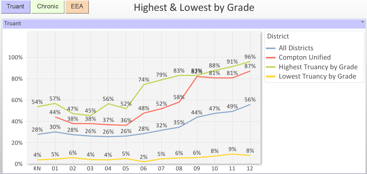
I have a QlikView chart that displays percentages of Truancy by grade (screenshot below). The purpose of this chart is to show a specific school district (Compton, in the example below) where they score compared to the highest, lowest, and average. You can see below that Compton ranks higher than average in all grades, and even has the highest rate for grade 9.
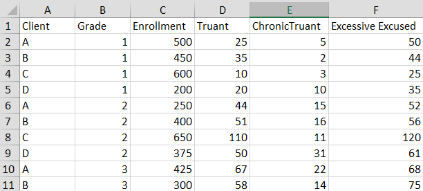
The raw data coming from the database looks similar to this (screenshot below) and currently requires a lot of spreadsheet calculations in order to display the data shown above. The twist is that each value plotted on the Highest or Lowest lines, is a separate district’s value. Essentially the Highest and Lowest by Grade lines are saying “out of all of our client districts, the highest or lowest score for each grade is X%”. Compton holds the record for the Highest Truancy for Grade 9, but some other district has the record for Grade 10, and another for Grade 11, etc.
Is there any way to calculate/display this in QlikView directly from the database, without an intermediary spreadsheet? And if so, how would you recommend developing this solution? Thanks
Accepted Solutions
- Mark as New
- Bookmark
- Subscribe
- Mute
- Subscribe to RSS Feed
- Permalink
- Report Inappropriate Content
- Mark as New
- Bookmark
- Subscribe
- Mute
- Subscribe to RSS Feed
- Permalink
- Report Inappropriate Content
You should be able to use a combination of max() and aggr() to achieve what you're looking for, but it's hard for me to tell without actually seeing a working .qvw with data.
- Mark as New
- Bookmark
- Subscribe
- Mute
- Subscribe to RSS Feed
- Permalink
- Report Inappropriate Content
I thought the current working .qvw might make it more confusing, but here we go. I will try to attach them.
I've been looking into max() and aggr() but so far can't figure out how I'm going to make it work
- Mark as New
- Bookmark
- Subscribe
- Mute
- Subscribe to RSS Feed
- Permalink
- Report Inappropriate Content
Here you go (attached).
Hopefully this gives you what you need.
- Mark as New
- Bookmark
- Subscribe
- Mute
- Subscribe to RSS Feed
- Permalink
- Report Inappropriate Content
Thanks nicole_kowalsky! That was the major hurdle.
There was one other part of it that I was trying to do and can't seem to get the expression correct...
In this attachment, you'll see I've added another expression to the chart you made that shows Average Truancy, in addition to the Highest and Lowest.
I've also added an Input Box allowing a user to specify a specific school district, which populates the vDistrict variable, and then I'd like it to plot the Truancy percentages by grade on the chart, so that the user can easily see where any given district ranks next to the Highest, Lowest, and Averages..
I just can't seem to get the expression right to make it display, after spending hours hunting through forum threads and the QV Help files... I bet this one will be an easy final touch for you.
Thanks so much!!
EDIT: after much digging around in the QlikCommunity threads, I finally stumbled upon the correct syntax for the expression I needed. I'll leave it here in case it might be of assistance to anyone else with a similar problem:
Sum({<District={'$(#vDistrict)'}>} Truant) / Sum({<District={'$(#vDistrict)'}>} StudentCount)