Unlock a world of possibilities! Login now and discover the exclusive benefits awaiting you.
- Qlik Community
- :
- All Forums
- :
- QlikView App Dev
- :
- Problem with displaying a gauche chart
- Subscribe to RSS Feed
- Mark Topic as New
- Mark Topic as Read
- Float this Topic for Current User
- Bookmark
- Subscribe
- Mute
- Printer Friendly Page
- Mark as New
- Bookmark
- Subscribe
- Mute
- Subscribe to RSS Feed
- Permalink
- Report Inappropriate Content
Problem with displaying a gauche chart
Dear all,
we just recognized a bug in our qvw. where we use gauche charts to present KPI`s.
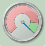
It usually looks like this:
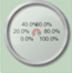
But in some of our installation it gets displayed like this:
We are thinking about that the reason for this issue could be our resolution or our graphic drivers.
Maybe someone experienced this issue before and can tell us his conclusion or the reason why this issue is taking place.
Looks like this can happen on windows 7/8 and 10 environments.
Accepted Solutions
- Mark as New
- Bookmark
- Subscribe
- Mute
- Subscribe to RSS Feed
- Permalink
- Report Inappropriate Content
I assume you mean gauge chart (I thought QlikView had been upgraded with a new chart type for a moment there!)
I haven't experienced this bug myself, but it just looks to me like the first chart doesn't have labels visible, and the other one does.
Edit: I've just tested this, and I think it's due to the size of the chart - if you make a small gauge chart, the labels disappear, so I would suggest you either make your chart slightly bigger, or remove the labels.
- Mark as New
- Bookmark
- Subscribe
- Mute
- Subscribe to RSS Feed
- Permalink
- Report Inappropriate Content
Hello Charlotte,
Removing the labels solve the problem. Thank you.
Best regards
Daniel
- Mark as New
- Bookmark
- Subscribe
- Mute
- Subscribe to RSS Feed
- Permalink
- Report Inappropriate Content
- Mark as New
- Bookmark
- Subscribe
- Mute
- Subscribe to RSS Feed
- Permalink
- Report Inappropriate Content