Unlock a world of possibilities! Login now and discover the exclusive benefits awaiting you.
- Qlik Community
- :
- All Forums
- :
- QlikView App Dev
- :
- Product Portfolio RoadMap Chart
- Subscribe to RSS Feed
- Mark Topic as New
- Mark Topic as Read
- Float this Topic for Current User
- Bookmark
- Subscribe
- Mute
- Printer Friendly Page
- Mark as New
- Bookmark
- Subscribe
- Mute
- Subscribe to RSS Feed
- Permalink
- Report Inappropriate Content
Product Portfolio RoadMap Chart
Dear All
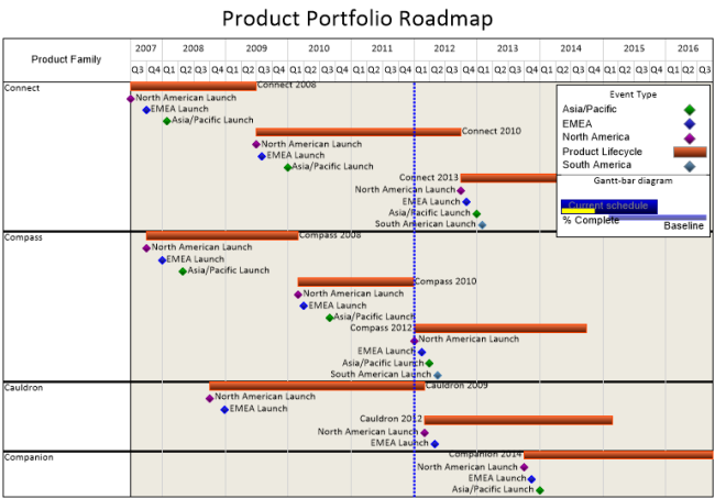
Couple weeks back i have received request to build chart similar to this one:
My first thought was: "EASY PEASY". later down the track i have faced so many issues with this chart and right now i am reaching the point of giving up or providing the solution i have build so far.
What i have achieved is not as bad as i thought but still it is far behind the thing i was expecting to get.
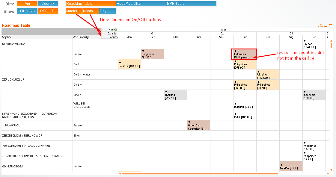
- First i have build this using Pivot Table Chart - that was the easiest in terms of putting all dimensions and measures in right places. Everything would be great with pivot table chart apart from 2 features which gave me a headake:
- Columns width which is always the same and obviously it works as designed but in this case it is actualy drawback as i would need rather dynamic change of collum width depending on time granularity as shown on picture below (Year/Quarter/Month/Day)
- Second drawback in this case is that whatevere value i have placed in the cell stays always within its boundries. That means that i had to wrap the text and make cells higher which made my chart not easy to read. On the other hand if i leave cell high on 1 row value than whole text from the cell can not be displayed (See the picture below)
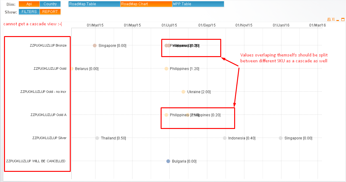
- My second thought was to use ComboChart flipped sideways. To use the time dimension as actual measure combined with the other measure which would display the title for it and other dimensions as the regular dimensions. Here it was everything great apart the fact that i cannot do cascade view on dimension side. Maybe here you would find a nice solution to help me with this. What ideally i would like to achieve is to get an API Dimension as the main one, and then as it is in the pivot table split values between particular Priority Dimensions. I have come up with an idea of building calculated dimension but the way it looks is unacceptable

Just to sum up:
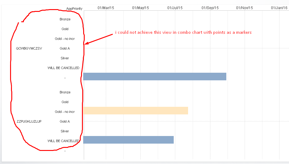
- Chart is much closer to what i want to achieve. But i have a trouble to display dimension the way i wantem them to be displayed which is this:
So people - Ball is on your side now. Any comments will be highly appreciated!
BTW...Just want to add that extensions object can be considered but i rather want to avoid them as production environment of this app will be deployed on +30 clastered servers and we want to keep it as simple as possible.
thanks
Lech
- Mark as New
- Bookmark
- Subscribe
- Mute
- Subscribe to RSS Feed
- Permalink
- Report Inappropriate Content
Maybe this is helpful: Files for creation of a Gantt chart
- Marcus
- Mark as New
- Bookmark
- Subscribe
- Mute
- Subscribe to RSS Feed
- Permalink
- Report Inappropriate Content
Yeah, thanks Marcus - i went this path as well - but no luck so far.
I know very well this document and still couldn't find right solution. Now we just tried to use bar chart and offset functionality to display particular points.
Maybe this hint will help you guys to help me...if it makes sense 